Year: 2011

Tour My Home: Boys Room ~ Skateboard Haven

The goal of my blog is to share inspirational ideas about design, and with that I like to showcase areas of my own home to actually show how a high-end look can be done for less (and no one has to know).  With being an Interior Designer, I have worked with clients that have limitless funds to spend, and others than have a barebone budget.  Either way, a well thought-out and designed space can be achieved.

Through my blog series, Tour My Home, I enjoy sharing different areas of the space I’ve created for my family. We last visited my daughter’s Honeysuckle Retreat, and the Next Stop: My son’s room ~ Skateboard Haven.

Continue reading

Blah to Beautiful: Bathroom Makeover on a Budget

I feel like I’ve been talking (and thinking) about this bathroom for decades, but in reality, it’s really only been a few weeks.  Somehow it took longer to execute than anticipated but I can thankfully say….IT’S DONE!

All things considered, this was (simply) a minor bathroom makeover.  Even though I dreamed of new white tile, a dark wood cabinet, and a fresh new sink, I’m very happy with the updates and the outcome.  My “overhaul dream” bathroom will come someday in the future!

SO here it is ~

(sorry for the narrow picture, it’s a bit difficult to take photos in such a small space)

And here it was ~

Do you happen to remember a few weeks ago when I shared my handy dandy Sherwin Williams Paint Visualizer tool?? Well it worked like a charm.  When testing out some paint colors using the visualizer, I really liked how these two options turned out, so I combined the look…

…and this is how it turned out (in real life)~

My inspiration for the space started with this towel rack that I picked up on my first visit to Hobby Lobby.  YES, it was only a few short weeks ago that I went to Hobby Lobby for the first time.  WOW, I know!

I don’t think I mentioned this earlier in the post, but this bathroom is the kids (FYI-I envision my bath to look a bit more lux).  I wanted to make it fun and reflect their personalities.  I liked the colors and style of this numbers towel rack and thought it would be an adorable start to the space. Above the towel rack, my son painted this priceless one-of-a-kind piece of art.  (He had some limitations ~ I only gave him paints that matched the room…I know, I’m sneaky!)

So here’s another view of the before…
Mirror: GONE
Light Fixture: REPLACED
Cabinet: PAINTED
Medicine Cabinet: TRANSFORMED

It went from this…

To this….

With a fresh coat of paint on the walls and the cabinet, the kids bathroom took on a new life!  The before cabinet did not have hardware, so I added new stylish knobs to dress em’ up a bit.  There was also quite a gap between the countertop edge and the wall, so I added a tile sidesplash, and continued two rows at the backsplash.  It was so easy and I installed it the same way as I did for the powder room backsplash.

Did you happen to see the medicine cabinet?  I kind of skipped over that and don’t want to give too much detail away…but I completely transformed it from what it was before.  Stay Tuned for a future post!

As for the mirror, the existing was removed, and in it’s place, I chose a simple frameless oval with a beveled edge. It’s clean and understated (especially next to the medicine cabinet).  With a new lighting fixture (and GFI outlets), the electric is up-to-date and complements this newly modern-edge bathroom.

The finishing touches were topped off with my Comic Art Mod Podge Project.  Another post to come for details!

So that’s it!  A space that I dreaded looking at everyday (well numerous times a day since it’s at the top of the second floor landing) is now fun and refreshing.

O, and the shower curtain…I had it from our old house (bought it at Bed, Bath, and Beyond years ago). No joke, I didn’t even remember I had it until after I chose the paint colors, and realized it coordinated perfectly!

So blah to beautiful is possible on a budget!  From paint to accessories, the total for this bathroom makeover cost about $150 (the mirror and the lighting fixture were the most costly items).  Not bad!

Have you made over your bathroom lately?  Or is there a plan to do so in the near future?

Whimsical Spring Forsythia Wreath

I was so completely inspired when putting yesterday’s post together on Spring Wreath Inspiration.  There are so many amazing and talented bloggers out there and I was so happy to showcase their work!

Now it’s my turn….

I created a lot of wreaths over the past months for the various seasons and holidays.  Now it’s time to celebrate the arrival of SPRING!  YAY!!

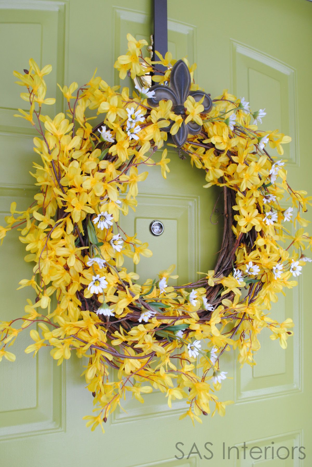
Here’s a sneak peak at my NEW Whimsical Spring Wreath ~

This is how the wreath looked before… BIG change, right?

My mom gave me this wreath quite awhile ago and it had been sitting in my garage for months.  My repurposing mind was in action and the transformation began.

To start off, I un-decorated the wreath.(If you want to create a wreath like mine, you obviously can skip the above step and start with a fresh, new wreath)

I wanted to create a whimsical wreath for the Spring ~ fun and flowery was my goal.  I decided to use (faux) Forsythia branches.  Similar to my faux centerpieces, I cut and separated the branches, then started to weave them through the wreath and used floral wire to secure.

Here it is…done~

WOOO…not quite yet…it’s missing something.  Seems kind of BLAH.
Let’s add alittle Wild Daisy, like this ~

Now it’s COMPLETE!

Simple, but just what I wanted!

WELCOME to my HOME

Have you seen my other wreaths?  If you missed them, here they are ~

My green door has been through many transformations!  I painted it this apple green color only a year ago, but I’m thinking that ‘It’ needs it’s own transformation for Spring….hmmm.  What do you think?

Tour My Home: Girls Room ~ Honeysuckle Retreat

A few weeks ago I shared a glimpse of my daughters room with the bow holder that I created for all of her pretty hair accessories.  I received some questions from readers about the specifics of the space and thought it would be fun to do a “tour” of her girlified room.

The moment I found out I was having a girl, I couldn’t wait to design her “pad” (what else would an Interior Designer think about??).  I wanted to create a space using color and decor that would be perfect for NOW, as well as her future ages and stages.  After much thought, I chose a color palette of fuschia (similar to the 2011 Pantone Color of the Year: Honeysuckle) and khaki, with the accent color of pear.  If you want to put a theme to the space, it would be birds.  I’m not really a theme person, but the bird is significant to my name and my daughter’s name, so it seemed like a perfect fit for the room!

I love adding an accent wall to a space…it creates drama and a focal point to the room.  Once I knew where the white crib (and eventually the grown up bed and headboard) would be positioned, I decided for that wall to be the fuschia color (accent wall/focal point).  To continue the white “look”, simple large frames with black and white photos were placed on the bright and cheery accent wall, while on the khaki wall, a vinyl applique with colorful birds and branches were introduced to bring in the bright color on the neutral wall.

The window wall is a khaki hue and to further the fuschia color throughout, I added heavy cotton draperies with a small herringbone pattern to “dress up” the windows. Complete with a simple drapery rod and crystal finials, the window treatments frame a beautiful view to the exterior.  Below the window sits a dresser that was refinished and handed down to me by my late Aunt.  The wood tone of the mahogany finished dresser, adds such warmth to the space.

This is a view of the other side of my little girls room (opposite the crib wall).  NOW, I have to start with this….I’ve never done TWO accent walls in a room (it’s usually just one ~ the focal wall), but this space just called for it.  I was just “feeling it” when I saw the room and went with my gut…..AND IT WORKS!  Something else that I have to add is that this room was kind of a mish-mosh of furniture from our previous house. (The girly room that I dreamed of, didn’t quite go the way I anticipated).

  • The crib was bought when my oldest was born
  • The chair (shown above) and the dresser under the window were from my previous guest room
  • The corner unit was from my bedroom.
  • The side table next to the chair was a yard sale find, and has been painted & repainted many times ~ the latest color: pear

When we moved to this house, furniture got moved around, and all the leftover pieces ended up in this room.  YES, the woods don’t match, BUT somehow it works.  It truly meshs together and looks great.

MY POINT: Furniture of different styles and different woods CAN work together in one room ~ it doesn’t always have to be matchy-matchy!

Like I mentioned above, the accent color of the room is pear.  There are various pieces with this common hue, which truly ties the space together.   Despite there being various wood finishes and styles, creating a common thread is important to pulling a room together to achieve a cohesive look.

“Love is in the Details”

The details complete the look of the room.  One of my favorites are the 3 fabric panels above the crib.   Using 12″ x 12″ canvas panels, I found three fun fabrics to cover them…it was inexpensive to create and completely eye-catching when entering the space.  Another detail that I love is a twist on a typical crib mobile.  The summer before my daughter was born, I was shopping at a craft fair and saw these adorable fabric birds, and thought they would be a perfect addition to the “bird themed” room.  With a branch from the yard, these beautiful birds fly above.

There’s my little one sitting in her reading nook.  Another piece, found at a yard sale, was refinished and painted, and now holds all of her books.  And of course, the bow holder above ~

Last but not least, my daughter loves her Tea Table, which design-wise, ties all the colors together!  At only a year old, she’s already a bookwarm…her favorite on this day ~ Brown Bear, Brown Bear

There she is….

I hope you enjoyed the tour of my little girls bedroom….a space that is perfect for her today and will continue to be in 5 years!


How to Make Fake Flowers Look Real

Even though it’s technically Spring, it’s difficult to believe, with all the snow still on the ground here in NY.  Thankfully my mindset is already on pretty Spring flowers to get me through the final days of the long drawn-out Winter.  I’m continually changing and updating my Dining Room display depending on the season and holiday.  I love the look of fresh flowers (who doesn’t?), but sometimes an artificial arrangement is simpler and more practical to maintain.

When shopping for your arrangement, look for flowers that have a natural, “real” appearance and that hang similar to a real flower.  Vary the size and texture of the faux flowers.  If your chosen flower is in a bunch, separate it, so you have individual stems.  By taking apart the pre-made flower bunch, it’ll give you more freedom to vary the heights and  discard parts of the bunch you may not want to use.

Like always, it’s important to use the appropriate tools for the job! Wire Cutters are perfect for this project.

Let’s get started…

Start arranging your flowers just like you would if using real flowers.  I chose a vase with a small opening, but the look of the arrangement will depend on the size, shape, and opening of the vase you choice.   Hot Tip: If you decide on a vase with a large opening, make a grid using clear tape. This will keep the flowers in place and the arrangement looking full.

I scored this vase at TJ Maxx for less than $4!

Begin by placing a handful of the flowers in the vase.  Then remove and trim them one by one. Vary the heights and sizes to create a balanced arrangement. Remember, just like when arranging “real” flowers, it won’t be perfect and that’s the beauty of it.

With the busy lives we lead, buying and maintaining fresh cut bouquets is sometimes just NOT possible.  If done right,  an artificial arrangement can look just as beautiful and the enjoyment of flowers can still be achieved.

Here is my completed arrangement…

O, I forgot to mention, I made two…

And here is an overall photo of my dining space…

I’m usually a “real” girl, but fake can sometimes do the trick!

I’ll be linking up {here}


Creating a Kids Art Gallery Wall

Over the past month, I’ve been sharing the various steps of my basement transformation. It has taken on a life of it’s own, BUT I can gladly say it is slowly, but surely, nearing the point of completion.  It’s not a perfectly designed masterpiece, but a space that is fun and enjoyable for the kids to hang out and play.  Along with my craft area / mom cave and built-in chalkboard wall for the kids, I recently transformed the scary ugly end feature wall in the room, to create an art gallery to display the kids beautiful creations.

Continue reading