Big Girl Bedroom {Reveal}

There’s been a whole lotta room tours around here lately, and the latest space I’m {revealing} is my daughter’s newly revamped big girl bedroom.

Honestly, I’m not sure who’s more excited about this space – me or Big Girl “A”.

So here it is…

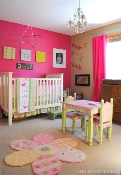
For a little reminder, this is what “A’s” room looked like before.

It was a beautiful space, but since turning 3, she was in need of a big girl room with a big girl bed.  Many of the elements in her room stayed, while others got “jazzed up” a bit.

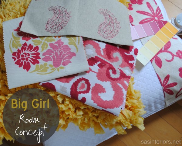
Here was the room concept…

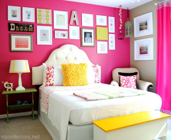
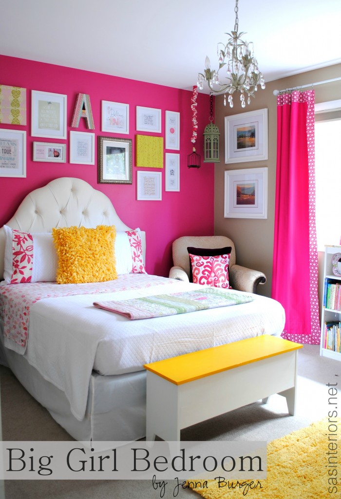
and, here’s the result…

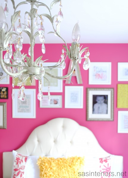
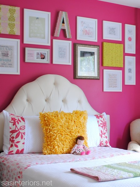
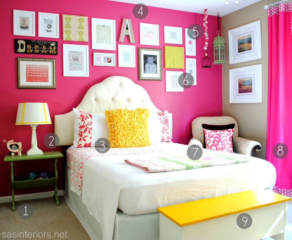
My favorite element in the room is definitely the new tufted headboard – and I have to confess, I didn’t make it, but instead bought it.  It’s an off-white scalloped headboard and pops against the strong and vibrant fuschia focal wall. When I chose the color for the space, which was painted before honeysuckle was named Pantone’s Color of the Year in 2010, I was hoping it would “live” through my daughter’s growing ages and stages.  Thankfully I can stay it has.  It sure was nice to start the work in her room without having to repaint.

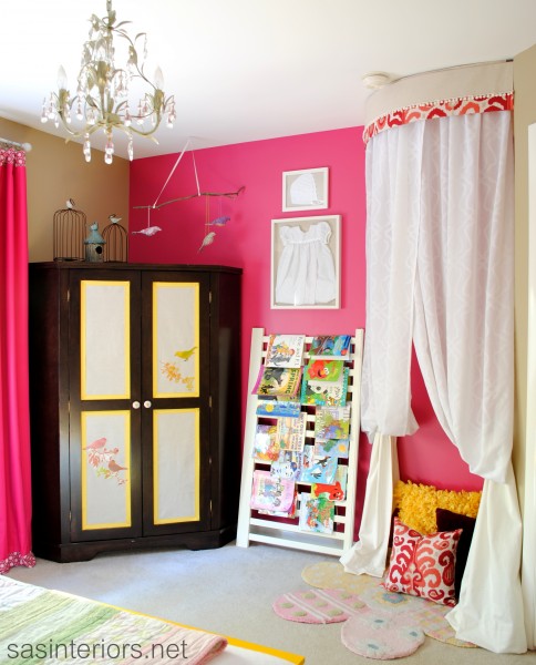
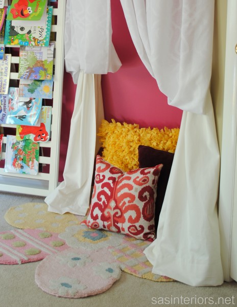
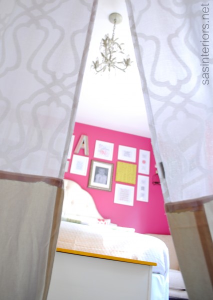
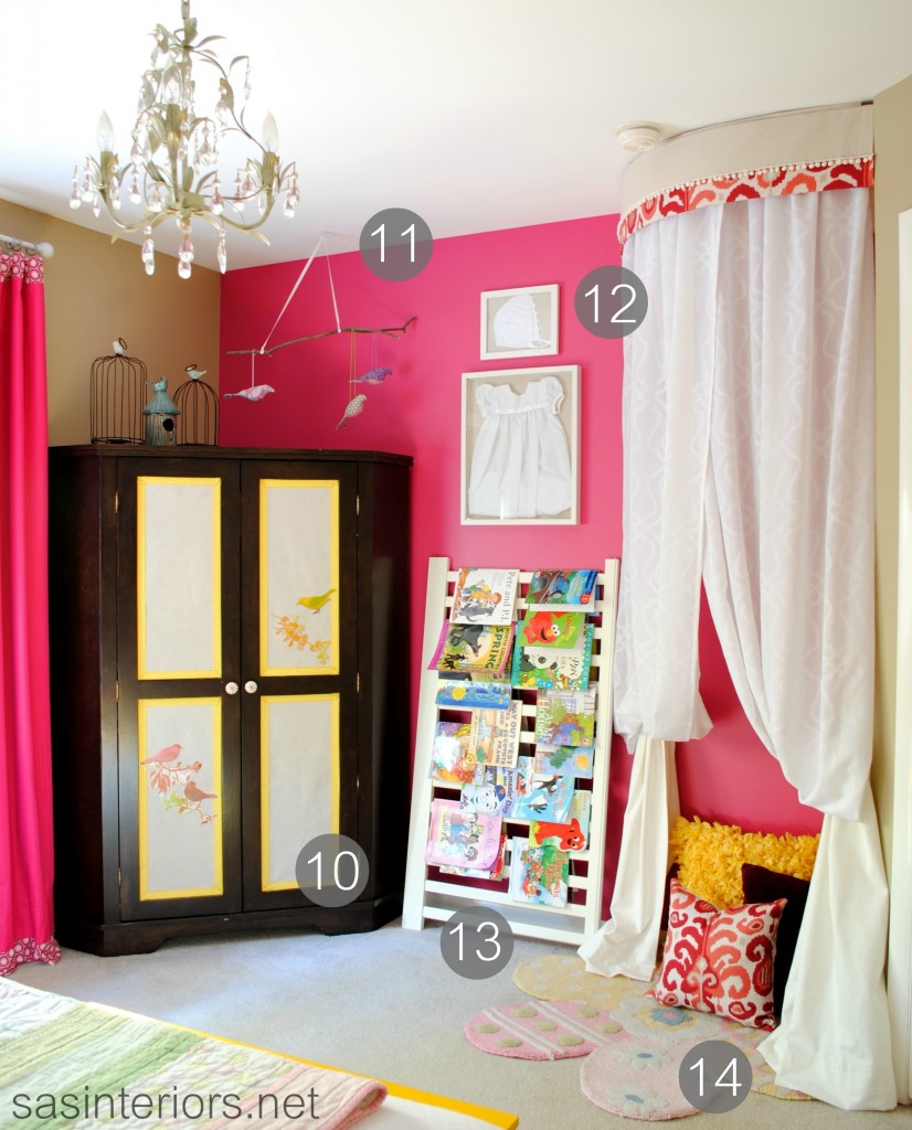
My other love in this room is the new kids play tent that I created in the corner of the room to the right as you walk in. It was the ideal little nook to add height, drama, and a little secret hideaway.

The corner cabinet was in the nursery space before, but I revamped it by adding fabric and ribbon within the 4 panels. By measuring and cutting pieces of drop cloth, I added ribbon trim surround and then secured it with a pretty thumbtack in each corner. Then to finish the look, I reused the bird wall appliques from the nursery and added them to the drop cloth panels.  It was a fairly easy update and softens the look of the cabinet.

The leaning book rack is part of “A’s” old crib.  I love this idea, but can’t take credit for it.  I saw it on Lindsay’s blog a few months ago and filed it away (in my head) for this new room.  I love for Miss A to see the actual book covers and similar to the pallet shelves I made for my son’s room, I love how the book covers bring so much color into the space.

And lastly above, I mounted “A’s” baptismal dress and hat into two different sized white framed shadow boxes.  (I gotta give the mister credit for this one – it was his idea)

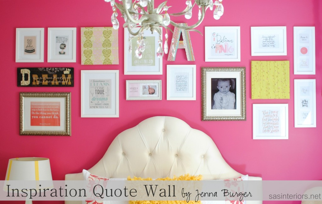
I have a soft spot for quotes and inspirational words.

I often share special sayings on my FB page and my Great Quote board is a favorite on Pinterest.  For a while, I’ve been wanting to create an inspiration wall.

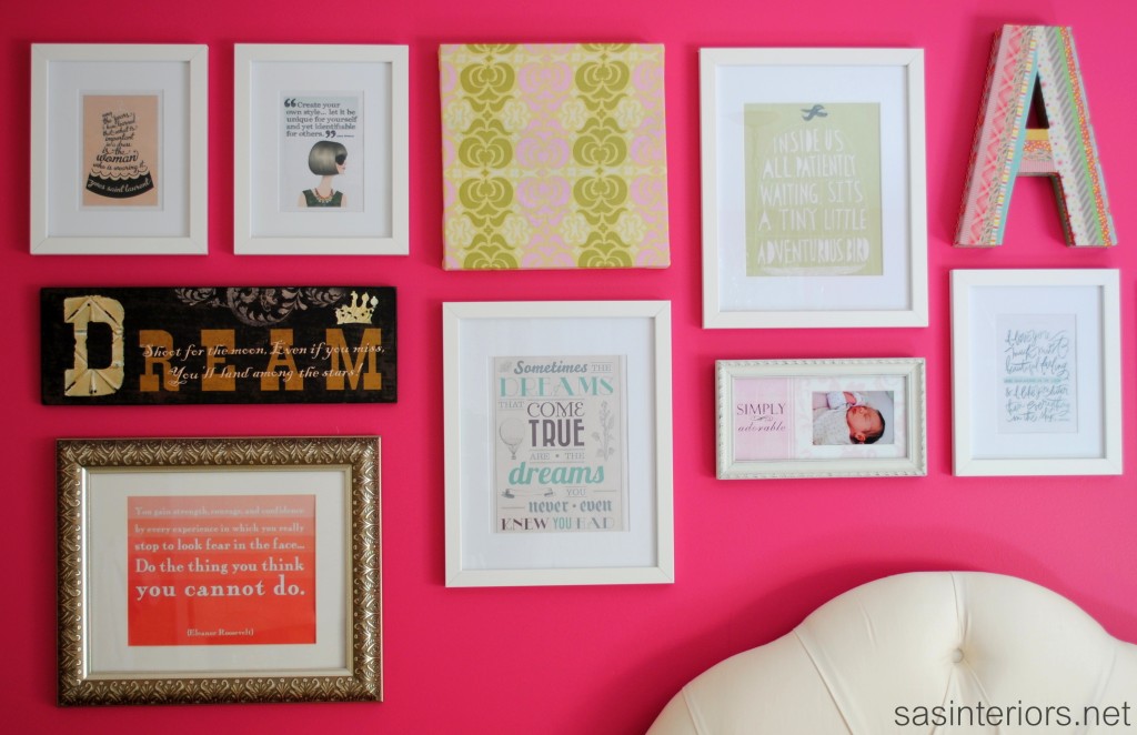
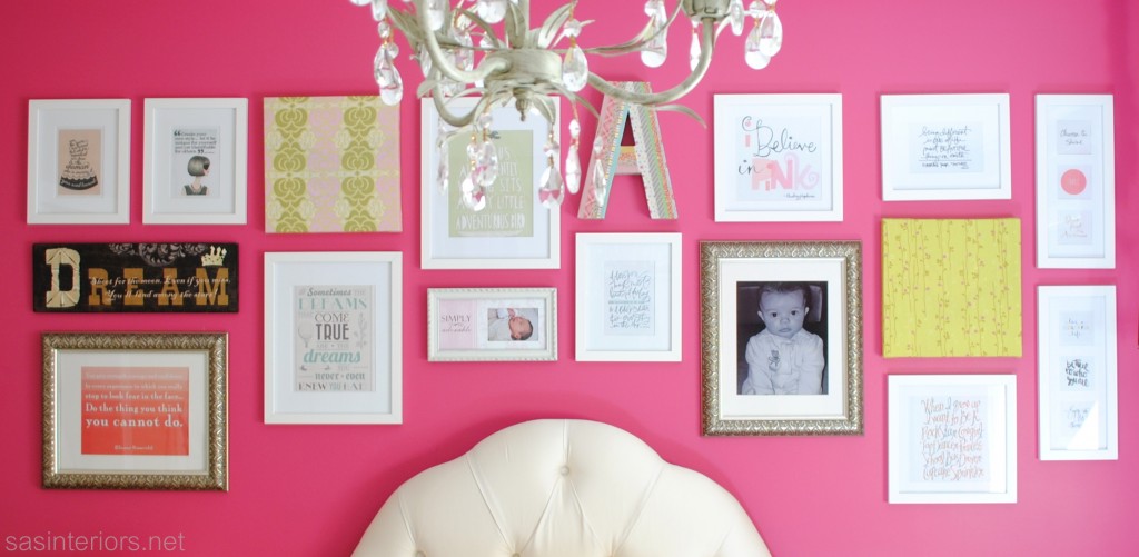
When the ideas started to flow for this room, I knew “A’s” room was the best opportunity to display all the wise words said by wise people.  There’s no symmetry to the wall (which allows the possibility for the wall to grow), and I mostly stuck with simple white frames while adding in a a few pictures and fabric wrapped canvases.

The “before” room was a combo of fuschia with soft greens, but for this new space I wanted it to be even more pow and decided a bright yellow would be the perfect addition.  And just a little goes a long way.

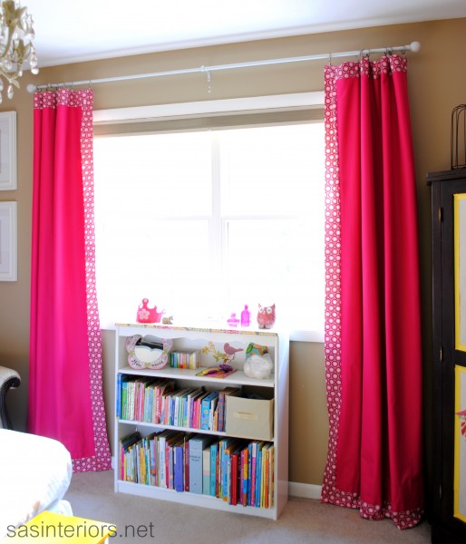
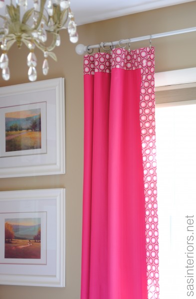
For the windows, they got a slight update as well.  First of all, I took the curtain rods and spray painted them a glossy white finish.  They were silver with clear ball finials purchased from Ikea about 5 years ago for my son’s first room.  Since I took them off the wall for the update, I also thought raising them higher was a must.  To reuse, but change the curtains / drapery panels, I added a 3″ decorative trim band to the top, side, and front of the curtain. This gave them a designer, custom look for pennies.  A tutorial on how to do this is coming soon!

Lastly, I painted all the mouldings – window trim and base trim – in the room to white and what a BIG difference that made.

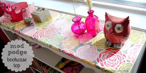
I also needed another spot for more books.  I upcycled an old wood bookcase from the basement, sanded it down and painted it white.  Then to add a little pizazz to the top, I purchased this pretty decorative paper from a store in my home town.  I then added a few coats of mod podge to protect it, and it was completely revamped!

To sum up all the details, here’s a breakdown…

1. Thrift Store Nightstand – was previously used as a sidetable in the nursery and is now a nightstand
2. NON-DIYed headboard, but I love it – Wayfair tufted high arch headboard
3. Quilt and shams – Joss and Main (sale expired) – I added a large fabric band at the edge of each sham; Yellow pillow – Homegoods; Sheets – Target on sale for $12
4. Washi Tape Initial (click here for tutorial)
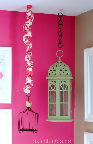
5. Birdhouses – hung from ceiling and added a fabric cover to the chain
6. Inspiration Wall – white frames from AC Moore; Square fabric covered canvases from nursery
7. Pillows on side chair – plum colored pillow from Crate and Barrel; Ikat pillow made by me with fabric from Duralee
8. Window Panels – fuschia panels purchased for nursery from Bed, Bath, and Beyond.  I added a 3″ decorative trim band at the top, side, and bottom (click here for tutorial) + used white spray painted on the old silver rod and raised it to be higher.
9. Bench with hinged top – found at a garage sale last year.  It was wood which I primed and painted white on the sides and yellow on the top

10. Corner Cabinet – Added fabric & decorative ribbon in panels
11. Reused crib mobile – DIY created crib mobile using a stick and fabric birds
12. Framed baptismal dress – Shadow box purchased from AC Moore to display baptismal dress and hat
13. Crib Railing Book Display
14. DIY: Kids Play Tent (click here for tutorial)

I have to say, I just love spending time in this new totally girly room with my big girl…  and she loves it too!  Thank you for checking out the reveal of this room makeover.  I’ve got a few DIY tutorials coming up for this space, plus my first Lowe’s Creative Team challenge project later this week.
Horrid to Heavenly Master Bathroom Reveal

In one week, my master bathroom went from a place that I dreaded and turned into a heavenly, serene, and spa-like oasis.  The last 7 days have been a whirlwind of working around the clock, but it’s all worth it!  Looking back, I can’t believe I waited so long.  I walk into this space now and I feel a fresh of breathe air.  Take a look…

Pin It

Beautiful right?  But wait until you see the before, and you’ll be sure to appreciate the after even more!

Pin It

I’ve been slightly secretive about the plan that I had for this space.  I didn’t want to reveal too many details and ruin the big reveal.  If you want to see more though, you can check out Part 1 and Part 2 of the Bathroom Makeover.

Can you believe how horrid the bathroom looked before?  Frightening! Enough about that…  Let’s take a tour!

The process for this bathroom makeover started last Friday when I spackled and prepared the walls for painting. Quick backstory: Before we moved into our home, the walls were wallpapered.  The previous owners removed the wallpaper, and painted the walls that horrid pink/purple color.  When they removed the wallpaper, the walls got really damaged, so there was ALOT of prep work before painting could begin.

Along with the walls, we also painted the previously stained mouldings, with a fresh coat of semi-gloss white. This update alone, made the space look completely different!

Once the walls were painted and complete, it was time to lay the new floor.  I decided to use groutable vinyl floor tiles, which I layed directly over my existing floor.  I chose a tile that has a similar look to Botticino natural stone and installed the tile the same way I did for my parents foyer. Groutable vinyl truly looks JUST LIKE ceramic – it’s amazing!

After the joints were grouted and set, I moved onto the sink base cabinet.  This was quite the experiment for sure and turned out nothing as I envisioned, but I’m still happy with the result.  I desired a dark cabinet, but with a light glaze overlay (opposite of my glazed cabinet), but it didn’t work.  After wracking my brain for a bit, I decided to use stain as the glaze.

The shower curtain isn’t a shower curtain at all.  It’s actually two drapery panels made and hung to look like a shower curtain.  I had found these panels at Target and was desperate to use them someplace, and this bathroom was the perfect spot. (Tutorial on how to make any window panel/curtain into a shower curtain).

The window valance I also made using drop cloth fabric and something pretty neat (another tutorial coming soon).

Even though I spent alot of time on this makeover, the process went quite quickly because all the existing plumbing fixtures remained.  The sink, faucet, cabinet, countertop, toilet, and tub are all the same pieces we had before – nothing is new.  Even though the fixtures looked a lil’ sad in the before space, once they were spruced up and surrounded by other beautiful elements, they looked new again.

Surprised that I didn’t do something funky or with more color?  I am, but I truly desired a soft, subtle, and spa-like retreat. And do you blame me after the color I’ve lived with for so long?!

For the existing frameless medicine cabinet that is built into the wall, I added a wood frame surround and secured it with liquid nails.  I took the same steps as I did with the kids bathroom, but without the chalkboard. Simply adding a frame around this somewhat boring style medicine cabinet, gives it new life and a new look for about $15.

I love a good quote and these are simple, to the point, and important to remember every day.

Of course you need a place to put a towel.. or two.  I installed these darling towel hooks right outside of the shower.  I added small frames above the hooks that I spray painted white and the glass with chalkboard paint to create a W (for wife) and H (for husband)…  now each of us knows which towel is whose!

Here’s a recap and rundown of everything in the space –

  1. New lighting fixture from Lowe’s
  2. DIY window valance made of drop cloth material (tutorial coming soon)
  3. 8×10 black frames with quotes I printed on my home printer
  4. Mirror was created using a 24 x 36 picture frame.  I took the existing frameless mirror to a local glass shop, which they reused and cut it down to size to create this new mirror – all for less than $20
  5. New hand and bath towels from TJ Maxx
  6. New tile backsplash (Read Tutorial: how-to install tile backsplash)
  7. Espresso bamboo roman shade from  Lowe’s
  8. Accessories from Target, Home Goods, and various local shops
  9. DIY cabinet makeover (Read Tutorial: how To glaze a cabinet using stain); Crystal knobs from Lowe’s
  10. Wool rug from Target 
  11. Window panels from Target made into a shower curtain (Read Tutorial: how to make any curtain into a shower curtain)
  12. Groutable Vinyl Tile (Read Tutorial: how-to install groutable vinyl tile)


13. Place card frames made into initial frames with white spray paint and chalkboard paint
14. Towel hooks from Hobby Lobby
15. Bath towels from TJ Maxx
16. Bath stand from Home Goods

For about $500 (for supplies and accessories), I think this bathroom makeover was a huge success and a must! Here are a few more pictures for ya…

So would you agree this bathroom is a drastic difference from what it was only one week ago?  I’ve enjoyed many of the comments and thoughts on what y’all thought about the before bathroom… at least I gave you a few chuckles!  I’m just SO glad it’s complete and I’m thrilled with the results!

Tutorials you may want to read:

Thanks to these sites for featuring my Master Bathroom Makeover: Stories of A to Z, Centsational Girl BOTB, Addicted 2 Decorating

Master Bathroom Makeover: Part 1

If you follow SAS Interiors on Facebook and Twitter (if you don’t, please do), you may have saw a few postings that I wrote mentioning that I finally decided to give my master bathroom a makeover.  And when I say finally, I mean FINALLY!  This is the only room in the entire house that hasn’t been touched since we moved in and it’s horrendous…  Until NOW.

Over the weekend, we (meaning the mister and I) finally took the plunge and gave this much-needed space a revamp.  I really wish that I could say in two days we finished the entire space, but that would be a big-white-lie. Bummer!  I went into this thinking it would be easy-peasy – we’ll paint, hang a few pictures, and we’ll be done.  HAHA – NOT! (I never allow for enough time – big no no)

The before space was a bright pink/purple color (why would anyone have chosen that color?).  When I first thought about this space, I envisioned 3 S’s – soft, serene, and spa-like.  Since the bathroom adjoins to the bedroom, I really wanted the two spaces to flow from one to another, so many elements in the new bathroom are an extension of the bedroom.  Here’s a peak at some of the selections for the new space.

The backdrop, similar to the bedroom, is a soft gray / taupe color with an accent color of dusty blue, which will be seen in the shower curtain (actually not a real shower curtain, but instead two window panels) and accessories. Again, because I envisioned the space being an extension of the bedroom, I felt it important that they “read” as one.  The accent color in the bedroom is orange, so the blue for this space is a perfect compliment.

I’m truly looking forward to this space being complete, especially since it was one of my Home Goals for 2012.  Actually, when I shared the before picture in my post about my home goals for this year, one reader wrote:

If you need help on your bathroom, I am sure all your readers would be willing…I know you did the best you could with what you had, but wow! I think I would have made that the first to redo when I moved in….not trying to be mean, or anything, but who would pick those colors????? All I can say is wow…  – Cindy

Well Cindy is so right!  Have you seen the before? I feel scared just showing it to you.

There are alot of reasons that this space got neglected, but the main issue was our indecisiveness to do a complete overhaul with a full tearout or a DIY bathroom with new paint and updates.  In the end, because of other priorities at the moment, we decided on a do-it-yourself revamp.  It simply makes the most sense for us!

On the list is:

  • New paint for the walls (gray / taupe)
  • New paint on the mouldings (white)
  • New floor (groutable vinyl – similar to my mom’s floor)
  • New paint for the cabinet
  • New hardware
  • New mirror
  • New light fixture
  • New accessories
  • New window treatment

So basically it’s all new, except for the plumbing fixtures.

And the reason why this space wasn’t complete by the end of Day 2?  Take a look at these snags…

1. The existing towel bar was attached to the wall with HUGE anchors… a full sized person could have hung from them. When the Mister took them out (which he had to yank them from the wall), a huge hole was left!  UGH.

2. Next frustrating snag? The light fixture had no junction box.  Really??  How is that possible?

3. And the most time consuming part was all the spackling – the walls were a mess!

Well no more complaining about this UGLY space.  It’s now in the process of being transformed.  Tonight’s task?  A new floor!  Wish me luck 😉

Have have remodeled a space in your home recently?  Have you made any updates to a bathroom in your home?

Kitchen Countertop Reveal Using the Rust-Oluem Countertop Transformations Kit

I have been quite excited all week to share this….  As you know from my recent posts, my kitchen is in the midst of a minor makeover.

No new cabinets.  No new countertops.  But the existing is all being TRANSFORMED.

When the friendly folks at Rust-Oleum heard about my kitchen revamp, they kindly sent me their Countertop Transformations Kit in the Oynx finish to try out on my existing hunter green laminate surface.  From the many posts I’ve written on my kitchen, I have been quite indecisive on what to do with the countertops, and I thought the Rust-Oleum kit would be a great solution!  This do-it-yourself “coating system” gives existing countertops a whole new look that is durable, long-lasting, and the look of a natural material.

I was very happy to finally say bye-bye to the old countertops which were quite dated!  Here’s the before…

Last Friday night (once the kids were in bed), my husband and I set forth on starting the transformation process.  The Rust-Oleum Countertop Transformations Kit comes with most of the supplies needed for the project.

But there are a few other things that you will need to purchase separately like rollers, painters tape, trays, gloves, and brushes.

The Instructions in the kit will explain EVERYTHING in detail, plus there is a very informative DVD (that you can view here) that will take you through each step of the process.  I can absolutely say that at no pint was I confused on what to do – the instructions are very clear and explanatory.

Bravo Rust-Oleum, for supplying great instructions! 

Here is a basic overview of the 5 steps to transform your countertops (image provided by Rust-Oleum)

Day 1

One of the most important parts to this project is to protect the areas around the countertop (ie: cabinet, floor, and backsplash).   You don’t want the product to get on any surface other than the laminate countertop area.  Unlike regular paint, this product creates a thick, hard surface and is difficult to get off other surfaces once dry.

Tape and use plastic or drop clothes

Once your surface is prepped and ready-to-go, you can start the sanding process.

As they say in the video, for the next step, you have to “work fast and work together”.  This could be difficult for some couples, but my husband and I worked in sections and abided by the rules – work fast and work together to cover the entire surface. After applying the adhesive (see manual for actual step-by-step instructions), it’s time to spread the Decorative Color Chips.  This was one of the most interesting parts of the entire project.  Be forewarned – they fly everywhere – I’m still finding chips in odd places and it’s been over 5 days.

At this point, the adhesive with the adhered chips has to dry overnight, so we embarked on the remainder of the transformation the next morning (12+ hours later).  The surface is VERY rough, but no worries…it’s far from being complete!

Day 2

The next step is to sand, sand, sand!  And then…sand some more.  At this point of the project, I was LOVING how the counters looked.  They had a concrete, dull appearance and I was so excited!

It was finally time for the last step….to adhere the protective top coat.  And it was done!  The top coat (which I hadn’t realized) leaves a glossy finish.  At first, I was a bit disappointed that the surface didn’t have a dull, flat or satin finish, but over the days it’s grown on me.  It would be nice if Rust-Oleum had a choice of a glossy or matte top coat (maybe in the future?).

Important Note: When the surface is dry about 48+ hours after applying the protective top coat, the painters tape can be removed.  It is VERY important to use a sharp blade to score the tape edge.

DO NOT just remove the tape because it will remove the countertop material as well.  Some of the wall paint was removed when I took off the painters tape, so I’ll have to go back and fix it.  Around the sink is a tricky spot, so score and remove the tape VERY carefully.

The Countertop Transformation Kit which is available at Lowe’s, covers up to 50 sq. feet or 20 linear feet.  My countertop surface is 18 linear feet and I had just enough product, so I would say that the product included is accurate to the area it covers.  If you are unsure of how to measure your countertop to get an accurate calculation, follow these steps.

The cost of the kit is $249, and the additional supplies will be about $30.  For about $300, you can achieve an entirely new and beautiful countertop surface, whereas a new laminate countertop (of this size) would be about $1500 and granite countertops would be about $3000.  That being said, there are other countertop paints available that are less expensive.  Rust-oleum makes another one-step laiminate countertop “coating” that is $20 +/-, but I have no experience with the product, it’s process, or how it wears over time.  Since it’s a one-step process, I would be reluctant about it’s durability.  Have you tried it?  Have you transformed your countertops using another product?  I’d love to hear!

As I mentioned in the beginning of this post, I chose to use the Oynx color, which is all black, but there are a total of 5 colors to choose from ~ Take a look at them {here}

Want to see the countertop colors in action?  Use the Kitchen Makeover Virtual Tool to see a preview.

Still wondering about the product, here is some additional information~

Overall, the Rust-Oleum Countertop Transformations Kit was really easy to use.  On a scale from 1 to 10, the level of difficulty would be a 2.  A beginner with no handy skills can absolutely use this system and achieve beautiful results.

My kitchen is still in the midst of being transformed, so I’m only making a minor reveal of the countertops.  I hope to have it complete and ready to share by next week!

Stay Tuned till next time!!

The product mentioned in this post was provided by Rust-Oleum, but the review and opinions provided are 100% my own.

Kitchen Revamp is Underway

It’s been a long time waiting, but I’ve FINALLY made my decisions on what to do with my kitchen.  A few months ago…7 months to be exact (back in late December), I mentioned that on my to-do list for 2011 was to makeover my kitchen.  I’d love to do a complete overhaul with new cabinets and beautiful new countertops, but it’s not in the cards right now.  If you remember, I had decided to use stain on the cabinets to achieve a darker look, but was stuck on what to do with the countertops.   Well I changed my mind entirely…a girl can do that, right?!  No more stain, but instead ~ PAINT!

My other major dilemma at the moment was that it was wintertime and I was afraid of the possible smells and vapors from the paint or stain.   Not being able to open the windows is a big no-no with kids in the house.  So I waited and waited and thought and thought……

And now, it’s summer.  I made a decision, the windows are open, and I’m transforming!

Here is a before picture of the kitchen

After lots of thought, I decided to use the Rust-Oleum Countertop Transformation Kit (which I pictured in this post), and a taupe colored paint for the cabinets (I’ll share the specifics in a future post soon)!

Here’s a sneak peak of what we’ve been up to, which I also shared in Sunday’s post.

Tomorrow will be the big reveal…stay tuned!

Tour My Home: Boys Room ~ Skateboard Haven

The goal of my blog is to share inspirational ideas about design, and with that I like to showcase areas of my own home to actually show how a high-end look can be done for less (and no one has to know).  With being an Interior Designer, I have worked with clients that have limitless funds to spend, and others than have a barebone budget.  Either way, a well thought-out and designed space can be achieved.

Through my blog series, Tour My Home, I enjoy sharing different areas of the space I’ve created for my family. We last visited my daughter’s Honeysuckle Retreat, and the Next Stop: My son’s room ~ Skateboard Haven.

Continue reading

Tour My Home: Girls Room ~ Honeysuckle Retreat

A few weeks ago I shared a glimpse of my daughters room with the bow holder that I created for all of her pretty hair accessories.  I received some questions from readers about the specifics of the space and thought it would be fun to do a “tour” of her girlified room.

The moment I found out I was having a girl, I couldn’t wait to design her “pad” (what else would an Interior Designer think about??).  I wanted to create a space using color and decor that would be perfect for NOW, as well as her future ages and stages.  After much thought, I chose a color palette of fuschia (similar to the 2011 Pantone Color of the Year: Honeysuckle) and khaki, with the accent color of pear.  If you want to put a theme to the space, it would be birds.  I’m not really a theme person, but the bird is significant to my name and my daughter’s name, so it seemed like a perfect fit for the room!

I love adding an accent wall to a space…it creates drama and a focal point to the room.  Once I knew where the white crib (and eventually the grown up bed and headboard) would be positioned, I decided for that wall to be the fuschia color (accent wall/focal point).  To continue the white “look”, simple large frames with black and white photos were placed on the bright and cheery accent wall, while on the khaki wall, a vinyl applique with colorful birds and branches were introduced to bring in the bright color on the neutral wall.

The window wall is a khaki hue and to further the fuschia color throughout, I added heavy cotton draperies with a small herringbone pattern to “dress up” the windows. Complete with a simple drapery rod and crystal finials, the window treatments frame a beautiful view to the exterior.  Below the window sits a dresser that was refinished and handed down to me by my late Aunt.  The wood tone of the mahogany finished dresser, adds such warmth to the space.

This is a view of the other side of my little girls room (opposite the crib wall).  NOW, I have to start with this….I’ve never done TWO accent walls in a room (it’s usually just one ~ the focal wall), but this space just called for it.  I was just “feeling it” when I saw the room and went with my gut…..AND IT WORKS!  Something else that I have to add is that this room was kind of a mish-mosh of furniture from our previous house. (The girly room that I dreamed of, didn’t quite go the way I anticipated).

  • The crib was bought when my oldest was born
  • The chair (shown above) and the dresser under the window were from my previous guest room
  • The corner unit was from my bedroom.
  • The side table next to the chair was a yard sale find, and has been painted & repainted many times ~ the latest color: pear

When we moved to this house, furniture got moved around, and all the leftover pieces ended up in this room.  YES, the woods don’t match, BUT somehow it works.  It truly meshs together and looks great.

MY POINT: Furniture of different styles and different woods CAN work together in one room ~ it doesn’t always have to be matchy-matchy!

Like I mentioned above, the accent color of the room is pear.  There are various pieces with this common hue, which truly ties the space together.   Despite there being various wood finishes and styles, creating a common thread is important to pulling a room together to achieve a cohesive look.

“Love is in the Details”

The details complete the look of the room.  One of my favorites are the 3 fabric panels above the crib.   Using 12″ x 12″ canvas panels, I found three fun fabrics to cover them…it was inexpensive to create and completely eye-catching when entering the space.  Another detail that I love is a twist on a typical crib mobile.  The summer before my daughter was born, I was shopping at a craft fair and saw these adorable fabric birds, and thought they would be a perfect addition to the “bird themed” room.  With a branch from the yard, these beautiful birds fly above.

There’s my little one sitting in her reading nook.  Another piece, found at a yard sale, was refinished and painted, and now holds all of her books.  And of course, the bow holder above ~

Last but not least, my daughter loves her Tea Table, which design-wise, ties all the colors together!  At only a year old, she’s already a bookwarm…her favorite on this day ~ Brown Bear, Brown Bear

There she is….

I hope you enjoyed the tour of my little girls bedroom….a space that is perfect for her today and will continue to be in 5 years!