
Master Bedroom Refresh: REVEAL

The master bedroom refresh is finally complete. I’ve been sharing most, if not all, of the steps along the way and it’s been an exciting journey.  I’m thrilled with the result and today I’m ready to share all the nooks + crannies of the room.  Ready? Let’s go…

Master Bedroom Refresh {REVEAL} : Room transformation with inexpensive solutions + DIY projects! You will surely be INSPIRED!

Where it all began…

The Creative Vision Board.  The idea + direction for the master bedroom refresh…

Creative Vision Board for Master Bedroom Refresh. Love the ideas seen here? See the actual space by clicking through...

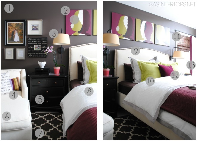
The bedroom took on a new life with an inexpensive upgrade to the bed wall.  Before, all of the walls with the exception of the bed wall, were painted Berkshire Beige when we moved into the house.  The bed wall was painted Texas Leather which is slightly darker, but with all the light that filters in from the large windows, the contrast wasn’t enough.

To really add some depth and contrast to the bed wall, I started out the refresh by going to the dark side and painting the wall a deep chocolate hue called Brownstone by Benjamin Moore.

Master Bedroom Refresh {REVEAL} : Room transformation with inexpensive solutions + DIY projects! You will surely be INSPIRED!

I had to start out the reveal with my favorite picture because it has my pretty kitty, Jessie.  She made her debut on the blog over a year ago when we finished the foyer floor. Hasn’t she grown so much?!  She’s the sweetest.

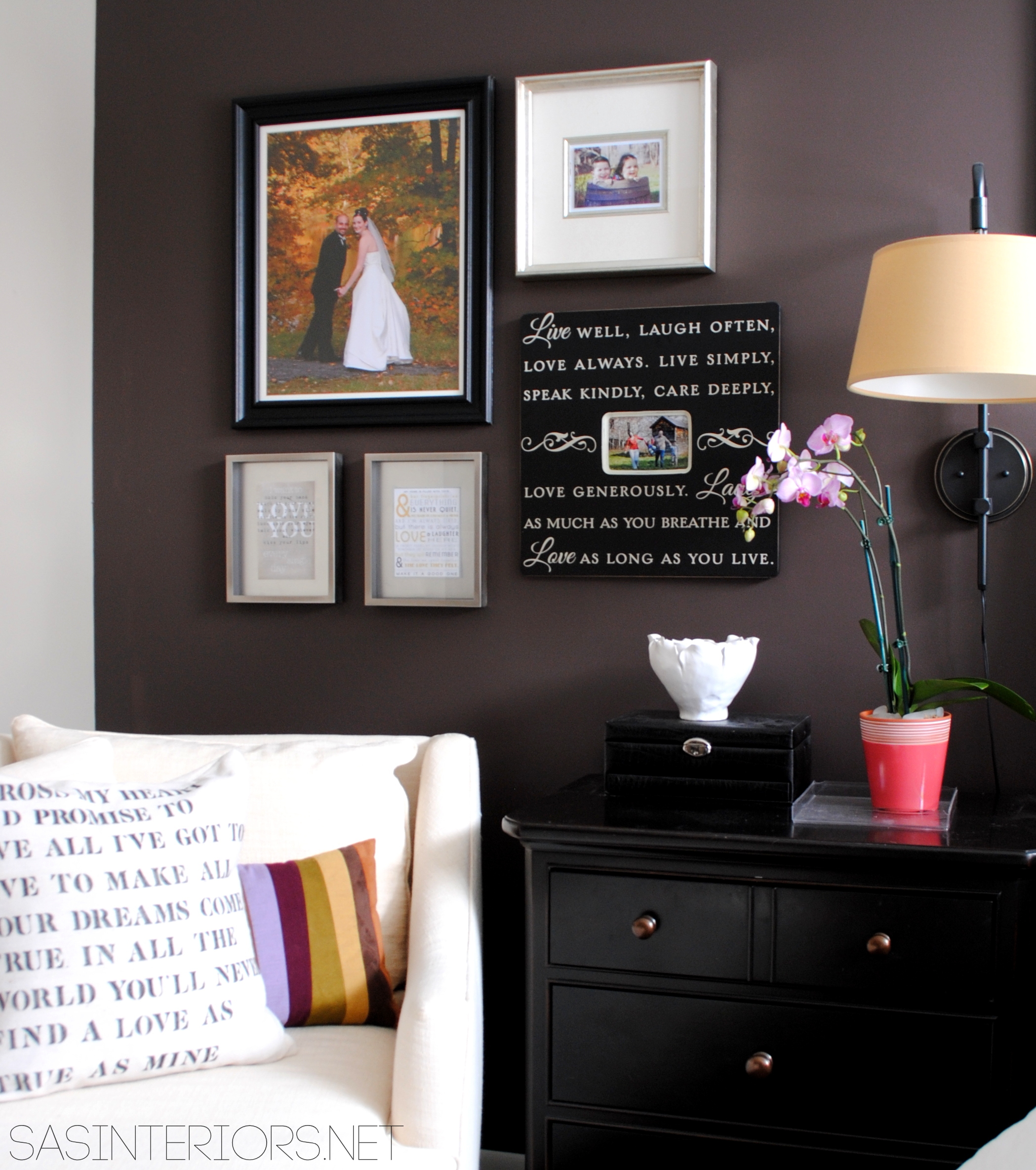
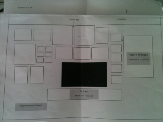
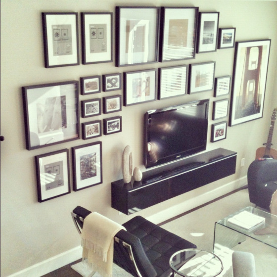
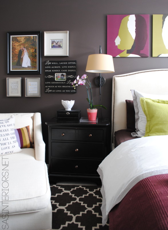
This is the area of the room that is to the left of the bed.  It had pictures before, but I rearranged them a bit to create a new and refreshened montage.  It’s amazing how a space can look so different using things you already own.

To put the collection together, I played around a little with the arrangement before adding nails to the wall…

Creating a photo montage - steps to putting it together.

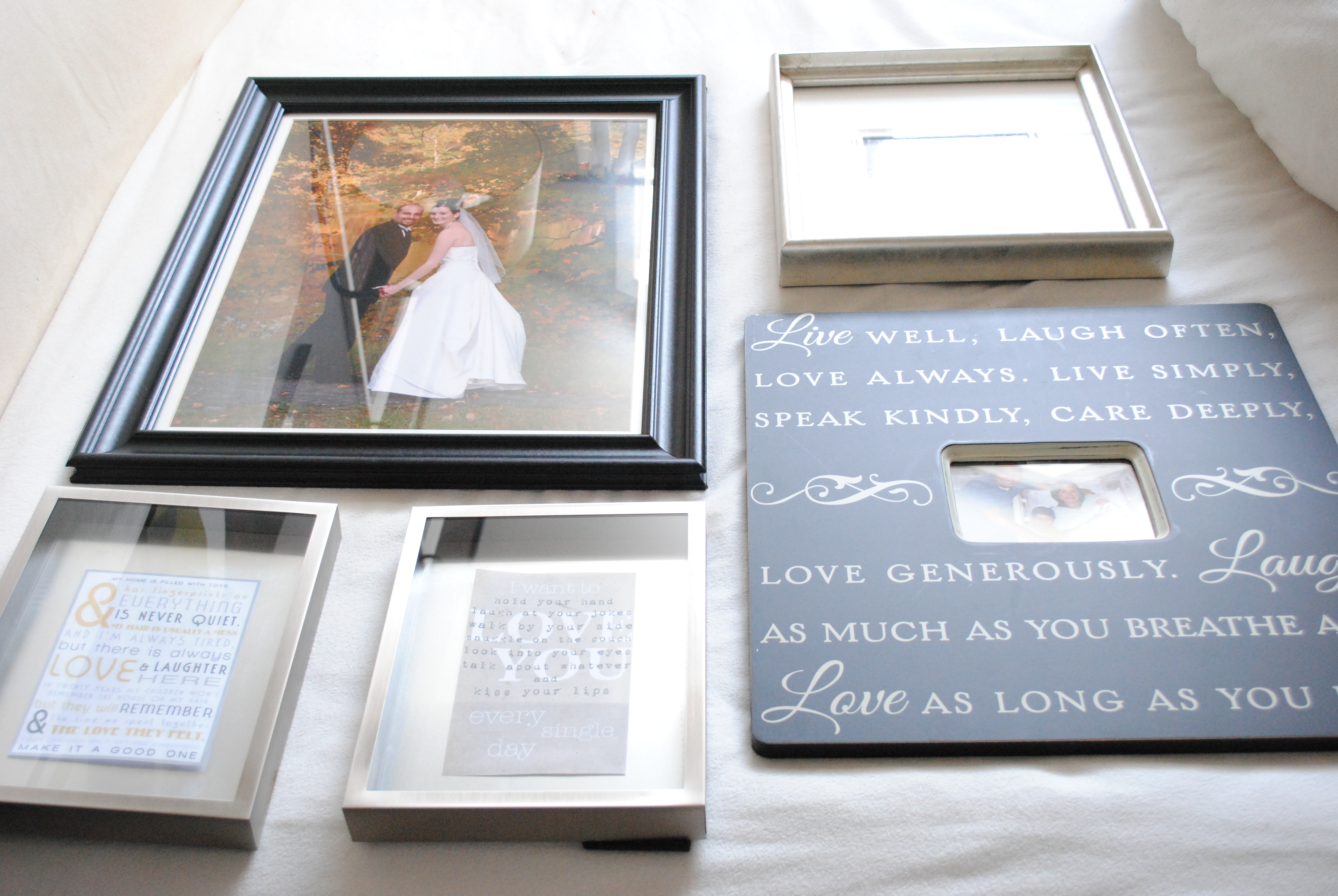
I love the balance of pictures and meaningful (to us) quotes.

In this picture below, you can also see the contrast of the two paint colors.  The dark wall surely makes a statement!

Master Bedroom Refresh {REVEAL} : Room transformation with inexpensive solutions + DIY projects! You will surely be INSPIRED!

Master Bedroom Refresh {REVEAL} : Room transformation with inexpensive solutions + DIY projects! You will surely be INSPIRED!

The statement.  The focal point of the room.  THE BED!  With the surrounding new/updated elements, the bed takes on a completely new look and feels brand new, even though it’s 10 years old.  I love the look of fully upholstered beds instead of just a headboard.  It eliminates the need for a bedskirt and gives a higher-end look to the space.  Yes, upholstered beds (with fabric side rails) are slightly more expensive than just a headboard, but they’re totally worth the splurge.  That’s a place to spend the money!!!

Master Bedroom Refresh {REVEAL} : Room transformation with inexpensive solutions + DIY projects! You will surely be INSPIRED!

I feel like I sleep in luxury every night (and a few weekend afternoons) with my new bedding from Crane and Canopy.  We worked together on choosing the right look and feel for the room.  With the other vibrant colors (plum + citrine), the simpler Linden Gray Border bedding was the perfect compliment. Sleeping under this luxurious 400 thread count duvet is like heavenly bliss.  To be honest, it was difficult to choose a bedding style.  They’re entire collection is beautiful!

Master Bedroom Refresh {REVEAL} : Room transformation with inexpensive solutions + DIY projects! You will surely be INSPIRED!

The square canvas images above the bed are actually one collection purchased from Ikea years ago.  sorry, but I doubt they’re still available.  As with most rooms I design, I typically start with one element; one statement piece.  The art is ‘The Element’ that the rest of the room evolved around.  The plum pillow on the bed and the striped pillow on the chaise were purchased from Crate and Barrel years ago as well and they compliment the artwork perfectly.  The only new pillows are the citrine shams that I randomly found at Homegoods.  Of course I wasn’t looking for them at the time, but I am so thankful to have went with my gut because they make the room.  In the store, I really didn’t think the color was right, but once home, they were spot on with the hues of the artwork! #score

Master Bedroom Refresh {REVEAL} : Room transformation with inexpensive solutions + DIY projects! You will surely be INSPIRED!

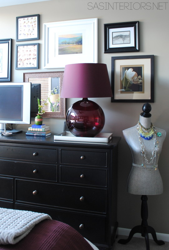
Breaking up the matching furniture was key to making this room refresh a success.  The space before looked heavy with 4 large pieces of furniture all in a dark hue.  Something had to give.  Eliminating one of the nightstands so the 2 weren’t matchy-matchy, was a great solution.  I relocated the one nightstand to my office and brought in a new smaller, round table in a light gray color.  It makes such a  difference.

Master Bedroom Refresh : Room transformation with inexpensive solutions + DIY projects! You will surely be INSPIRED!

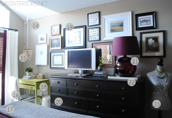
With the main wall going darker, other elements had to go lighter, which meant lots of white layers.  The new white velvet window treatments were the perfect compliment, but needed to be jazzed up.  My simple, inexpensive solution?  Add a decorative leading edge!  The update is incredible and the contrasting plum fabric frames the windows beautifully.

Master Bedroom Refresh {REVEAL} : Room transformation with inexpensive solutions + DIY projects! You will surely be INSPIRED!

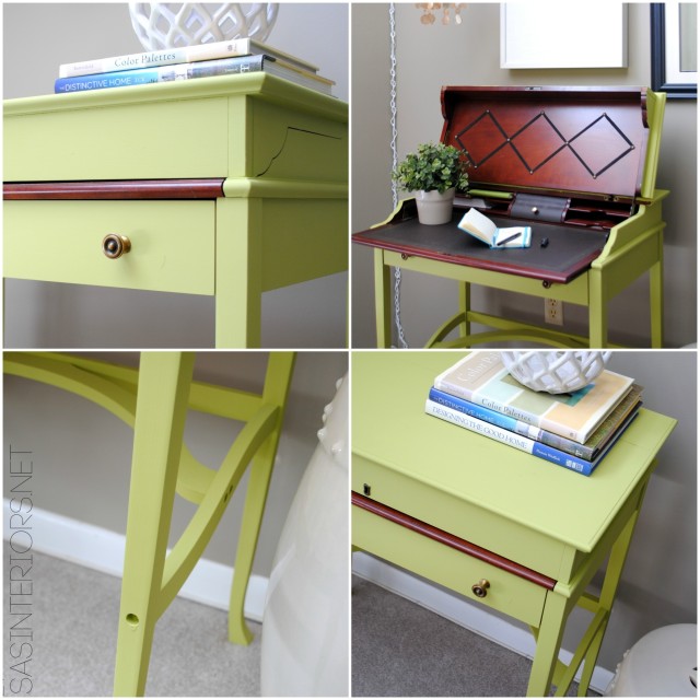
Also in this area of the room are the new hanging pendant-turned-light and the revamped desk that was headed curbside. Both were fun projects and made this corner of the room so interesting…  so much more than before.

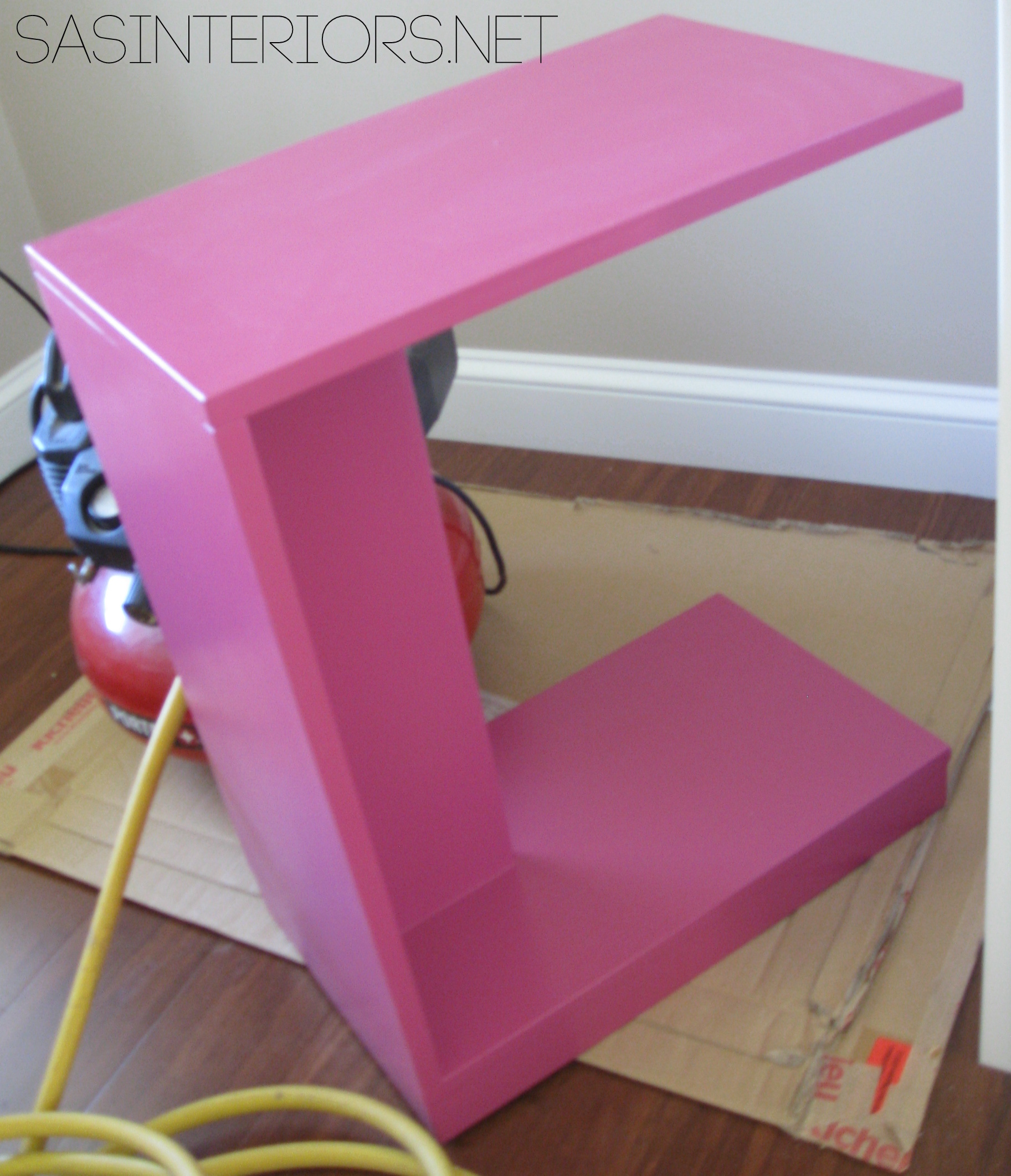
The desk is surely my most favorite furniture makeover to-date.  I love what the bright hue does for the space + I’m happy to have tried something new – Make Your Own Chalk Finish Paint!

Master Bedroom Refresh {REVEAL} : Room transformation with inexpensive solutions + DIY projects! You will surely be INSPIRED!

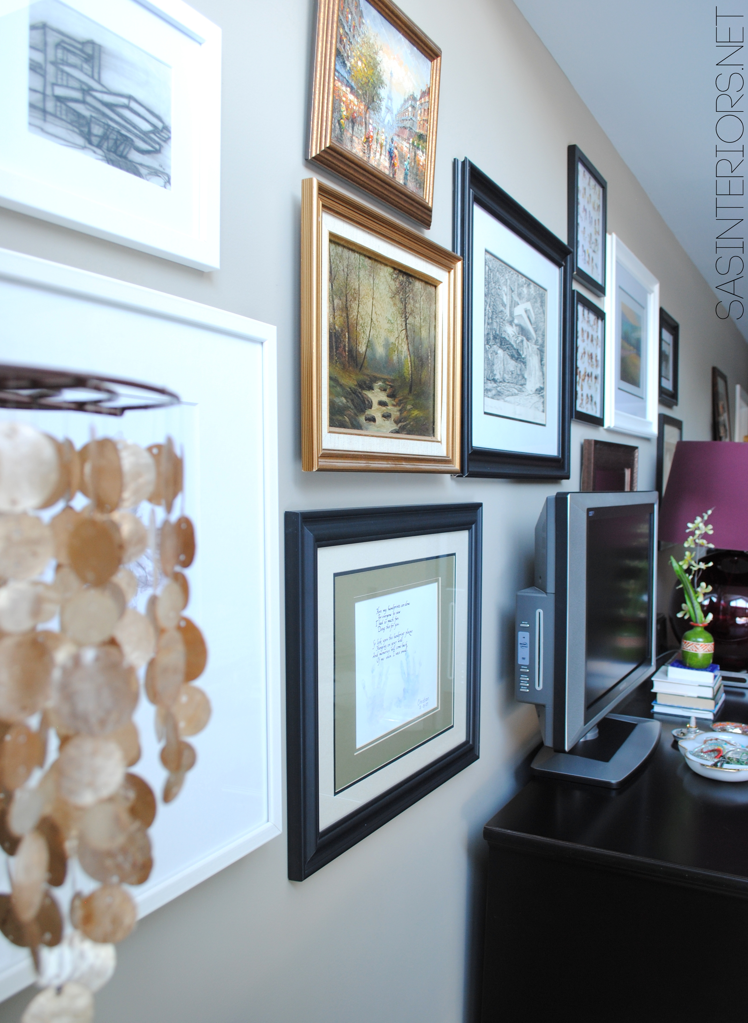
The pictures and artwork seen above the revamped desk are a new gallery montage I created and they continue across almost the entire wall, which is opposite of the bed wall.

This is what I wake up to and see every morning!

Master Bedroom Refresh {REVEAL} : Room transformation with inexpensive solutions + DIY projects! You will surely be INSPIRED!

Master Bedroom Refresh {REVEAL} : Room transformation with inexpensive solutions + DIY projects! You will surely be INSPIRED!

I love the new dress form that holds some of my pretty, colorful necklaces.  It brings such an elegant, feminine quality to the bedroom.

Master Bedroom Refresh {REVEAL} : Room transformation with inexpensive solutions + DIY projects! You will surely be INSPIRED!

Master Bedroom Refresh {REVEAL} : Room transformation with inexpensive solutions + DIY projects! You will surely be INSPIRED!

So do you want to know more details on what I purchased where?  Here are some resources:

Resources

Resources:
1. Wall Paint – Benjamin Moore Brownstone in flat
2. Artwork – Ikea, Collection of 3
3. Lamps – JCPenney
4. Wedding Song pillow (DIY project) + striped pillow from Crate and Barrel
5. Nightstand – part of a 4 piece collection purchased at a local store
6. Chaise – Crate and Barrel; item no longer available
7. Rug – Safavieh purchased on Joss and Main
8. Duvet – Linden Gray Border bedding from Crane and Canopy
9. Upholstered bed – Queen Colette Bed from Crate and Barrel
10. Citrine Shams – Homegoods
11. Bamboo Shades – Payless Decor
12. Deep plum pillow – Crate and Barrel
13. Drapes – white velvet panels from Lowes with custom edge detail (DIY project)

All the RESOURCES for the Master Bedroom Refresh {REVEAL} : Room transformation with inexpensive solutions + DIY projects! You will surely be INSPIRED!

14. Wall Paint – Benjamin Moore Berkshire Beige in flat
15. Lantern from World Market turned Light Fixture (DIY project)
16. Chair – Thrift store chair given new life with spray paint (DIY project)
17. Throw – Homegoods
18. Desk – Desk Makeover using Make-Your-Own chalk finish paint (DIY project)
19. Gallery Wall – Everything was repurposed from throughout my home; nothing new on the wall
20. Dresser – part of a 4 piece collection purchased at a local store
21. Lamp – Crate and Barrel; item no longer available
22. Silver Leaf Tray – Target
23. Dress form – Homegoods

And there you have it.  The master bedroom refresh {reveal} in it’s entirety.  Most of the space was revamped with new DIY creations and items from other rooms in my home.  A few new items that I didn’t have were seamlessly added to create a cohesive look.  I know it took a few weeks from start to finish, but thank you for following along on the ‘real’ timeline of my room refresh!

Cozy Adirondack Christmas Porch

Christmas is officially less than 2 weeks away.  It’s crazy how the season is passing us by so quickly.  Are you ready?

So I’ve got another surprise for you today…  Yes, another secret!

Since I shared a tour of the inside of my home last week, it’s time to take you outdoors… to my newly decorated Cozy Christmas Adirondack Porch.

Welcome…

I’m usually so focused on decorating the interior for the Holidays, that the porch often gets little thought and sadly neglected – are you like that?  Well not this year!

On a way-too-cold-to-be-outside day a few weeks ago, myself and the troops (a.k.a The Mister and the kids) ventured outdoors to decorate.  After a few hours, way too many decorating edits, broken bulbs (and they were brand spank-in new), and a couple of trips to Lowes, I was finally satisified with the result of this year’s cozy adirondack-style front porch. And I have to say, it’s our best yet.

Thankfully I can say that I live in the adirondacks, so having a front porch with a rustic, natural aesthetic is so apropos.  (my interior doesn’t really reflect the same look, but that’s okay).

I didn’t start off the porch with a specific idea in mind, but as the family and I started decorating, it all came together (over many cold hours) to create a cozy outdoor haven.  We began the transformation by removing some of the porch furniture that we have out for the summer.  We left the pretty lutyens bench though, draped a blanket over the back, and added a few pillows – it was the beginning of the adirondack porch.

In front of the bench, I positioned a round table (which is actually an electrical cable spool that I found on the side of the road) and added some festive elements including “dressed-up” mason jars, a lantern, and some pine and berry sprigs.

I said to the Mister that afternoon, “Let’s get some hot chocolate, cuddle under the blanket, and enjoy our newly decorated porch”.  Well we all ended up being too chilly and unfortunately ‘sitting and enjoying’ hasn’t happened yet, but it sure looks so inviting.

Would you stop over and have a cup of-something with me?

On the other side of the porch, I created a small festive vignette.  I stacked two large slices of cut logs and topped them with a poinsettia and a small pile of pinecones. As a larger and taller anchor, I brought in the potted boxwood (which sits throughout the year next to the garage), two lanterns filled with a large candle, and another poinsettia.  The varying heights and sizes of the elements, plus the differing textures, in the vignette, create an interesting composition.

Behind the poinsettia and pinecone vignette, I wanted even more height and added a leftover piece of pallet scrap, which I added a quick coat of white paint to and wrapped with twine.   A super simple 3 minute project!

Of course, we needed some greenery on the porch and I surely didn’t fail in that department.

On either side of the front door are two small (3′ high) faux trees decorated with petite ornaments and twine for garland.  Plus we added more greenery on the columns with a garland mix of pine and cedar.

The last element that we added to the front porch are the hanging ornaments.  This was the last addition and definitely my favorite!

The overall porch…

And alittle more ornament action…

And of course donned on my front door is my whimsical winter wreath that I made a few years ago.  Still a favorite.

Thanks so much for taking a tour of my newly decorated cozy adirondack front porch.  The porch and/or entryway of a home sets the tone for what’s to come inside.  Whether you have a simple wreath on your door or you go all out with lights, festive decorations always bring happy cheers and smiles.

Christmas Home Tour 2013

Surprise!

Jennifer Rizzo Holiday House Tour 2013; Stop 17, SAS Interiors

A secret that I’ve been keeping for too long can now be shouted from the rooftops.

I am one (#17 to be exact) of the 25 homes on the amazing Jennifer Rizzo Holiday House Tour.  I am so excited not only to show you around my home but to be amongst a great group of Bloggers who are opening their doors this Holiday season.

If you’re new here, you just headed over from the house tour by Vanessa of At the Picket Fence.  Wasn’t it amazing?!  She has a beautiful home and opened her doors for all to see in the Creating a Meaningful Home series earlier this year.  She is just the sweetest person ever!

Jennifer Rizzo Holiday House Tour 2013; Stop 16 - Vanessa of At the Picket Fence

Ok, well let’s get this tour started.  Are you ready?

Welcome.  Grab a cup of coffee (or tea, if you prefer) and stay awhile.  Let me show you around.

Jennifer Rizzo Holiday House Tour 2013; Stop 17, SAS Interiors

The new addition to this year’s Christmas decor is our new white Christmas tree.  Wanting to have a bling, bling pretty tree, this new beauty sits in the blue room, a.k.a. my office / family room.  With the dark hue on the walls, the white tree with varying shades of gold & brown ornaments, is the perfect contrast.  This room is a favorite of mine in our home because of all the light that comes shining through from dawn to dusk.  The filtered light accents the golds + my new disco ball just right!

Jennifer Rizzo Holiday House Tour 2013; Stop 17, SAS Interiors

Jennifer Rizzo Holiday House Tour 2013; Stop 17, SAS Interiors

The coffee table got a quick festive makeover by using a round mirror as the centerpiece topped with a montage of Christmas favorites – gold trees, ornaments, the light turned vase that I created earlier this year, and of course Santa.

Jennifer Rizzo Holiday House Tour 2013; Stop 17, SAS Interiors

Also on the coffee table is my newly created Nate Berkus knock-off wood block candle holder.  What do you think?  I love how it adds so much height to the vignette.

Jennifer Rizzo Holiday House Tour 2013; Stop 17, SAS Interiors

Transitioning to the dining room, I used a few similar ideas by using another mirror – the clock turned mirror – as the dining room centerpiece topped with more gold trees (that I scored from the Christmas Tree Shop last year) and a small tree adorned with miniature ornaments.

Jennifer Rizzo Holiday House Tour 2013; Stop 17, SAS Interiors

Simply, but elegantly set, our Christmas table is filled with a whole lotta candles – one of my favorite items to decorate with.

Jennifer Rizzo Holiday House Tour 2013; Stop 17, SAS Interiors

The buffet is set with treats for all to enjoy.  As I shared earlier in the week, the sidebar / buffet in the dining room is filled with varying sized glass jars, ceramic houses, and other festive decor.  My favorite element of the space is the charlie brown tree with colorful ball ornaments.  Okay, well it’s really not really a charlie brown tree, but instead branches from my backyard put into a glass jar to bring height to the overall space.  It would make a great table centerpiece too.

Jennifer Rizzo Holiday House Tour 2013; Stop 17, SAS Interiors

Jennifer Rizzo Holiday House Tour 2013; Stop 17, SAS Interiors

Jennifer Rizzo Holiday House Tour 2013; Stop 17, SAS Interiors

Jennifer Rizzo Holiday House Tour 2013; Stop 17, SAS Interiors

Also in the dining room is my kids favorite part our home tat the Holidays, the Christmas Countdown Tree that I made using pallets and leftover scraps of wood.  It’s such a whimsical, colorful handmade creation!

Jennifer Rizzo Holiday House Tour 2013; Stop 17, SAS Interiors

Jennifer Rizzo Holiday House Tour 2013; Stop 17, SAS Interiors

Heading over to the last space in our home, the living room.  Our hang out space…

Jennifer Rizzo Holiday House Tour 2013; Stop 17, SAS Interiors

And there is a peak at our other Christmas tree…  The tree that is filled with our family’s sentimental ornaments that we’ve collected, made, and bought over the years.

The main wall of the living room features our mantel and it’s totally decked out for the Christmas season.  A large wood panel is set as the backdrop with my newly created vintage-inspired  J-O-Y sign as the focal point.

Jennifer Rizzo Holiday House Tour 2013; Stop 17, SAS Interiors

Jennifer Rizzo Holiday House Tour 2013; Stop 17, SAS Interiors

Other pretty festive elements adorn the fireplace and the creme de la creme are the felt + dropcloth Christmas stockings that I made a few years ago.

Jennifer Rizzo Holiday House Tour 2013; Stop 17, SAS Interiors

Another handmade element that we love + adore is the Christmas Card Holder where we treasure and enjoy all the cards and photos that family and friends send throughout the Christmas season.  How do you display cards sent to your family?

Jennifer Rizzo Holiday House Tour 2013; Stop 17, SAS Interiors

Well that’s the end of the tour.  I wish it wasn’t over, but I really hope you enjoyed our home decorated for Christmas.

Jennifer Rizzo Holiday House Tour 2013; Stop 17, SAS Interiors

Hasn’t the Holiday House Tour been fabulous?!  We’re only on day 3 of the tour, and there are many more houses to see.  So don’t stop here!  Grab another cup of joe and head on over to my friend Roeshel’s house at The DIY Showoff.  She is an amazing creator and surely won’t disappoint.  ENJOY and Merry Christmas!

Jennifer Rizzo Holiday House Tour 2013; Stop 18 - The DIY Showoff


Foyer Reveal

You guys have been troopers holding out this long for the final reveal of the foyer.  I was waiting on a few pieces that I had ordered, and over the weekend they finally arrived.  I hurriedly styled and took pictures of the space, and this is the result…

Foyer Remodel with newly striped walls, fern art, and layers of colors + texture.  Spaced designed by @Jenna_Burger, WWW.JENNABURGER.COM

It is so fresh + updated.  I’m thrilled with the result and it wasn’t a lot of work.

A new greige paint color + wide horizontal stripes + a gold dresser + a few added accents = A revamped foyer that makes a statement

Past Posts you may be interested in
gorgeous gold dresser + new foyer paint colors —> Click here
10 top greige colors —> Click here
tips + tricks for painting stripes —> Click here

Let me take a step back and show the evolution of the space over that past few years.  When we moved in a little less than 4 years ago, the space was dark and the complete opposite of inviting.  The mouldings were wood, the floor was a dark teal ceramic, and the space looked dated.  Actually this picture (from 2011) shows it better than when we moved in with the walls painted and the chevron sisal rug.

'Before' Foyer Revamp

Within that year, I stenciled the wall, tackled the staircase (no more carpet), changed the wood mouldings to white, and installed a new luxury vinyl tile floor. The result (from 2012)…

'Before' Foyer Revamp

A lot of tone-on-tone cream hues.  Not really my style. Hence the 2013 revamp!

Let’s take a tour of the new space…

This is the main “feature” wall of the foyer.  It’s a fairly small space, with a lot going on.  The foyer, office, and dining room/kitchen are all off of the foyer space, as well as the entry to the garage, the coat closet / pantry, and the laundry.  A lot.  As much as the space needs to be pretty, it also had to be super functional and not cluttered.  It’s a high traffic area with our family coming and going throughout the day.

Foyer Remodel with newly striped walls, fern art, and layers of colors + texture.  Spaced designed by @Jenna_Burger, www.sasinteriors.net

On the main wall is where I decided to add wide horizontal stripes in contrasting colors – a light greige with a dark charcoal (all the details can be found in this post).  The wide stripes visually create a taller space and fools the eye to think the space is long.  The stripes pull you in.

Foyer Remodel with newly striped walls, fern art, and layers of colors + texture.  Spaced designed by @Jenna_Burger, WWW.JENNABURGER.COM

Even though the foyer is not a huge space, it does allow room for a piece of furniture.  I found this gold “gorgeousness” dresser that is super amazing.  It had me at first sight!  As much as it’s beautiful, it also is wonderfully functional.  The 4 drawers allow plenty of storage for the kids shoes and other misc items that never seem to have a home.

Next to the dresser, I added a beautiful upholstered ottoman – perfect for sitting and putting on shoes – as well as my favorite garden stool.  A few added pillows (from other rooms in the house) + some fun accessories for the dresser, complete the space!

Foyer Remodel with newly striped walls, fern art, and layers of colors + texture.  Spaced designed by @Jenna_Burger, WWW.JENNABURGER.COM

The rug is a recent purchase from One Kings Lane and was handmade in India.  I love the pattern, as well as the two blue hues.  Since I have multiple blue paint colors throughout my home, it really ties it all together.

Here’s a view coming down the stair…

Foyer Remodel with newly striped walls, fern art, and layers of colors + texture.  Spaced designed by @Jenna_Burger, WWW.JENNABURGER.COM

For the walls above the dresser, I decided to bring the outdoors in by framing nature.  The new “art” above my dresser are dried ferns and wild flowers —> for tutorial Click Here.  They were super easy to create and are so meaningful to our home since they came right from the backyard.

Foyer Remodel with newly striped walls, fern art, and layers of colors + texture.  Spaced designed by @Jenna_Burger, WWW.JENNABURGER.COM

Look who hopped in the photo session…  My little kitten Samson.  He’s never an arms length away.

Foyer Remodel with newly striped walls, fern art, and layers of colors + texture.  Spaced designed by @Jenna_Burger, WWW.JENNABURGER.COM

Welcome, as you come through the front door, this is the view.  The light greige color was continued around the room, but the darker charcoal stripe was only added to the main wall.

Foyer Remodel with newly striped walls, fern art, and layers of colors + texture.  Spaced designed by @Jenna_Burger, WWW.JENNABURGER.COM

To continue the deep charcoal color in the space, I also used it on the back of the front door.  Now the space completely flows since the color is used in multiple places.  And just to point out, the stair railing is also a taupe / gray color, so it’s all cohesive.

Foyer Remodel with newly striped walls, fern art, and layers of colors + texture.  Spaced designed by @Jenna_Burger, WWW.JENNABURGER.COM

Foyer Remodel with newly striped walls, fern art, and layers of colors + texture.  Spaced designed by @Jenna_Burger, WWW.JENNABURGER.COM

Foyer Remodel with newly striped walls, fern art, and layers of colors + texture.  Spaced designed by @Jenna_Burger, WWW.JENNABURGER.COM

It’s a great space to come home to now.  It’s absolutely an inviting, welcoming spot to enter.  Something that it wasn’t before…

Foyer Remodel with newly striped walls, fern art, and layers of colors + texture.  Spaced designed by @Jenna_Burger, WWW.JENNABURGER.COM

Thanks for taking a tour of my recently finished foyer revamp!  This space has had quite the transformation over the years.  I hope you enjoyed!  If you want to see more spaces in my home, click on over to my House Tour.

Ideas + Solutions for the Wall Behind the TV

Another Monday here again!  I hope you had a great weekend.  It was fairly low key on my end, but as a family we enjoyed the beginning signs of Fall, with the brisk chill in the air, by taking a family bike ride + watching football.  I also got the opportunity to shop for some colorful mums to transition the front porch, as well as the mantel.  Both are still in progress, but are coming along.  I’m waiting for some small pumpkins & ghords to arrive at the local stores – upon asking, it seems like it might be another week or 2.

Onto today’s blog topic… The TV and what to do with the wall behind it.

Ideas + Solutions for the Wall Behind the TV by @Jenna_Burger, WWW.JENNABURGER.COM

I often get emails from readers asking design-related questions and most of them I return with a few short sentences in hopes to point them in the right direction.  If they need more help, we usually end up working together through my E-Design ProgramBUT, last week I received a question that I KNOW alot of homeowners struggle with, so I thought it would be best to put a blog post together to assist and inspire more than one reader.

This email is from Christina:

I was hoping you can direct me with a huge dilemma. We have a tv hanging on the wall in our family room. Which I can’t stand. I prefer an armoir or built in. Any how hubby wanted modern tv on wall so I compromised. I have no idea what to do with all the extra space on either side of the wall. My style I would say is old world, electic, traditional. Could you please offer suggestions. I’m also confused if both sides need the same exact item hanging on the wall. Could I do a decorative mirror on one side and a collage of artwork on the other. Do I hang distressed wooden panels on either side or tapestry…….help. This space kills me. I can’t stand the TV on the wall.its so cold. Thank you for any guidance you can offer.

Is this a topic you’ve often struggled with as well?   If so, I have some great ideas + solutions.

Most homeowners have flat screen TVs that are only inches deep (I’m excluded from this bunch – we still have a big ole’ cumbersome TV in the living room).  The minimal depth of these televisions allows for it to be functionally integrated without overwhelming the space.  If designed right, the artwork, pictures, paintings, and/or wall decor that surrounds the TV on the wall can become just as important, or more important, than the TV.  In turn, the TV ends up not being the dominant focal point of the room.  It still functions the same, but doesn’t overtake.

Let’s dive into some design solutions…

Gallery walls are in.  Gone are the days of 1 or 2 pictures on a huge wall.  The size and number of pictures on a wall should be proportional with the wall height and width.  The wall that is chosen for the TV is often the largest and/or longest in the space, so it should be filled.

One idea is to create an asymmetrical gallery wall, which is probably the easiest because there is no right or wrong.  It allows for growth and it allows to incorporate what is most meaningful for you.

Ideas + Solutions for the Wall Behind the TV by @Jenna_Burger, WWW.JENNABURGER.COMThis TV gallery wall is surrounded by pictures and images in an array of sizes and frame finishes, which the eye is drawn to instead of the TV. via One Kings Lane

Ideas + Solutions for the Wall Behind the TV by @Jenna_Burger, WWW.JENNABURGER.COMFramed by two windows, this TV gallery wall is a great solution for incorporating a TV into a living room space.  A mix of black and white artwork in black or white frames, are set behind the TV which is atop of a white dresser.  via Emily Clark

Ideas + Solutions for the Wall Behind the TV by @Jenna_Burger, WWW.JENNABURGER.COMAnother idea for a TV wall is this eclectic asymmetrical composition that displays collected art and a vintage lamp along with the wall-mounted TV.  Incorporating an element larger than the TV steers the eye away from the “black-hole” and instead allows it to focus on the other elements – the lamp + artwork.

Another idea to take away – Because many of the other elements on the wall are black, your eye is tricked into not focusing on the TV. From the black lampshade to the black frames (some with black matting) to the black and white artwork + photos, so the TV actually looks like another piece of dimensional art. via The Hunted Interior

Ideas + Solutions for the Wall Behind the TV by @Jenna_Burger, WWW.JENNABURGER.COMSlightly different than the above examples, this TV gallery wall is fairly symmetrical.  The wall-mounted TV is centered on the console and the pictures / artwork are “bookmatched” on each side (for the most part).  Other interesting elements, like the animal horns, surround the black and white frames and bring an added dimension to the wall.

Ideas + Solutions for the Wall Behind the TV by @Jenna_Burger, WWW.JENNABURGER.COMCompletely different than the examples above, this TV is wall-mounted and is surrounded by perfectly symmetrical black and white pictures in black frames. It truly is an art gallery.  This wall created by Brooklyn Limestone shows all the steps of how she created it, plus a video on the progress.  It is definitely one to watch.

Ideas + Solutions for the Wall Behind the TV by @Jenna_Burger, WWW.JENNABURGER.COMNo matter the size or configuration of a space, a TV can always (well 99% of time) somehow be incorporated.  In this narrow living room, the TV is set off to the side and sits on top of a dresser / console table.  It’s tucked out of the way, not making it the focal point.  Above is a picture that is even larger than the TV, which draws the eye up instead of at the black box. via La Dolce Vita

Ideas + Solutions for the Wall Behind the TV by @Jenna_Burger, WWW.JENNABURGER.COMThe space around the TV doesn’t have to be only for pictures, but displaying other wall decor, like shutters, mirrors, or general wall art, is a great opportunity to create an interesting and unusual composition. via Southern Hospitality

Ideas + Solutions for the Wall Behind the TV by @Jenna_Burger, WWW.JENNABURGER.COMGoing the minimal direction, the television in this space sits on top of a black lacquered console table and is pushed to one side allowing space for a large lamp and other accessories.  the wall space around is kept fairly bare, but interesting. via The Little Green Notebook

Ideas + Solutions for the Wall Behind the TV by @Jenna_Burger, WWW.JENNABURGER.COMAgain, going back to a symmetrical look, the TV in this room sits on a smaller dresser and behind are two larger painting, then 2 more smaller styles on each side.  Two ghost chairs sit in front allowing for the art to speak”, yet still making an architectural statement. via Maple + Shade

Ideas + Solutions for the Wall Behind the TV by @Jenna_Burger, WWW.JENNABURGER.COMLarger artwork behind the flat screen TV can make just as much, or even more, of an impact as smaller pictures / photos. via Apartment Therapy

Ideas + Solutions for the Wall Behind the TV by @Jenna_Burger, WWW.JENNABURGER.COMAnother great TV gallery wall designed by Kristin of The Hunted Interior, showcases the television set off to the side with framed black and white photos around.  A large white lamp with black shade sits forward of the TV allowing it to be the focal point.

Ideas + Solutions for the Wall Behind the TV by @Jenna_Burger, WWW.JENNABURGER.COMAn asymmetrical gallery of black and white photos surround this TV  mounted on the wall.  To the sides sit two large floor lamps bringing height to the space. via HGTV

How to Create a TV Gallery Wall in your Home

So how can you incorporate these ideas into your own home?  It takes time, planning, and a layout.  Gallery walls don’t come together as easy or as quickly as hanging a simple picture on the wall.  BUT, a gallery wall can make a huge impact that will be far worth a single photo.

When the DIYer over at Tasty n’ Chic took on the endeavour of a new gallery wall, she created several plans and layouts before deciding on what worked best.  She used a computer program to create the ideal layout, but you can also use craft paper or wrapping paper (outline the sizes of your frames), or layout the frames on the floor (that’s what I do to get the exact plan).

Here is her drawing…

Ideas + Solutions for the Wall Behind the TV by @Jenna_Burger, WWW.JENNABURGER.COM

And then the result…

Ideas + Solutions for the Wall Behind the TV by @Jenna_Burger, WWW.JENNABURGER.COM

I hope I’ve provided my reader Christina + all of you with some interesting and creative ideas + inspiration for what to do behind the TV.   I still have my humungous TV behind doors, but have had ideas and thoughts of upgrading.

If you’re looking for useful ideas and layouts to create a photo gallery wall, check out this post {click here}

Useful Ideas and Layouts to Create a Photo Gallery Wall

Good Luck with your TV wall creation!

I’m a CoverGirl

I was thrilled when the Fall issue of Saratoga Mama (affiliated with SaratogaMama.com & Saratoga Today) hit the stands last week because not only do I love finding out what’s happening in my neck of the woods, but I got to finally see the space I designed featured on the front cover.

My first cover! I’m officially a CoverGirl.  Well kinda…

One of the fun & challenging projects I took on this Summer was to partner with Colleen of Saratoga Mama to makeover 3 rooms for a feature in the back-to-school issue.  In 2 days (not consecutively, thankfully) we scouted, shopped, staged, and shot the spaces.  It was a whirlwind, but it was a blast.

Here is the result.

Fall Issue of Saratoga Mama Magazine

All 3 spaces were okay.  Just okay.  But they needed a little TLC to ultimately be more stylish & functional.  Once a plan of action was set, we were on our way!  Check out more of the process + what worked/didn’t work {here}

Now to the details of each space…

Space 1: Central Command Center

Creating a Central Command Center

The homeowner of this space was in major need of an organized drop space for everything to keep her family running. They needed a spot for all the everyday ‘stuff’ like keys, kids school papers, announcements, invitations, etc.  We decked out the open wall space between her kitchen and dining room with a new central command center to get her family on track.  The space includes:

  • A personalized 2-month calendar (similar to the one I created for my family)
  • Clipboards to easily rotate and change the weekly chore chart and homework chart
  • Metal bins for each child
  • A corkboard for important things
  • and a little Personalization!

After we shopped, I layed out the items on the floor to create the perfect montage.  I created a faux wall on the floor using painters tape so the measurements would be exact once translated to the wall.

We moved, rotated, tweaked, and adjusted until it was just right.  Here is the result of the layout…

Creating a Central Command Center

And the final Central Command Center on the wall…

Creating a Central Command Center

Creating a Central Command Center

And finally, the layout in the magazine.

Creating a Central Command Center

The homeowners kids were super cute.  And even though the little girl didn’t want to be photographed, it all ended well and the photographer captured an adorable photo.

Creating a Central Command Center

In the end, the homeowner was thrilled and expressed how useful + functional this space is for her and her family. It’s a real space she uses everyday!  It’s incredible what can be created with a little thought and focus.  In all, this space cost less than $100 to create.

Here is a breakdown:

  • Clipboards: $5
  • Personalized Calendar: $15 (for the frame; calendar is a DIY creation)
  • Red metal files: $30 (homegoods)
  • Corkboard: $30 (homegoods – it’s supposed to be hung horizontal, but I removed the original hooks and added new white hooks placed vertically for keys)
  • Pen holders: $8 (even though meant for the desk, I hung them using a nail)
  • Shelf & wall decor:$0 (repurposed from another space)

Space 2: Mom Cave

Office Makeover in one day + on a budget

This was an awesome space to transform.  Most of the elements were already there and actually remained in the space, but with some minor tweaking, this office looks completely different!  The desk area is located at the landing of a second floor cape-style home.  The ceilings slope to about 4′, but the area was too large to be wasted.  Just recently, the homeowner moved her desk to this area and it’s been a great, quiet haven to work.  YET, it wasn’t pretty and inviting.  It needed something!  With a few quick changes, this space went from drab to fab.

The first thing I noticed when I walked up the stairs to this space was the lack of color.  It needed something for the eye to draw in.  The ideal wall was the low wall behind the desk.  It was begging for something intense.  I chose Benjamin Moore Rhubarb for a splash of color against the white distressed desk. It was the perfect solution for this office makeover. A few other elements included:

  • A new desk lamp. (Target)  The old style was too harsh, so I brought in a non-typical task lamp that gives a soft glow to the space instead of an intense, direct light.
  • New knobs. (Hobby Lobby) Changing the top knobs added definition to the desk + they pick up the new rhubarb wall color & gold tones in the lamp
  • Storage for desk organization. (Homegoods and Staples)
  • A corkboard. (Homegoods)
  • A desk chair. (TJ Maxx)  A comfy and non-traditional desk chair.

The space was so fun to put together and in the end I saw how happy the little changes meant to the homeowner.  Little things do make a difference.

Office Makeover in one day + on a budget

I’m in love with this lamp.  The faux snakeskin lamp base gives the space texture and depth, and an unexpected elegance.  The brass tones at the bottom of the lamp base were also picked up in other areas of the room (small doses, of course) like the labels on the corkboard organizer and the new knobs.

Office Makeover in one day + on a budget

What was supposed to be a picture frame got changed into a daily corkboard organizer using a roll of cork + stick on labels.  Now the homeowner can add reminders for the week and break it up per day.

Office Makeover in one day + on a budget

The side wall used to hold 2 floating shelves that protruded too far into the room.  Now a photo montage wall filled with black & white family photos + meaningful elements makes this wall a happy place.  Adding in a repurposed chair + a standing lamp with a new shade was the final touch.  This space is now inviting, comfortable, and ideal for a work-from-home mom.

shoot26

Office Makeover in one day + on a budget

The final result in the magazine…

Office Makeover in one day + on a budget

A few of the elements in this space are new, but most were repurposed from other rooms throughout the home.  It’s a space that is warm + welcoming, & ideal to work in.

Space 3: Kids Corner

Kids Corner Makeover

If you’ve got kids, most likely they love to color and create.  A place in the home just for them to call their own is so important.  A place that holds all their stuff so that at any time they can grab a puzzle, a book, or a paint brush will make them happy and independent.  The newly created kids corner in this home was once a dark space with a chair that covered most of the corner.  The outcave that was meant for a TV was unoccupied leaving a large span of open space, and the doors below were serving no purpose for what was behind them.  A new functional space was needed!

The first step to transforming this space was to remove the cabinet doors.  With my suggestion of a soft blue hue, the homeowner painted the interior of the cabinet, as well as the shelves + the new shelves above.  Then on our scouting adventure, we found fun baskets to hold paper, books, and all the necessary crafting supplies to fill the shelves. Books, puzzles, and pictures from around the home quickly filled the rest.

The new spot was coming together…

Kids Corner Makeover

Sometimes the most unexpected items end up being the best.  My most favorite element in the new kids corner is definitely the industrial-style arrow.  The homeowner thought I was a little crazy about purchasing this for the space, but I felt it was right.  It was fun, unique, and totally not expected.  It also makes the ideal space for holding books, stuffed animals, and other cute accessories.  Lastly, I love this arrow because it heightens that space.   Even though the wall is narrow it needs to be filled.  Filling it draws the eye up, which makes the room feel larger and taller.

Kids Corner Makeover

Kids Corner Makeover

Finding this ‘desk’ that was actually part of a nesting table set makes for the perfect work space.  Even though this wall is only about 30″ wide, it’s the perfect spot for a little creator.  The top of the desk wasn’t flat (not ideal for working), so I suggested the homeowner have a piece of glass cut to size.  It cost about $15 and make the best flat surface.

3 adorable coat hangers are hung on the side wall to easily change out artwork & beautiful one-of-a-kind creations.

Kids Corner Makeover

The result in the magazine…

Kids Corner Makeover

And that’s a wrap.

It was awesome to be apart of such 3 great transformations.  In just 2 days, Colleen and I accomplished a whole heck of a lot.  It’s amazing how much can be transformed with a plan and a small budget.  If you live in the Saratoga area, be sure to pick up the latest issue of Saratoga Mama Magazine.  If you’re not in the area, no worries, click here to read it online.

Have a space in mind that you’ve been wanting to give a makeover?  Start by shopping your home.  Repurposed items that you already own are the best way to give your home a new look without spending a dime.  As an example, you should check out how I spiced up my bookcase with $5. Yes it only cost $5!

Inspiring + Vibrant Craft Room Reveal

It’s been a while since I gave you an update on the mega craft room & office space that I’ve been working on for a local client. The room is 98% complete minus a few wall decor pieces. Aside from that, the space is looking dynamite, so I thought I’d give you a tour.

Before


After


The space will be used for the clients new business, Creative Nest, a new informational craft blog that will be launching later this year. I asked my client to share a few thoughts about the space and here is what she shared:

The development of an arts and crafts room in my home has, for years, been one of my goals. I envisioned a very special place where my son could make messy discoveries and be free to make his own place in the world with glitter, glue, and paint.

I had the perfect location: Our living room. In most houses, they’re big, stuffy rooms filled with nice things that kids aren’t allowed to enjoy and not typically a welcoming environment for a child. Instead, I wanted to fill the space with shelves, bins, and drawers, all overflowing with materials. I wanted a room that inspire my son’s imagination, a nurturing environment that would be as attractive to him as TV or video games. And that’s all true in this creative nest we’ve developed.

Fittingly, this art room is also the heart of another Creative Nest, which is the name of an informative craft blog I’m launching later this year. The blog will provide parents with plenty of ideas and craft projects to do with their children, and will feature tips and resources from art teachers and other experts. I hope Creative Nest becomes a resource that makes it easy for parents to share art time with their kids and show them that there’s more to life than precut shapes and step-by-step directions. As all parents know, great art often comes from happy accidents and the full exploration of the imaginative process. Having this wonderful space and this creative nest in which to play and share has been an amazing experience. I am so happy with the results.


The work large desk gives ample space for creating. At about 5′ long, quite a few artists can work at the same time. The ghost chairs are the perfect seat by allowing the architectural millwork to “speak” and having the ability to easily wipe away mistaken spills.


Cubbies are the ideal way to stay organized. There is a place for everything & everything in it’s place. Crayons. Markers. Paints. All put away in their own containers.


The storage zone is the ideal spot all the crafting supplies.


I didn’t take a picture looking from the craft space to the office, but here’s a progress pic during construction…


This is what the desk space looks like now. Beautiful and functional.


On the other side is a comfy, cozy lounge space with a humungo built-in bench with a lot of storage below and an awesome built-in shelf at the end. The owner’s son is an amazing 6 year old artist and mom loves to display his creations in each of the recessed panels. I’ll tell you, the panels were not created for the pictures, but it just so happened that they were the perfect fit and they bring gorgeous color and meaning to the space.


Refreshing. Energizing. Inspiring. Creative. Fun. All words that, to me, describe this incredible new craft room space.

Craft Room: Progress Update 1

This morning, I mentioned that I was headed out early for a site visit to check on the progress of the mega craft room /office space that I’ve been working on for the last few months.  It’s a local project which I shared details about a few weeks ago and the transformation has been amazing.

In the last post about this project, the construction hadn’t even begun, but since then alot has happened, including:

  • Removal of the popcorn ceiling
  • Removal of old carpet and installation of new hardwood floor (in this room and throughout the entire house)
  • Removal of old window treatments
  • New recessed lighting / hi-hats
  • New painted walls
  • New crown moulding
  • And last, but not least GORGEOUS NEW BUILT-INS!

Here are some progress pictures…

Craft Room: Progress of Client Project _ Designed by @Jenna_Burger

Still in progress, but better than before…

Creative and Inspiring Craft Room Mood Board by @Jenna_Burger, WWW.JENNABURGER.COM

Crazy that it’s the same space, right?

Here are some more teasers…

The turquoise backs are gorgeous and all those cubbies are going to give plenty of room for storage!

Wait until you see what is going on the sides of that awesome built-in. {Major Goodness}

Craft Room: Progress of Client Project _ Designed by @Jenna_Burger

This is a view from the craft studio into the office.  It used to be a small doorway, but now it’s a large opening that lets in a huge amount of light and gives a unified flow to the overall space.

Craft Room: Progress of Client Project _ Designed by @Jenna_Burger

More turquoise.  This is just the beginning of how fabulous this room is going to look…

Craft Room: Progress of Client Project _ Designed by @Jenna_Burger

And the bench.  A 6′ long X 30″ deep heavenly haven.  Don’t you want one of these for your home??  And the little book nook is adorbs!

Craft Room: Progress of Client Project _ Designed by @Jenna_Burger

Last but not least, a few of the details.

Like the chandelier…

Craft Room: Progress of Client Project _ Designed by @Jenna_BurgerDoes it get better?!

And this darling fuschia C-table.  How can you not love it.  The fabulous contractor that I’m working with built-in using these Ana White plans. I so want one for myself!

Craft Room: Progress of Client Project _ Designed by @Jenna_Burger

More updates to come soon!

Come Tour My Home

The entrance way to a home, is what I believe, sets the tone for what’s to come, so it’s such a delight to surround our home in nature’s beauty.

House Tour of @Jenna_Burger, DIYer, Designer, and Home Blogger of www.JENNABURGER.COM

Step inside.

What a transformation this foyer has received. From an entire new staircase to new flooring to the gorgeous stripes on the wall (the wall used to be stenciled), the foyer sets the aesthetic of my classic eclectic design style where I believe, all things should have meaning.

Foyer Remodel with newly striped walls, fern art, and layers of colors + texture.  Spaced designed by @Jenna_Burger, www.JENNABURGER.COM

Foyer Remodel with newly striped walls, fern art, and layers of colors + texture.  Spaced designed by @Jenna_Burger, www.JENNABURGER.COM

Posts associated with the foyer
Foyer Reveal
Painting perfect stripes on the wall
New greige wall color
Removing carpet from stairs
Filling homes & staining treads
Staircase Reveal
Stenciled Wall
Glazed cabinet
How to install a luxury vinyl floor

When entering into my foyer and as soon as you look to the right, BAM there is my newly created home office / family room.  I’m loving the blue walls and this is one of the spaces that was recently featured in a major mag AND will also be featured in BHG soon (squeal)!  This room has had quite the evolution process (and probably the most difficult in my home to design), but the result was so worth the wait.  It’s such an inspirational space, which I’m so thankful for since it’s where I spend the most time (other than the kitchen… hehe).

House Tour of @Jenna_Burger, SASinteriors.net

Posts associated with the office / family room
How to paint laminate shelving
How to style a shelves
My favorite navy wall colors
How to hem & paint stripes on curtains using paint
How to make a GIANT inspiration board
Home Office / Family Room reveal
DIY: Modern to industrial style coffee table

House Tour of @Jenna_Burger, www.JENNABURGER.COM

Speaking of kitchen…  My office / family room is adjacent to the kitchen.  This space got a huge DIY renovation 2 Summers ago and everyday I still love the color I chose for the cabinets.  I had originally thought black cabinets, but changed my mind to this gray/taupe/almost-green hue.  It’s a color that I have continued to use around my home and can be seen in other accents like the stair banister and the fireplace surround.

The countertops also got transformed from hunter green to black. What a change and a great spot to cook!

SASinteriors_Kitchen_After_1

Posts associated with the kitchen
Countertop transformation
Painting the cabinets
Custom tile backsplash
Faux support brackets
Kitchen reveal
Simple window upgrade
Change a recessed light to decorative light

SASinteriors_Kitchen_After_3

From the kitchen is the dining room / breakfast room / we-eat-all-our-meals-here room…

If you were to walk straight through the foyer, you’d enter into this space as well.  My home is a total open concept, so every space flows into each other; I love the bright and airy feel of flowing rooms.  Navy was a color that I started to introduce last year and from the looks of the dining room, and obviously my office (pictures above), you can see that I just adore the deep hue.  The dining room has a large bay area with two side windows and a sliding glass door that leads to our deck.  Super easy access to the outdoors.  We love being outside once the weather warms up (I can’t wait)!

House Tour of @Jenna_Burger, www.JENNABURGER.COM

The dining room then leads to the orange-accent-wall living room…

Another example of how I love color.   This is our comfy room.  The space where the kids play and our family relaxes (well tries to relax amongst all my DIY projects).  It’s a large space and really makes the house feel bigger because it steps down from our dining room and has a high angled ceiling.  With the addition of the skylights, there’s so much sunshine that enters in, which we adore.

Would you like to come relax with us?

SASinteriors_LivingRoom_After_1Posts associated with the living room
Fireplace Transformation

So that’s basically it for the first floor.  Come on upstairs…

…into the master bedroom.  A space that has forever been in transition (and is still a work in progress).  Somehow this room gets neglected often and even though it looks pulled together here, it rarely looks like this (I’m so bad at taking the time to make our bed).  Just like my office, this space has a huge amount of light filtering through.  The windows are amazing.

The aesthetic in this room is more serene than the rest of the house.  Comparably to the other spaces, it seemed less dramatic, until it got a revamp earlier this year!  The space is still very serene and has a quiet palette, but pops of color bring in the added dimension and depth it needed to pop.

Master Bedroom

Master Bedroom

Posts associated with the bedroom
How to make a simple lined curtain (from previous space)
Master Reveal {2014 revamp}
Master Makeover: Plan of Attack
The Dark Side: Choosing a Contrasting Paint Color
Ideas for Breaking Up Matching Furniture
Customizing Store Bought Curtain Panels
How-To Make a Pendant Fixture
Desk Makeover using Make-Your-Own Chalk Finish Paint
Picture Gallery Wall
DIY: Jewelry Holder

And then there is the bathroom.  If you want to see a horrid looking bathroom, you have got to check out the ‘before’!!  You’ll be frightened.  And to think back and remember that it took us over a year before we even started to redo it, just simply scares me.  Anyway, similar to the bedroom, the master bathroom is another quiet space accented with shades of blue.  From the ‘before’ color, you’ll know why this hue was chosen.

Similar to most of the spaces in my home, the master bathroom was a full-on DIY endeavour.  From the cabinet to the floor to the mirror to the shower curtain, this space was entirely transformed using my two hands (and a bit of the Misters – gotta give him credit.  He’s my “Can you help me?” savior)!

House Tour of @Jenna_Burger, SASinteriors.netPosts associated with the master bathroom
Horrid to heavenly master bathroom reveal
How to glaze a cabinet using stain
How to make a shower curtain using a curtain panel

Onto my kids spaces…

The room that my 2 daughters share has had quite the transformation over the years starting as a nursery, then getting revamped to a big girl room with a 3-in-1 play tent.  Once baby #3 (our littlest lady) came along, a new wall color was added and changes were made to accommodate a nursery nook.

This is kind of how it looks today minus that the beige wall which was recently revamped with a new mint-colored hue…

House Tour of @Jenna_Burger, SASinteriors.netPosts associated with my girls bedroom
Washi tape initial craft
How to add decorative trim to curtains (for cheap)
DIY: 3-in-1 Play Tent
Nursery to big girl room reveal

Here is the nursery nook (which took place of the 3-in-1 tent) & the newest DIY creation, honeycomb wall hooks.

Nursery Nook created by Jenna Burger Design

DIY Tutorial: Honeycomb shaped wall hooks [inspiration for many other fun + functional wall storage ideas] Tutorial by Jenna Burger Design www.jennaburger.com

And now to my little guys room…

His room actually got a makeover last year, which has received lots of kind comments, but many of you still love his old space with the stripes, so here are details on both…

At one time he had bunkbeds, but we took them apart to make two twin beds.  Since we don’t have a guest room, having an extra bed was nice, but it was rarely used so in his current revamped room, he only has one twin bed.  His ‘before’ room, which is an untraditional blue-for-boy was a fun and creative space.

House Tour of @Jenna_Burger, SASinteriors.netPosts associated with my boys ‘before’ bedroom
How to paint stripes
Skateboard shelves
How to make pallet shelves
Painted two-tone desk + Tips on painting furniture

His current space which was finally completed in mid-2014…

Rolling Cart 10a

Boy Bedroom

Posts associated with my boys ‘current’ bedroom
Ideas for a shared kids room (when we thought our kids were going to share a space)
How-To hang wallpaper like a PRO!
New Leaning Shelves: Decorating with leaning + ladder shelves
DIY: Rolling underbed toy storage crates
DIY: Honeycomb Shelves
Boy Bedroom Reveal

Last, but not least (since it’s my latest + greatest room revamp), the hall bathroom…

This was my biggest DIY to date because this involved hardwork + manpower (actually more like willpower) + plumbing, which made for a big job!

Bathroom Makeover

Bathroom Makeover

Posts associated with the hall bath
Plan of Action
Demo: Removal + Installation of the Tub & Walls
How-To Tile + Grout the Bathroom Walls
Installing Wallpaper
Adding a Tile Accent Border
Creating a Tiled Niche

And that’s my home.  WOW!  I hope I didn’t loose you in one of the rooms.

House Tour of @Jenna_Burger, DIYer, Designer, and Home Blogger of SASinteriors.net

Thanks for taking the tour with me. What’s your favorite space?  Hmmm… I’ll have to give some thought to which mine is.

While your thinking, if you want to check out the paint colors in my home, here is the post on all the details…

Whole House Wall Paint Color Palette

Before and After: Kitchen Makeover

I hope your week is going well and you’ve had some time to shop!

A few weeks ago, I shared a teaser about a kitchen that I just finished up for a local Client. The transformation is pretty spectacular and the space not only looks amazing and is now completely updated, the way it functions is SO much better.

Before and After Kitchen Makeover by @Jenna_Burger, SASinteriors.net

Here is the breakdown of what needed to change with the old kitchen…

Before and After Kitchen Makeover by @Jenna_Burger, SASinteriors.net

To start off, the Client and I evaluated what was wrong with the kitchen and how it was not functioning the best way possible. We discussed widening the space by adding an addition to the outside wall, but the cost would have been way too much. We discussed moving the sink location to the outside wall, but decided the current placement was better. In the end, the only large appliance to be relocated was the refrigerator, since ‘before’, it dominated the main focal wall. Other details that had to be addressed were:

1. The unused space above the upper cabinets

  • There was about 12″ of unused space, so we brought the new cabinets to the ceiling plane which allowed for additional storage, plus the taller cabinets heightened the entire room.

2. We removed the angled wall & countertops

  • The wall that separates the living room and kitchen was extended to define each space more. The layout is still an open concept, put eliminating the angled wall allowed for more definition and cabinet space.

3. The cabinets were dated

  • Enough said about that! The client wasn’t sad to say bye-bye to the old white cabinets.

4. Same with the countertop – dated!

  • The turquoise blue countertop wasn’t a color that they wanted to keep, so that also had to go!

5. The placement of the large refrigerator was dominating the main focal wall

  • Figuring out a new location was tricky! In the end, there was a pipe chase on the other side of the room that was boxed out around 1 pipe. It was crazy that this crucial floor area was going unused. After calling in a plumber and electrician to move the pipe location, the new-found floor area resulted in the new home of the refrigerator.

6. With the refrigerator location moved, wall space was freed up for more cabinetry = more storage!

  • The unused wall space next to the ‘before’ refrigerator allowed us to create a beautiful “china-style” cabinet.

7. Last, but certainly not least was the removal of the “popcorn” ceiling.

  • “Popcorn” ceilings create shadows resulting in the space feeling not as high as it actually is. It’s a pain to take down, but well worth it. For this Kitchen Makeover, the clients tackled it themselves (using Brittany’s tutorial) and they did a damn good job!

So that’s it in a nutshell.

The transformation is incredible.

The cabinets are all from Lowe’s and the team there was very helpful. I worked with the Client every step of the way in choosing the three-toned cabinet colors and all of the other selections. The Lowe’s team was great at helping us with all the nitty-gritty cabinet sizes and options.

AFTER

Before and After Kitchen Makeover by @Jenna_Burger, SASinteriors.net

Before and After Kitchen Makeover by @Jenna_Burger, SASinteriors.net

Before and After Kitchen Makeover by @Jenna_Burger, SASinteriors.net

Before and After Kitchen Makeover by @Jenna_Burger, SASinteriors.net

Before and After Kitchen Makeover by @Jenna_Burger, SASinteriors.net

Before and After Kitchen Makeover by @Jenna_Burger, SASinteriors.net

Before and After Kitchen Makeover by @Jenna_Burger, SASinteriors.net

Before and After Kitchen Makeover by @Jenna_Burger, SASinteriors.net

Before and After Kitchen Makeover by @Jenna_Burger, SASinteriors.net

Before and After Kitchen Makeover by @Jenna_Burger, SASinteriors.net

Tackling a kitchen makeover is quite an endeavour, but if planned out correctly from the start, the process doesn’t have to be overly grueling. My best advice is to plan ahead and choose / purchase all the new selections before anything in the space is touched.