Creative Vision Board: Serene and Sophisticated Bedroom

I’ve been super psyched for Wednesday to arrive so I could share my newest, latest, and greatest Creative Vision Board.  After last week’s Red Hot Eclectic Living Room board started off the series, I was hard at work conceptualizing and creating my latest “room”.

If you’re new to this Wednesday ritual, every hump day (a.k.a. Wednesday) I will create and share a new Creative Vision Board for a room in the home, then I’ll break-it-down explaining how I created the board and how you can create something similar for your space.

Drumroll please for this week’s, Serene & Sophisticated Bedroom Creative Vision Board

For this week’s CVB, I started with the chevron side table lamps (which in reality would be placed in front of the lamps on the nightstand).  Lighting often ‘makes’ a room, and just like last week, it was where I started when pulling this space together.  Because of the mere WOW-factor that these chevron beauties make, the other larger selections in the room took a backseat to compliment this dominant fixture.

Let’s jump in and break down the room even further using my three key factors to make a room: color, texture, and style.

Color

For me, a bedroom should be calming and serene, creating a heavenly oasis to retreat to after a long, exhausting day.  Believe me, I love color, but keep the vibrant hues for the other spaces in the home. With the deep navy and white on the lamp, I decided to introduce other blue tones into the space which can be seen in the rug and pillows.

Additionally to add a pop of color, I introduced the accent color of lime green – just a little goes a long way – that can be seen in the pillows and the garden stool, which would be perfect as a side table next to the chair.

Soft tones for the bedding, window treatments, wallpaper, and wall color are a perfect backdrop for this bedroom.

Texture

Tactile surfaces are a must for me when designing a space.  Whether a soft rug, grasscloth wall, or a high-polished lamp, texture in a room gives great depth and dimension!  A room could be all one color (bo-ring), but when different textures are introduced, it becomes completely engaging.  In this ‘room’, texture can be seen in the bamboo shades, the linen draperies, and the soft leather stool.  Even the chandelier has a textural quality.  Ooo, so much to touch!

Style

From classic to modern, this room is filled with elements of various styles, yet still reads as one cohesive space. One of my favorite elements in the room is the minimal, slightly-retro style chair with the orange and white floral fabric. What a divine chair for reading!

My Advice to Design a Room Like This

Start with the larger pieces in the room – the bed, chair, chandelier – and then introduce soft finishes and accessories that enhance the overall look and compliment the larger elements.  Think about the feelings that you want your bedroom to evoke and introduce colors that will project that aesthetic.

Thanks for checking out my latest Creative Vision Board – what do you think?  Would you love a bedroom like this?  If you have questions regarding any of the specific pieces shown in my Creative Vision Board, you can gladly contact me and we can work together through my E-Design service. Until next week… Happy Decorating!

* Creative Vision Board Disclaimer: Some CVBs are created for specific clients and others are created by me to inspire you.  Either way, specific resources are not provided because these are the types of creations that clients pay me for and if I gave the information away for free, no one would hire me.  BUT if you’re interested in specific pieces seen on my Creative Vision Boards or want to create the exact look in your space, you can gladly pay a nominal fee for the resources.  Nothing on my Creative Vision Boards are to-the-trade only and everything can be found on the internet. Also, if you have a question about a specific resource then my One-Question Consult would be perfect for you and/or if you’re looking for a new, custom created CVB, then you might want to take a look at my Jump Start Design option.  If you have a question about anything, email me!

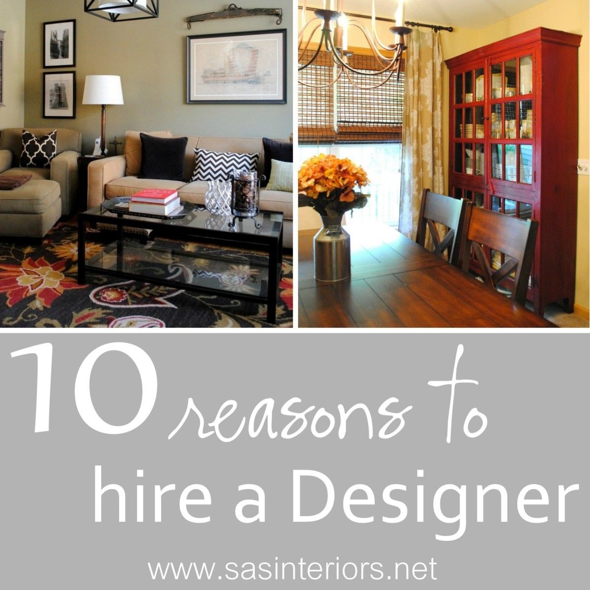
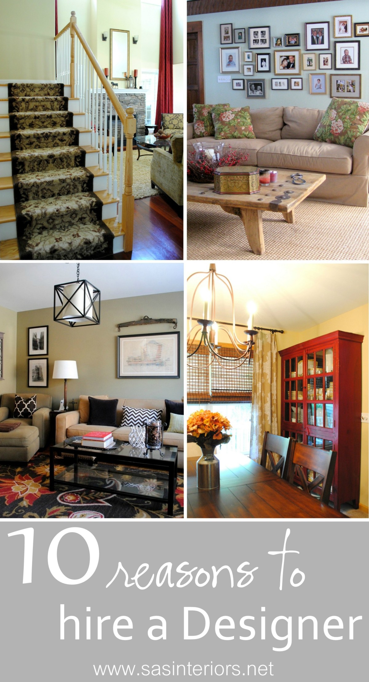
10 Reasons to Hire an Interior Designer

It’s been a little crazy around here lately and one of the reasons is because I just wrapped up three design jobs this week.  It’s always so gratifying when a project is complete and the vision that I originally had for a space comes to fruition.  As I finished up the final details of these latest projects, each client said (in a different way, of course) how I made them think outside the box and how the space wouldn’t be what it is without my assistance.  That surely brought a smile to my face 🙂

Many think, that an Interior Designer is only for the stars or the uber-wealthy.  So not true!  For many years I worked in the high-end design field, but honestly, I’d much rather assist the everyday person with making their vision a reality.  That being said, I am so thankful for what I learned when practicing high-end design because  I now know how to get that pricey look at a fraction of the cost!

As these projects are wrapping up and it’s fresh on my mind, I thought I would share a few reasons why hiring an Interior Designer is a must for anyone, with any budget!

WHY HIRE A DESIGNER!

1. Designers can save you money.  When making interior selections and decisions for one room or your entire home, it can be overwhelming and it’s possible that you’ll make purchases or choices on items that are either not worth the cost or won’t “live” for long.  With a Designers (like me) assistance, direction, and know-how, they can steer you in the right direction so the entire space can come together as a whole.  Let me ask you this – How many times have you purchased 2,3, or 4 different gallons of paint to repaint a room and you still weren’t satisfied?  Maybe once or twice??  Be honest…  With a Designers perspective, big bucks can be saved, along with the countless wasted hours.  That leads me to my next reason on why to hire a Designer…

2. Designers can save you time.  Think about all the time (and gas) wasted by buying items, not being happy with them once at home, and then returning them.  Has that happened to you once or twice?  When I work with clients, many never step foot into a store or showroom (unless they want to), because I bring samples, images, and pieces to their home.  Not bad, right?!  I’m sure the last place you want to be on a beautiful Saturday afternoon is a furniture store with 3 crying kids. I won’t even get to the point on how much time a Designer can save you with all those gallons of wrong paint.

3. Designers think outside the box and give a fresh perspective.  The mind of a Designer is simply made up differently.  We can see things that others may not and we think outside the box to provide fresh ideas and a unique perspective for a space.

4. Designers create and work within a budget. (most of the time) A good and experienced Designer will work within your budgetary means (and/or tell you up front if your scope is/isn’t possible within your budget) and make a plan before anything is purchased.

5. Designers listen.  When working with a Designer, the designs are exclusively for you and your project. I listen to my clients needs and wants to direct / assist them so the result is a space that reflects their personality and style.

6. Designers push you.  Not literally (well, some may, hehe) of course.  Designers are trained to know scale, proportion, color, size, texture, etc. so that a space is unique and personal, and not directly taken out of a catalog.  I like to introduce elements into a space that my clients wouldn’t have chosen without me.  Sometimes pushing the limits truly makes for an amazing result.

7. Space Planning.  Determining the best furniture layout for a space is critical in how the room functions and how it reads aesthetically.  When I meet with a client, we discuss the pieces that they want to repurpose or eliminate, and what needs to be added. Planning the space is HUGE (and my favorite part)!

8. Project Management.  Whether a homeowner desires a few new accessories or an entire kitchen renovation, alot of time and effort is needed for project management and coordination.

9. Designers have passion.  I live and breathe design.  From my blog to my business, design is what I know and what I do, day in and day out.  It’s not just my job, but a hobby and career that I’m truly passionate about, which is reflected in every one of my creations.

10. We have contacts. Designers have access to trade only resources that are not often available in retail stores and are often deeply discounted from retail costs.  Additionally, being in the design / building field, Designers often have formed relationships with kitchen consultants, millworkers, plumbers, electricians, etc.  We can get the right people for the job!

I hope you learned a little something, especially that working with a Designer is attainable for anyone with any space and any budget!  If you are in the market for a Designer or if reading this post peeked your need to finish up the space you’ve been working on for the last year, you can gladly take a look at the Design Services that I offer by clicking here.  I also offer E-Decorating services and can gladly assist you with a project if you live in the US.

Have you ever worked with an Interior Designer?  Have you ever thought of working with a Designer but didn’t think it was possible? I’d love to hear your thoughts!

Boy Bedroom Makeover {Reveal}

I’ve talked about it enough and now I am finally delivering… my son’s bedroom is complete and I’m making the reveal {squeal}.  It’s been enjoyable and fun to work on some new do-it-yourself projects and make some design updates in his room, but I’m also happy to say, it’s DONE.  And what a coincidence that the reveal is today because it’s also his 6th birthday – wow the time has gone fast.

Let’s stop the chattin’ and get to the room reveal.

If you happen to remember way back when before painting the stripes, I created this quick sketch of what I wanted the space to look like once we took apart the bunkbeds (yes, the two twin beds used to be a bunkbed).

And here is the actual space…

A year ago he loved the bunkbeds, a year later he’s much happier with two separate beds (he’s definitely my child who loves to change furniture around).

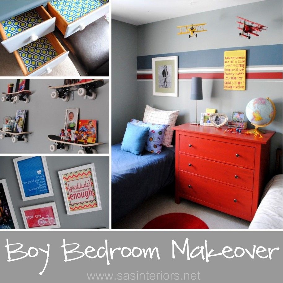
Adding a few bold stripes on the bed wall really make a huge difference for the overall look of the space.  They are a great focal point when you enter the room.  The red dresser is an Ikea purchase from a few years ago and even though it’s a strong hue, it blends well with many colors, especially the various shades of blue and the crisp white. The bedding is also from Ikea and the vintage “flying” planes are from Homegoods.  And the sign?  Cute, right?  Well I made that and I can’t even share a tutorial because it took SOOO long and I would never want you to experience the same agony as I did.

My little boys room is surely an eclectic style showcasing various hobbies and interests.  From superheros to sports to skateboarding, his loves surround him.  The skateboard shelves that we installed last year remained in place (I wouldn’t dare ask the Mister to move them, hehe) and next to them are 3 pennants of teams he likes.  The pallet shelves at the end of the bed were alot of fun to create and the book fronts add a beautiful splash of color in the space.

Pallet Shelf Tutorial

Onto the desk.  Yes, the desk.  THE DESK.  I’m thrilled to have it complete. Do you remember “the” desk?  The infamous desk that took forever to get a makeover, but thankfully went from this, to this?  Another project that I am so glad is complete and I love it 😉  Above the desk I added a photo / happy sayings gallery. Beautiful quotes & sayings are one of my favorite things to display around the house and even though I envisioned (and still want to do) a wall filled with sayings, I added a few that I felt were most appropriate for a growing boy.

Just a few of my favorites…

Painted Desk Tutorial

One fun part of the desk space is the pallet shelf that I turned around and instead of holding books, it’s oriented horizontal and holds pictures and accessories.  This pallet shelf is made exactly the same way as the other two, but was drilled into the wall on it’s bottom.

And that’s the room! 

What do you think? Not too different than before, but the few design updates have really made the space unique and personal for my little guy! Thanks so much for sticking around for the ride and enjoying all the parts and pieces of my son’s bedroom makeover.

Have you made any design updates to your kids rooms lately?

Tutorials you may be interested in:
Painted Desk + Tips on Painting Furniture
How to Make a Pallet Bookshelf
How to Paint Stripes on a Wall

Spring Mantel with Shades of Turquoise

Last week here in Upstate NY, the weather was amazing and I soaked up every bit of sun I could get. Now it’s a little chillier, but Spring and Summer will be here before ya know it! In the midst of the gorgeous weather, I took some time to put together my new Spring Mantel.

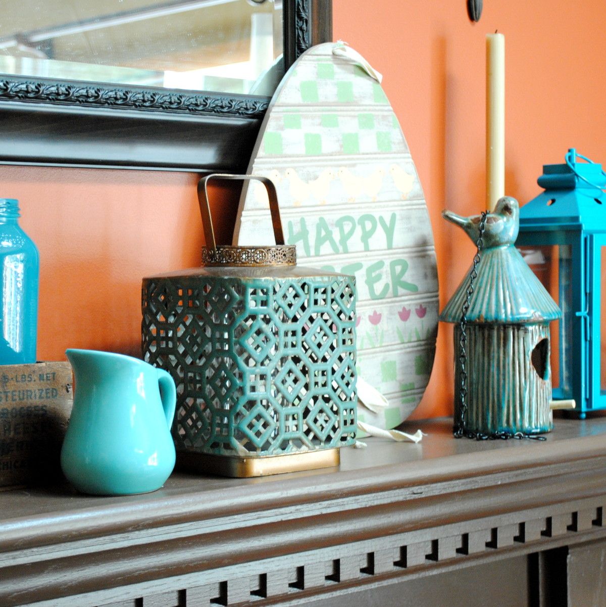
Over the past few months, I have been introducing more cooler colors than the warmer colors that I’ve lived with for many years. So my latest mantel creation has a whole lotta turquoise, which is a beautiful and dynamic compliment to the burnt orange focal wall.

Here it is… What do you think?

Turquoise is absolutely one of my favorite colors and from my past post, Totally Turquoise, many of you love it just as much!  It was kind of risky to have the mantel be dominant in one color and when planning it out in my head, I wasn’t sure if it was going to work.  I think by including a variety of different turquoise shades, the overall composition has alot of depth and intrigue, especially with the backdrop of the burnt orange wall.  Other textures and muted colors of browns were also added within to break up the monotony.

Here’s an in depth look …

Many of the pieces that make up my new Spring Mantel have been repurposed from around my home or picked up at local stores for very little.  The turquoise glass vase on the left is something new I bought a few weeks ago at TJ Maxx.  I had already had this turquoise-mantel-idea in my head and thought this would make a perfect addition – it was taller and I knew it’d make a great ‘anchor’ piece!  The glass mason jars which I found at an estate sale last year have been showcased on my mantel before and are filled with lentils and a votive candle. To the right is a tall glass jar filled with rocks from last years vacation to the beach.  I love displaying memories and these rocks are a beautiful and quiet shade of blue…  a perfect compliment to the other bold and vibrant colors.

One of my favorite upcycling things-to-do is paint old, used glass jars – tomato sauce jars, apple sauce jars, jelly jars, any jar will do! It’s so easy and unexpected.  In the Blue Label wood box stand two sauce jars that I added a little color to (it’s actually the leftover paint from my kids bathroom cabinet).  My mantels are always about layering, so in front of the wood box is a cute little turquoise pitcher and to the right is a lantern, both of which I purchased at Homegoods.

Of course, I had to add a touch of Easter decor within my Spring mantel.  I love this egg shaped Happy Easter sign that I’ve had for years (forget where I got it), but in a few weeks once the Holiday is over, it’ll be swapped out with a new Spring sign (not sure yet what it’ll be).

Continuing to the other side of the mantel, I added a sweet distressed turquoise ceramic bird feeder.  Originally intended for my daughter’s room, its so cute and fit perfectly amongst the like colors. To “anchor” the other end, I finished the mantel with two different sized bold turquoise lanterns that I purchased from Target.  They have some awesome colors this season like lime green, hot pink, and of course turquoise.

I also whipped up some fun new pillows with accents of turquoise.

Isn’t that owl fabric so cute?!  Love it with the brown and white chevron.

And this is how the entire room looks all pulled together for Spring.  It’s so different from last year’s quieter, frappe colors.

I think this is my favorite mantel design yet!  What do you think?

Do you love turquoise just as much as I do? 

Create a Layered Window Treatment

Whether they are dainty wood blinds or over-the-top dramatic drapery panels, something is needed on every window!   And without, it’s like going to a party wearing a gorgeous dress and  jewelry, but forgetting your shoes. That being said, I’m also a big fan of layering window treatments which means having a combination of functional parts and pretty parts. By adding different layers, the window(s) will have added depth and dimension, plus offer energy efficiency and privacy. To begin, ask yourself a few questions which will help determine the type and amount of layers that you want and need for your window(s).

Here are some suggestions:

  1. Desire privacy for your space?  If so, you may want to consider something that can is functional and can open & close.


  • Desire complete darkness in your space?  If so, you may want to consider black out shades.


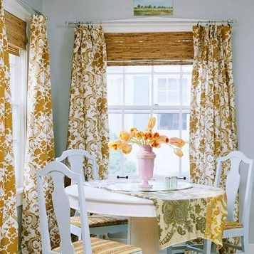
  • Desire texture, color, and height? If so, you might consider long drapery panels that are hung high close to the ceiling, plus a bamboo shades.


These are MANY options and those are just a few questions to start the process in deciding what’s right for your situation.  Let’s move on and discuss layering window treatments.

Aesthetics Only (Layer 1)

In many rooms of the home there may be no need for privacy, so a window treatment for an aesthetically pleasing look will be just enough.  Window treatment ideas could include:

  • Long drapery panels that are stationary


  • Roman Shade that is stationary


  • Cornice or Valance (above the window)


The following images show examples of window treatments that are one layer and for mere aesthetic purposes only.


Summer Thornton Design


Little Green Notebook


Amoroso Design


BHG


Privacy (Layer 2)

There are different degrees of privacy that you may want to achieve from your window treatments. You may still desire some light, so a light filtering shade may be the solution in a kitchen or living room, but a shade that completely blocks the light (and your naked silhouette) is better for a bathroom or bedroom. Window Treatments for privacy include:

  • Long drapery panels that are functional and can be pulled across the window (consider blackout lining and/or insulated interlining)


  • Roman shade that is functional (some are light filtering that allow sunlight into the space, while others can be completely room darkening and energy efficient)


  • Woven Wooden Shades (add texture to a space; some are light filtering and some are room darkening)


  • Roller Shades (inexpensive and can almost “disappear” when fully rolled up)


  • Real or Faux Wood Blinds (available in different wood tones which add comfort and character to a space)


  • Cellular Shades (light filtering or room darkening and energy efficient)


The following images show examples of window treatments that have two layers – a functional layer and a pretty layer.


BHG


BHG


Southern Hospitality


BHG


Sheers (Layer 3)

This layer is optional and usually not needed, but in some cases may be.  Depending on the window treatment design, you may want stationary panels (or a cornice), functional blinds or shades for room darkening / privacy, as well as a third layer for semi-privacy (perhaps for during the day hours).  I actually had this scenario years ago when I lived in the city and my apartment faced a busy street.  I obviously didn’t want people looking in, but I also wanted light to enter during the day, so the solution was to include a sheer in front of the functional blinds which I put down at night and darkened the room.

The following images show examples of window treatments that have three layers – a functional layer, a pretty layer, AND a sheer layer.


The Lettered Cottage


Apartment Therapy

There are many different styles and designs for window treatments, but adding numerous layers truly makes a huge impact in a room.  Imagine your window as a piece of artwork… It would look so blah and boring without the perfect frame to surround it. 

How To Achieve a Well Styled Bookcase

There is truly nothing like a well styled bookcase filled with books, accessories, collectibles, and photos that add warmth, intrigue, and uniqueness to a space.  I’ve been doing some styling lately for a few clients, and it’s been so enjoyable to start with a blank slate and build from the ground up by adding different elements and layers to create an engaging and interesting composition.

Whether built-in or freestanding, bookshelves can represent and showcase you and your families passions, interests, and hobbies.  They can make a bare wall go from blah-to-beautiful and make an overall space feel larger and taller.  No matter your budget, a well-styled bookcase can be achieved using random accessories from around your home, discount store finds, collectibles, and do-it-yourself creations.

The key to the overall look is how to pull the accessories together to create an aesthetically pleasing result, yet not add too much so it looks cluttered and not add too little so it appears bare.

So how do you achieve a well styled bookcase?
And how do you create an aesthetically pleasing result?

Let’s take a tour of some amazingly well styled bookcases and dissect ~

This is one of the BEST styled bookcases that I’ve ever seen – by Jennifer of Dimples and Tangles.  It has the perfect balance of books, accessories, collectibles, and pictures. The overall setting is engaging, intriguing, and has just the RIGHT amount – not too much, but not too little.

The key to good balance is layering from front to back and adding elements at varying heights. For instance, let’s take the bottom shelf…  The tray is propped up and leaning on the back of the bookcase.  Layered in front of it, is a horizontal pile of books with a filled bowl on top.  An appropriate balance of books and accessories has been achieved and the differing elements are of varying sizes.

The other interesting part of this bookcase is that two of the shelves on the right side were removed, which allowed for taller accessories to be added.  A tray has been turned into art by adding the ‘&’ symbol and hung at the back of the bookcase.  Layered in front is a slightly turned birdcage, a photo, and a small accessory.  Then behind that is a small pile of books with a slender, yet tall lamp – all creating a balanced composition.

In all, this small space has so much interest! Let’s pick apart another example ~This bookcase styled by Cassie of Hi Sugarplum is another awesome example of how to achieve a well styled bookcase.  Instead of leaving the backs of the bookcase white, a fabric back with a small geometric patten was added, which gives an unexpected and unique pop.  Using the same layering technique that I mentioned before, Cassie has a good balance between books, accessories, and pictures.  There’s not too much or too little of any element.  By adding framed art to the bookcase surround, another layer has been added giving the overall bookcase even more depth than before!

Want to take a look at another example?

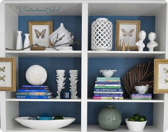
Another great example of a well styled bookcase is the wall-to-wall built-in by Kate of Centsational Girl.  After building this bookcase using 4 Ikea Billy bookcases, Kate used her amazing talents to accessorize the entire wall – WOW, what a task!

Instead of wallpapering the bookcase back like Cassie, Kate decided to paint them which allowed for books and accessories (ie: the white vases) to “speak”. Using a combination of horizontal and vertical layed books, Kate layered them with ceramic bowls, vases, diy creations, and personal momentos.  She also added framed art to the backs AND the fronts of the bookcase, which like Cassie’s composition, made the bookcase appear even deeper.

I think you get the picture by now, but here’s a quick recap on the key elements to achieve a well styled bookcase!

  1. Layer – Add elements to the back of the bookcase and continue it to the bookcase frame.
  2. Add Varying Heights – Incorporate elements with varying heights.  Display smaller accessories in front and graduate to taller and larger pieces behind.
  3. Mix it up – Display a mixture of books, accessories, collectibles, DIY creations, and photos
  4. Books Become Art – Books are beautiful.  From their color to their typography, books are truly art, so let them tell a story.  Display them horizontally and vertically, by color, or by subject.

Here are a few more of my favorite well styled bookcases.

White walls and a white bookcase, allow books and accessories to pop – via BHG

The dark painted bookcase back allows for the books and accessories to “have a voice” – via YHL

Even if you have alot of books, alternate their position between laying horizontal and vertical, then add accessories throughout – via The Art of Doing Stuff

A good balance between books, accessories, and photos is key to achieving a well styled bookcase – via Cottage and Vine

This bookcase has a good mixture of accessories at varying heights – via I Suwannee

Books become art!  This well styled bookcase has some leaning books against a high pile behind to show their beautiful covers.  Accessories are added to give scale and break up the monotony – via Lonny Mag

I’ve always loved this bookcase composition and shared it in a previous about creating a dazzling display. This white bookcase was dressed up with the addition of grasscloth wallpaper at the bookcase back.  It adds an unexpected touch to a typical built-in – via Cottage and Vine

The beauty of this bookcase display is the common thread of color in the books and the accessories.  The hues of gold, white, and varying shades of blue create a cohesive composition – via HGTV

This backless bookcase allows for the vibrant wall color to pop through the color coordinated books – via Style at Home

Creating a well styled bookcase can be tricky and a challenge for some, but with practice and patience a beautiful display can be achieved.  If you have no idea where to begin- no problem!  I love styling bookcases, fireplace mantels, tops of cabinetry, and truly any place in the home.  Read more about my Interior Design Services and Contact ME – I’ll be glad to help no matter where you live.

What do you display on your bookshelves?  Do you find it difficult to know where to begin and what to display?

Your Favorite Top Posts of 2011

I hope you had a wonderful Holiday filled with many blessings.  I had a beautiful Christmas and was so thankful to spend it with family!  With the weeks of anticipation leading up to the big day, it’s kind of sad to see it end.  At the same time though, it is exciting to think about what the year ahead has to offer.

I can not believe 2011 is just about over.  Can you?  I’m always asking myself, where has the year gone!  It seems like it was January, just two days ago.  Do you feel that way?  As a wrap up of 2011, I decided to walk down memory lane to see what posts were favorites of my SAS readers.  Some of them, I was quite surprised about, and others I knew you really enjoyed.

Let’s take a look by counting down from 10 to 1

10. DIY: How to Make Simple Lined Window Drapery Panels

Funny that this post is in the top 10…  My lined window treatments for the master bedroom that I still have yet to complete – ha!  I was a bit nervous to make these window treatment panels since I had never made something like them before, but using drop cloth as the lining material and a fun geometric fabric, I was quite surprised how easy and luxe they turned out!  I hope to finish up this space soon…that’s on my 2012 list of To-Do’s.

9. DIY: Personalized Dry Erase Calendar

This is the post I’ve probably received the most comments / questions about!  It was definitely a favorite of mine to create and something that I use EVERYDAY…  my personalized dry-erase calendar that I made for my central command center .  Upon being inspired by Beth’s, I made one for my family to keep us on track so we know where to go and when!  Yes, you can use a dry-erase marker directly on glass and if you’re looking for the calendar printables, click {here}.

8. 5 Ideas to Accessorizing Your Coffee Table Decor

It’s the center of most living / family rooms, yet it’s often forgotten about or is cluttered with magazines, papers, and remotes. Even though in my home most of the coffee table decor is thrown on the ground and instead my 2 & 5 year old sit or jump on the coffee table (a.k.a. large leather ottoman), here are some 5 easy tips for accessorizing your coffee table.

7.  Faux Animal Heads For Your Interiors

I’ve realized for a while that this has been a popular post by y’all, but of the many that I’ve written, it surprises me.  I know faux animal heads /antlers were hot-hot-hot this year, but it’s interesting to me how many views this post received.  I have to admit, some of these interior spaces are gorgeous!

6. Decorating Above Kitchen Cabinets

Another decorating post that was really popular – How to decorate above the kitchen cabinets!  I felt alittle bad after publishing this post with what I said about ditching the faux vines…  Sorry if I hurt your feelings, it’s just my opinion.   Above the cabinets, is often a bare space of unchartered territory that you may have thought to add some decor, but just didn’t know what to display or how to pull it all together. Am I right?  By having a focal point, adding layers and varying heights, this “real estate” in the home can become Oh-So-Stylish!

5. DIY: Child’s Play Kitchen

The kids play kitchen was probably my favorite diy project of the year.  I’m not sure if it’s because it’s outside of the typical realm of my everyday “interiors” life or simply because my kids get so much enjoyment out of it, but this was a great project to imagine and then create.

4. 15 Creative Ways to Display Christmas Cards

I only write this post three weeks ago, but it has received an unbelieveable amount of interest and views.  I guess many of you needed ideas on how to display your Holiday cards (I did – that’s why I wrote the post and created this). I’m glad you enjoyed!

3. 15 Inspiring Autumn Wreaths

Some of the most enjoyment I receive when putting together posts are researching and being inspiring by others creations.  Autumn is my favorite time of year and I was so excited to create this post of Inspiring Autumn Wreaths.  There were SO many amazing wreaths to choose from and the ones I showcased were just a few of my favorites.

2. Creating a Photo Wall Display

Creating a montage of photos can be a bit tricky (and intimidating) to figure out where to start and then how to balance the sizes and layout. In this very popular post, I shared room examples and actual layout ideas to help make displaying those beautiful family photos alittle easier.

DRUMROLL…


1. 5 Minute Autumn Centerpiece


With over 20,000 views, my Autumn log centerpiece blew every other post away by a landslide.  This was the easiest and most beautiful DIY creation that I have ever made, and it literally took my 5 minutes!  The response from this post alone has been crazy.  My daily pageviews since this was published has gone up 3x – I truly never thought this simple project would get such great attention.

And this is how I transformed it for the Holidays.

I never know what will make a good post.  Some things that you love surprise me and other things that I thought would be very interesting to read, no one really cares about.  That’s what makes everyone different!  Thanks for taking a trip with me down memory lane to peak at your favorite projects and posts from the 2011.  Later this week, I’m going to share a month by month review of what I’ve accomplished and then in a few weeks after the New Year, I plan on sharing a post about my goals for 2012…  I’ve got to give some more thought to that.

How to Decorate a Mantel

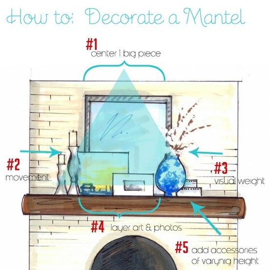
Many of you know that I’m a Pinterest junkie.  From recipes to photography to gardening, anything and everything you could want to know about is on this amazing site.  Of course, for me, my #1 search is usually home decor and DIY.  The other day I stumbled upon this great pictorial on how to decorate a Mantel.  I’m sure you know the expression, a picture means a thousand words, and this image certainly says it all.  Through the words in my blog, I’m forever looking for ways to inspire you to create a haven of your own, well this is it!

original image via and via

When starting to decorate your mantel, it’s best to remove everything and begin with a fresh palette.  It allows you to see it free and clear so your creative juices start to flow.

Simple tricks to start your mantel decor

1. Center 1 big piece: Begin in the center and choose something that is of a substantial size, maybe a mirror or artwork that you love.  This will be the main focal point of the mantel and will “ground” the other accessories in front.
2. Movement: Choose items that “move” the eye.  Whether it be candles which move from the flickering flame or items of varying heights which make the eye move up and down, include accessories that are intriguing and add vision interest.
3. Visual Weight: A secondary focal point that isn’t as big, but still gives a punch, is a great addition to a mantel ensemble.  When pulling together a mantel, it’s best to layer one piece in front of another.  Choosing a vase with flowers or branches that will sit in front of your “big piece” starts the layering effect.
4. Layering: Whether it be art, photos, candles, or accessories, layering and staggering different sized items in front of each other is a must to create a cohesive composition.
5. Vary Heights: Along with layering, adding accessories of varying heights is more visually engaging.  It helps the eye move up and down and across.  Between layering and varying heights, you want to create a wave effect with your mantel.  It starts out low, then goes up, comes back down, then up again, and finishes low.

As  Steven and Chris say, these 5 tricks create a Visual Triangle.  Starting at the top most point, you have your 1 big center piece, and then each side angles down with the addition of interesting accessories, resulting in a finished triangle = a beautiful decorated mantel.

Looking at some real-life examples always help, so let’s take a peak at two of my recent mantels.

Fall Mantel – This is my most recent mantel decorated for Fall.  Similarly to the pictoral above, I “marked up” the 5 tricks to create a cohesive mantel.  Starting with the big piece in the center, a rectangular mirror, and layering different accessories at varying heights, the Visual Triangle was created.  And do you see the “mantel wave”?  There are lots of lows and highs, lows and highs.

 Summer Mantel – This second mantel design was from the summer and even though it’s simpler and less accessorized, it still uses the 5 basic principles for decorating a mantel.

What do you like to showcase on your mantel?

Creating a Central Command Center

If I’ve said it once, I’ve said it a gazzillion times alot…I’m always moving things around my house.  As I’ve mentioned in previous posts, my foyer has been making quite the transformation with repurposed items, along with the newly stenciled wall and glazed cabinet.  With a few moves, there was a wall in my kitchen/dining room that was all of a sudden left empty… Yes, it was blank and something had to be done with it!  A blank wall with nothing on it…that’s sinful (ha)!  I thought and thought…what to do?  what to do? 

Let’s take a step back ~ a while back I had created a central command center by my refrigerator, but it really wasn’t useful.  With much thought, I decided to use this newly blank wall for a new CCC (central command center)!

What’s a central command center, you ask?

Well, I will tell you!  It’s the go-to place for EVERYTHING.  A spot (especially if you have kids) where all the daily details are layed out, where papers are organized, and where there’s a detailed calendar of events so you know where everyone is going at a certain time, on a certain day.  A must need for any home ~ don’t you agree?!

I had alot of thoughts in my head of what I needed and how I wanted to design this space, BUT before I started, I wanted to check around for some inspiration.  Where was my go-to place?  Pinterest, of course!

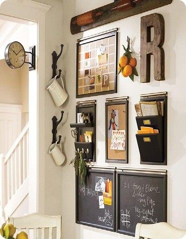
Pottery Barn has some great items to help with organizing your family.  A reader just emailed me yesterday about the picture from this post and it’s the incredible modular system that Pottery Barn offers, that helps pull together any space to create an efficient organzational hub.

Buckets, Baskets, and a Bench… What more do you need to create a central command center?

Isn’t this CCC beautifully layed out and functional?  I really like the idea of having the initial of each member of the family and their information in one place – it’s easy to identify and grab on-the-go!

This Kitchen Command Center created by The Clay Family is a must for any family to stay organized!  With a spot for a daily menu, notes, and kids chore board there is no question of who does what and when…right?!

We all love chalkboard (am I right?) and this CCC that Sarah of The Yellow Cape Cod created is perfect for any large (or small) family.  The daily responsibilities of everyone in the family is simply stated with no questions asked! And I love the quote – “Many Hands Make Light Work” (so true!)

Sometimes a central command center isn’t just for the family, but instead a place where we keep all of our “stuff”.  Candice Stringham created this office/studio/art supply closet to hold all her supplies.  With all the “objects in her office”, now everything has a home.

My kids are young and haven’t been overloaded with homework … YET.  DaNita of Delightful Order created this Homework Bulletin Board for her family, so she can easily keep track of her boys school and activity schedules.  I like how she has added a picture of each of her kids, so their space is easily identifiable.

Two more Pottery Barn spaces that are gorgeously designed.  Great look and fabulous idea for the hub of the home !

House of Fifty (published by one of my favorite bloggers, Janell of Isabella and Max Rooms), a seasonal online magazine has a fabulous article in their premier issue about creating a Command Center for the home.  I love that stylish cork board and just recently made one for myself – I’ll be sharing that soon!

BHG always does it right and has awesome organizational ideas ~ Check out some of their strategies on storage {here}

Lastly (but certainly not least), here’s a sneak peak of my Central Command Center, which I will be revealing tomorrow….

Stay Tuned!

What projects have you been up to lately?

You would have thought after my kitchen makeover that I would have taken a break (that was my intention, but didn’t happen – O, well).  I can’t wait to show you what I created for our new CCC

A Favorite Summer Space

When I think of summer, the first thought that comes to mind is the outdoors — the beautiful great outdoors!  After a long winter of being cooped up in the house, I’m always ready to spend my summer days soaking up the sun and enjoying my time outside.

One of my favorite Summer Spaces is “nana’s house” – – that’s what my family calls it.  Actually, it’s a screened house on my parents property surrounded by the great outdoors.

It’s a little oasis in nature…

… a  place to sit and relax for hours reading a good book while sipping a favorite drink.

There are no worries or stresses….

… just pure bliss while communing with nature.

No matter what direction you look, you can see and hear the beauties of your surroundings – –

Flowers…

Water…

Birds (cardinals and goldfinchs are our favorite)…

“Nana’s House ” didn’t always look this pretty.  This is a before picture only a few short years ago…

The areas surrounding “nana’s house” are just as beautiful including gardens, quaint details, and the sounds of the great outdoors.

Thanks for taking a tour of on of our favorite Summer havens!