
Tag: Jenna Burger Design

Brass in the Bathroom is BACK

Happy Tuesday my friends!  I know it’s already the 2nd day into the week, but I hope you had a fun + fabulous weekend.

I’m working on a slew of client projects, but took a bit of time for myself this weekend to hunt down an old, salvaged door for a DIY project that I have in the works for my home.  After church Sunday morning, I went to a favorite local “junk” shop which has the best old treasures and found just what I was searching for.  Head over to my Instagram feed to check out this hidden treasure in Upstate NY!

In the meantime, I’ve been busy with a few new articles for Better Homes and Gardens.  My latest is on BRASS IN THE BATHROOM

Brass in the Bathroom is BACK! From vintage to modern, brass has been given new life and a whole new look. Check out this roundup of inspiration... www.JennaBurger.com

Gone are the days of the late 80s, early 90s opulent bathrooms with the cheap-looking inexpensive gold (brass-plated to be exact) fixtures. Faucets with swan wings eerily come to mind.  Who thought those looked good?

I didn’t think anyone would ever be accepting of brass again, but it’s back and has been given new life and a whole new look – even one I’d be accepting of.

From vintage to modern, brass in the bathroom can give a beautiful, warm, regal (but not in an ostentatious way) look that makes a bold statement.

Brass in the Bathroom is BACK! From vintage to modern, brass has been given new life and a whole new look. Check out this roundup of inspiration... www.JennaBurger.com

BE INSPIRED.

Brass in the Bathroom is BACK! From vintage to modern, brass has been given new life and a whole new look. Check out this roundup of inspiration... www.JennaBurger.com

Small, but over-the-top gorgeous.  Kristin of The Hunted Interior hit it out of the ballpark with this bathroom.  Modern brass fixtures compliment the class black + white floor and traditional vanity + toilet. The brass fixtures have an almost rose hue to them which gives this bathroom such a warm aesthetic.

Brass in the Bathroom is BACK! From vintage to modern, brass has been given new life and a whole new look. Check out this roundup of inspiration... www.JennaBurger.com

Same fixtures, different space.  Kristin of Bliss at Home paired modern brass with clean lines + minimalist marble.  Another gorgeous black & white bathroom, this space evokes a cosmopolitan aesthetic!

Brass in the Bathroom is BACK! From vintage to modern, brass has been given new life and a whole new look. Check out this roundup of inspiration... www.JennaBurger.com

Kate of Centsational Girl created this gorgeous bathroom and used brass in a minimalist way by pairing it with other complimentary finishes.  The brass seen in the mirror and on the cabinet hardware don’t overwhelm the traditional space, yet enhance the other finishes and overall look.

The cabinet hardware is so chic with the simple ring pull and diamond backplate, while the bamboo-style mirror is a beautiful layer on the geometric green wallpaper.

Brass in the Bathroom is BACK! From vintage to modern, brass has been given new life and a whole new look. Check out this roundup of inspiration... www.JennaBurger.com

This bathroom is so attractive because of the contrast and the play on modern-versus-traditional.  To offset the more detailed brass mirror and hardware, Kate chose simple, minimal brass accessories which continues the eclectic feel.

Brass in the Bathroom is BACK! From vintage to modern, brass has been given new life and a whole new look. Check out this roundup of inspiration... www.JennaBurger.com

What a space.  Talk about contrast! From the ultra modern lines of the sink paired with the geometric floor versus the ornate traditional mirror, this bathroom by Jenny Komenda is so chic + sophisticated. Again, brass is used in an understated, non-dominating way, and is paired with other finishes to create a gorgeous space.

WANT MORE?

Check out more examples of brass in the bathroom in my recent post at BHG.com

Click to read the full article on >>> Brass in the Bathroom

Brass in the Bathroom is BACK! From vintage to modern, brass has been given new life and a whole new look. Check out this roundup of inspiration... www.JennaBurger.com

Check out my bio page + all my articles on Better Homes and Gardens

More content coming soon to be featured on BHG.com!

Choosing Kitchen Appliances

Appliances are a pertinent component of the kitchen.

Not only are they the primary purpose for cooking + food prep, but appliances contribute a large part to the overall aesthetic.

Basically the appliances have 2 major roles… they have to be highly-functional AND look fabulous!  They’re a big deal!

Tips for CHOOSING KITCHEN APPLIANCES. I just finished a kitchen renovation and share my tips from shopping + why I chose the appliances I did . www.JennaBurger.com

When it came time to choose appliances for our kitchen remodel, I chose Frigidaire.  I had just finished up a client project and after scouring big box + local appliance stores for appliances ranging from budget-friendly to commerical-grade, we both fell in love with the Smudge-Proof collection.

For about the last 15 years, stainless steel finish has been the top choice for kitchen appliances.  The utilitartian look makes us feel like we’re in a commercial kitchen – and doesn’t that make you cook better?  Maybe in my mind… Restaurants have always turned to stainless because it stands up to wear + tear and it holds up to high heat, better than paint.

The downside of stainless, the smudges.  A small issue for some, but with a load of kids (like we have), it can seem like the solid stainless surface is never clean.  Enter… SMUDGE -PROOF. The solution to all world problems.  totally kidding. well kinda.

Resist Fingerprints on your appliances with SMUDGE-PROOF stainless steel by Frigidaire

Appliances in my kitchen: Gas Range / Hood / Refrigerator / Dishwasher / Microwave

KITCHEN MAKEOVER REVEAL: before and after kitchen renovation with white & gray cabinets, open shelving, subway tile backsplash, quartz countertops, and layers of color. This kitchen is gorgeous! Check out the entire renovation process @ www.JennaBurger.com

Aside from the surface – stainless, white, black – of the appliance, here are a few tips when choosing appliances to suit your style + budget.

TIPS BEFORE YOU APPLIANCE SHOPPING

> The Layout.  Before setting out to choose appliances, finalize the layout of the kitchen first to determine what you’ll need + the sizes.

> Budget. Appliances come in a range of price-points and are dependent on the power they provide + the look you want.  Determine a budget what you want to spend, then SHOP.

> Microwave. In many kitchens, the microwave is over the range.  For compact spaces this is a great solution to maximize on space. BUT if you have the space to locate the microwave in another spot (ours is in the island), I would.  The range is more often or not, one of the major focal points of the kitchen that your eye is drawn to. No matter the size of the range (ours is 36″ wide, which is typical), you can make a statement above.

I chose an exposed hood for above the range.  The impact on the overall look outweighs the small lose of storage by eliminating a cabinet.  Need storage above the range? Consider a concealed hood with a decorative mantel which provides space for a cabinet above.

> Refrigerator.  Choosing a refrigerator can be overwhelming.  The selection is vast!  Refrigerators from years past are deep (32-35″ +), which makes them stick out way beyond the countertop depth (typically 25″).  I would recommend a refrigerator that is counter depth or a style that is no more than 27″ deep.  The door of these models sit forward of the counter, but the overall depth compared to older refrigerators is much less.

Having a refrig that isn’t as deep leaves more area form traffic flow – bonus!

> Range. Are you a baker? You need a convection oven. My new oven has convection bake + roast capibilities, which means heat is distributed throughout the oven more evenly rather than heat being emitted from the oven walls only as with a conventional oven. It took some getting used to because when suing the convection setting, the oven auto-adjusts, but overall I am loving the results.

Also with the range, look at the cooktop surface.  Again, lots of options in this area.  I chose a model that has a continuous grate top versus 4 separate burners.  This allows me to move pots / pans easily + to fit more.  Additionally, there is a 2-in-1 burner + griddle, which is ideal for simmering sauces, as well as flipping pancackes.

> Dishwasher. To me a dishwasher is a dishwasher.  Consider what you like / don’t like about your existing style and start from there.  Does it make too much noise?  My new dishwasher is quiet-as-a-church-mouse and actually reflects a blue light onto the floor so you know the cycle has ended.  Or do you not like the inside configuration for plates and glasses?  Look for a model that has flexibility for the top + bottom racks.

> The Handle. A small detail to some, but a huge detail to me which reflects the overall look of a kitchen… The Handles.  Remember, it’s all about the details.  When choosing appliances, *try* to find a collection you like – like the smudge-proof collection – or one manufacturer so the handles on various appliances match.  You wouldn’t have various pulls and knobs on your cabinets, right?

> The Finish.  Whether stainless or painted, every manufacturer has a variation of stainless or white. Again, try to choose a collection so the finish is the same for each.

Appliances are a lot of money.  They are an investment.  And a lot of time + research can go into choosing the right model for your style + budget. It can be quite daunting, but hopefully with the tips I’ve shared, it makes the process a bit less stressful.

If you want to see all the posts documenting the kitchen renovation, here they are from start to finish:
Wonderful White Kitchen Inspiration
Kitchen Remodel: Before + Plan of Action
Demo Day: Steps for Demolishing the Kitchen
Kitchen Progress: Staining Hardwood Floors
The Cabinets Arrive + Get Installed
Natural Quartz Countertops in the Kitchen
10 Countertop Materials to Consider for the Kitchen
Subway Tile Installation + Choosing the RIGHT Subway
Kitchen Backsplash Tile Options + Inspiration
Choosing a Paint Color + Wallpaper for the Kitchen and Dining Room
Kitchen Renovation: The Appliances
Dissecting the Details
Kitchen Renovation: REVEAL + RESOURCES

DISCLAIMER: THIS KITCHEN RENOVATION IS A COLLABORATION WITH LOWE’S AND FRIGIDAIRE.  ALL OPINIONS + SELECTIONS ARE MY OWN WITH THE ASSISTANCE OF THE LOWE’S DESIGN TEAM.

In-Trend Wallpaper Inspiration + Sources

Wallpaper from the 70’s… Some patterns are still bareable, but many have lived their life on the wall to the max.

Recognize any of these patterns from decades past?

1970 Wallpaper patterns

As soon as you saw the title of this post on the topic of wallpaper, you might have cringed.  But don’t stop reading… please!

For many, the thought of wallpaper might bring you back to your childhood home with the walls covered in bold, intense patterns in hues of pea green and orange. Those ugly retro patterns adorning not only the walls of each room, but also the curtains, sofas, and more, will forever be engrained in our heads.

After the many years of removing wallpaper from our fixer upper homes to rid the intense, dated look for a more soothing aesthetic, the thought of wallpapering again was far from thought.

I can gladly attest that wallpaper patterns have made a complete 180.  And after living with paint for so many years, I new something more on the walls would pull the space together and that missing element was wallpaper.  I now have 4 different wallpaper patterns throughout my home and it looks nothing like the overwhelming 70s style.

There is a vast selection of wallpapers available today and honing in on just the right pattern + style can be quite daunting. Once the right one is found, it can completely transform any space from blah to beautiful!

Wallpaper Inspiration for every room of the home + WALLPAPER RESOURCES. It's amazing the impact that wallpaper can make in a room. Roundup + Inspiration @ www.JennaBurger.com

Whether a subtle geometric pattern in a bedroom or a vibrant, modern floral in the bathroom (like my powder room), wallpaper makes an impact!

Let’s dissect + be inspired…

INSPIRATION

This large scale baby blue wallpaper in a hallway is reminiscent of a damask pattern from the turn of the century. The subtle, but strong paper makes a statement and compliments the height of the space + the detailed architectural mouldings.

I’m not often drawn to coordinating patterns on multiple surfaces, but with this style space it truly works.  The pattern of the paper is repeated on the traditional side chair which continues the classic style.

Even though a bit too traditional for my aesthetic, I adore this soothing, yet dramatic space.

Wallpaper Inspiration for every room of the home + WALLPAPER RESOURCES. It's amazing the impact that wallpaper can make in a room. Roundup + Inspiration @ www.JennaBurger.com

VIA HGTV

Wallpaper shouldn’t overwhelm a room and with an intense pattern, it can easily happen.  Drawn to a powerful paper?  Use it on a focal wall and choose a complimentary color for the other surfaces in the space.

The gold-looking botanical print in this dining room is intense but is complimented by the other walls being painted a shade of chocolate.  Not only does the deep warm hue evoke a warm feeling, it’s also contrasted by lots of white – the door, mouldings, chandelier, display shelf, and the chairs.

It’s all about contrast…

Wallpaper Inspiration for every room of the home + WALLPAPER RESOURCES. It's amazing the impact that wallpaper can make in a room. Roundup + Inspiration @ www.JennaBurger.com

VIA BHG

Wallpaper in a hallway or transition space is a great ‘neutral’ between rooms to create a cohesive thread. You can never go wrong with a modern geometric pattern to tie spaces together.  This modern wallpaper in a kelly green hue is detailed, yet simple in a bold way.  It’s the perfect compliment to the oversized flower print in the bedroom beyond.

And I can not move on without commenting on those adorable framed toddler-sized swimsuits.  What a playful + unexpected addition to a 2nd floor hallway.

Wallpaper Inspiration for every room of the home + WALLPAPER RESOURCES. It's amazing the impact that wallpaper can make in a room. Roundup + Inspiration @ www.JennaBurger.com

VIA BHG

Smaller scale patterns are perfect in smaller spaces.  Not only will the proportion of the design feel more suited for the scale of the space, the repeat of the paper will be more visible.

This entry is such a sunny space!

Wallpaper Inspiration for every room of the home + WALLPAPER RESOURCES. It's amazing the impact that wallpaper can make in a room. Roundup + Inspiration @ www.JennaBurger.com

VIA BHG

The modern floral pattern makes such a statement in this entry and works so well with the colorful elements that are layered atop.  The organic patterned paper is also offset by pieces that have interesting architectural lines seen in the mirror and console table.

Wallpaper Inspiration for every room of the home + WALLPAPER RESOURCES. It's amazing the impact that wallpaper can make in a room. Roundup + Inspiration @ www.JennaBurger.com

VIA BHG

Similar to using a dark paint in a small room, many people are reluctant to use wallpaper, thinking that it will make the space feel smaller.  Just a myth!  If you have a small space, such as a powder room, foyer, or office, adding wallpaper will make it dramatic and unique, similar to this modern floral design I used in my powder room.

Instead of overwhelming the 4 walls of this small space, I wallpapered the main wall (sink wall) only and painted the other 3 walls using a complimentary paint that I matched to the background color of the wallpaper.  All the other elements in the space – vanity, toilet, roman shade, light – are white, which give the perfect contrast to the dark + bold walls.

Wallpaper Inspiration for every room of the home + WALLPAPER RESOURCES. It's amazing the impact that wallpaper can make in a room. Roundup + Inspiration @ www.JennaBurger.com

MY POWDER ROOM, PHOTOGRAPHED FOR KBMO MAGAZINE, PHOTO VIA BHG

This is another example of using a bold wallpaper in a small area to make a big impact look.  This watercolor floral pattern creates a beautiful focal point for this office nook.

It would look nice with a contrasting paint color in the nook, but it truly makes a statement with the addition of the wallpaper.

Small commitment, but a big look!

Wallpaper Inspiration for every room of the home + WALLPAPER RESOURCES. It's amazing the impact that wallpaper can make in a room. Roundup + Inspiration @ www.JennaBurger.com

VIA BHG

Wallpaper doesn’t always need to be bold + dramatic.  Soft and subtle on one or all walls of a space can create an engaging, unique aesthetic.  This modern, geometric pattern is a lovely addition to this bedroom filled with grays and shades of lavendar.

Wallpaper Inspiration for every room of the home + WALLPAPER RESOURCES. It's amazing the impact that wallpaper can make in a room. Roundup + Inspiration @ www.JennaBurger.com

VIA BHG

Go big or Go Home!  This vibrant orange wallpaper with a bird + cloud design makes a big statement on this focal wall.  A paper like this isn’t for an entire room but instead ideal for an accent wall or a ceiling, with whites + neutral layers and accents.

This breakfast area works so well because the paper has ‘it’s moment’, which is complimented by the white layers + minimal, simple furniture.

Wallpaper Inspiration for every room of the home + WALLPAPER RESOURCES. It's amazing the impact that wallpaper can make in a room. Roundup + Inspiration @ www.JennaBurger.com

VIA BHG

Decades ago when rooms were wallpapered, there often was no order or level of importance to the elements in the room. An intense wallpaper adorned the walls, but an equally dramatic sofa, chair, rug, bookcase made the space overwhelming, stuffy, and just too much!  There was no statement.  No heirarchy.  No ONE ELEMENT to rest the eye on.

Wallpaper can be a lot and if a dramatic, bold paper is the right choose for you, it will only work when all other elements are minimal and quiet.  This bathroom is a perfect example… The traditional patterned paper in a deep raspberry hue is bold, but it works well because all the other elements are minimal and plain jane.

Once again, it comes down to contrast.  For this space, it’s contrasting the intense wallpaper with the minimal layers.

Wallpaper Inspiration for every room of the home + WALLPAPER RESOURCES. It's amazing the impact that wallpaper can make in a room. Roundup + Inspiration @ www.JennaBurger.com

VIA BHG

WALLPAPER SOURCES

With all that inspiration, are you looking to wallpaper a spot or entire room in your home?  Not sure where to start looking for the right wallpaper to fit your style?

Here are 15 favorite sources for wallpaper…

15 Favorite Sources for Wallpaper!

GRAHAM AND BROWN
THIBAUT
HYGGE & WEST
GROW HOUSE GROW
CAVERN HOME
ANTHROPOLOGIE
WALNUT WALLPAPER
FARROW & BALL
CAITLIN WILSON
FERM LIVING
COLE & SON
JUJU PAPERS
SPOONFLOWER
ESKAYEL
SERENA & LILY

Interested in seeing where I’ve incorporated wallpaper into my home?

Check out my pad…

Wallpaper Inspiration for every room of the home + WALLPAPER RESOURCES. It's amazing the impact that wallpaper can make in a room. Roundup + Inspiration @ www.JennaBurger.comDining Room / Kitchen – Anthropologie wallpaper

Wallpaper Inspiration for every room of the home + WALLPAPER RESOURCES. It's amazing the impact that wallpaper can make in a room. Roundup + Inspiration @ www.JennaBurger.com2nd floor bathroom – Serena & Lily wallpaper

Wallpaper Inspiration for every room of the home + WALLPAPER RESOURCES. It's amazing the impact that wallpaper can make in a room. Roundup + Inspiration @ www.JennaBurger.comPowder Room – Amy Butler wallpaper

Wallpaper Inspiration for every room of the home + WALLPAPER RESOURCES. It's amazing the impact that wallpaper can make in a room. Roundup + Inspiration @ www.JennaBurger.comBoys Bedroom – Graham and Brown ‘Frames’ wallpaper

I’m on the hunt for the next wall or room to wallpaper.

Are you ready to start wallpapering?

9 Ideas for Organizing the Bathroom Vanity

Well we totally missed last weeks snowstorm that I know a lot of you were affected by and are still digging out from.  Kinda crazy that upstate New York has less snow that DC…

What haven’t missed – or rather, avoided – is the nasty sick bug going around. Once again, another January has hit us hard with sickness and it’s the kind that lingers and seems to never leave. Unfortunately it’s got us all down.  The last few weeks have been rocky, but I’m trying to keeping chugging forward with thoughts of warmer weather + sunnier days ahead.  It’s the only think you can do, right?!

Anyway, I am happy to share that I have a new post up at Better Homes and Gardens.

If you’ve been busy decluttering and organizing since the new year hit, then I have a post for you…
Getting a hold on THE MESSY VANITY.  I’ve got one, do you?  Then here are 9 Easy Ways to Make Over a Messy Vanity.

I took away so much while putting this post together and I hope you will too.

Click to read the full article on >>> 9 Easy Ways to Make Over a Messy Vanity

BATHROOM ORGANIZATION: Organizational ideas + tips for the bathroom vanity

Check out my bio page + all my articles on Better Homes and Gardens

More content coming soon to be featured on BHG.com!

Kitchen Renovation: Details

I’m overwhelmed by the outpouring of kindness + sweet thoughts for the new kitchen space.

It being called, A HAPPY KITCHEN, was by far my favorite comment because that just completely + perfectly sums up the new setting.  A happy space is exactly how I envisioned the new kitchen to look + feel.

As a whole, the kitchen from top to bottom is entirely new, and last weeks KITCHEN REVEAL post focused on the before + after, as well as the overall design & changes.  But there is still so much more to tell… a follow up post to share the nitty-gritty details + thought-process of WHY & HOW the design came to be, had to be told…

When the planning process of the kitchen renovation began, I started by focusing on the big picture; the space as a whole.  From there I put my efforts into spending time on the details + layers.  This attention to the smaller elements is what really makes a space complete and unique.

Upon making the decision to change the layout & have the new cabinetry be white, I set out to find inspiration.  Before putting together the mood board for the new space, I wanted to analyze + dissect other kitchens to see what elements I liked and didn’t like.  With this process, along with my past experience designing client kitchens, here is a list I created as to what details were important and needed extra focus + attention:

> tile backsplash

> open shelving

> outlets

> cabinet hardware

> lighting

> color

> storage

With attention to detail in these 7 areas, I knew my kitchen would be set apart from the norm.

Here’s How…

1. TILE BACKSPLASH

The white subway tile I chose is probably the most common + least expensive tile out there.  Yes, very ordinary. That’s okay though, because I was still going to set it apart from the others.

How? Grout and Layout.

Instead of choosing a grout color that coordinated with the tile (which would’ve been white), I chose to use a contrasting grout color.  Lowe’s has a display with all their grout colors and with a sample of the island color in hand – a dark grey called Greyloft by Kraftmaid – I chose a grout color that matched.  By choosing a like color to the island, this allowed the deep hue to carry through in other areas of the kitchen.  The dark island color wouldn’t be a stand-alone in one spot but instead a common thread throughout.

KITCHEN MAKEOVER REVEAL: before and after kitchen renovation with white & gray cabinets, open shelving, subway tile backsplash, quartz countertops, and layers of color. This kitchen is gorgeous! Check out the entire renovation process @ www.JennaBurger.com

The staggered / brick layout of the subway tile is Oh So Norm, BUT I set it apart by continuing the tile behind the hood, as well as up and around the window.  Instead of stopping the tile at the line of the upper cabinets, I continued it up to heighten the space.  Additionally, the tile was installed behind the open shelves, which makes the space feel larger.

>>> CLICK HERE FOR MORE DETAILS ON THE TILE INSTALLATION

KITCHEN MAKEOVER REVEAL: before and after kitchen renovation with white & gray cabinets, open shelving, subway tile backsplash, quartz countertops, and layers of color. This kitchen is gorgeous! Check out the entire renovation process @ www.JennaBurger.com

2. OPEN SHELVING

Since we’re on that subject, let’s jump right in…  Open Shelving.  Most of you would never think of open shelving in the kitchen.  Who would want to display plastic cups + mismatched dishes?!  Wrong my friends…  My kitchen doesn’t have all open shelving.  In actuality only a small portion of the space has open shelves.  Like you, I have cups, plates, and a lot of other things that I want hidden.  And those things are behind closed doors.  BUT, I do have some nice dishes, pretty glasses, and colorful bowls.  All perfect for display + easy access to grab.

Why open shelving? Shelves add depth, openness, and a way to introduce color.  Look through your cabinets and figure out how many ‘nice’ things you have to display, then figure out how much open shelving is appropriate for your kitchen.

KITCHEN MAKEOVER REVEAL: before and after kitchen renovation with white & gray cabinets, open shelving, subway tile backsplash, quartz countertops, and layers of color. This kitchen is gorgeous! Check out the entire renovation process @ www.JennaBurger.com

3. OUTLETS

Still on the subject of the backsplash, outlet locations are important to figure out during the design phase.  More often or not, outlets are typically every 18-24″ apart and are positioned half way between the counter and the upper cabinets.  So basically, they’re an eyesore smack in the center of the tile.  Outlet placement can be daunting, but avoid the eyesore mistake by giving thought to the outlet placement BEFORE you renovate.

Moving the outlets lower, about 3″ above the counter, and to a horizontal position, will help keep them out of sight and in line with your appliance plugs. As an alternative, try one horizontal outlet on the backsplash for the appliances / items that sit permanent on the counter – think beforehand about where they’ll be placed – then add outlets to the underside of the upper cabinet for the temporary plug-in / take-out items.

The outlets in my new backplash can barely be seen…

KITCHEN MAKEOVER REVEAL: before and after kitchen renovation with white & gray cabinets, open shelving, subway tile backsplash, quartz countertops, and layers of color. This kitchen is gorgeous! Check out the entire renovation process @ www.JennaBurger.com

And please always use GFCI outlets above countertop level to avoid electrocution!

Outlets in the island is another area of focus.  You want + need outlets in the island (and they are required by building code), but it is important to place them in a pleasant looking place.  Have a recessed panel on the side of the island?  Be sure the outlet is centered and position it in the same orientation as the backsplash.

KITCHEN MAKEOVER REVEAL: before and after kitchen renovation with white & gray cabinets, open shelving, subway tile backsplash, quartz countertops, and layers of color. This kitchen is gorgeous! Check out the entire renovation process @ www.JennaBurger.com

Aside from the major appliances – refrig, micro, hood – it’s important to think about what will be going where when the kitchen is finished.  I knew I wanted to create a coffee station + charging station in the new pantry next to the refrigerator.  With the specs of the cabinet – showing the heights – in hand, the contractor and I layed out the outlets to provide electric for our needs.

KITCHEN MAKEOVER REVEAL: before and after kitchen renovation with white & gray cabinets, open shelving, subway tile backsplash, quartz countertops, and layers of color. This kitchen is gorgeous! Check out the entire renovation process @ www.JennaBurger.com

4. CABINET HARDWARE

Hardware (and lighting, which I’ll get to) is like the jewelry for an outfit.  A black shirt + jeans are nice, but the outfit is set apart by the layers that are added.  That is where hardware plays a huge part in a kitchen!  White cabinets + White backsplash in a kitchen are pretty norm, but it was the details that were added that set it apart from others.  I had this nutty idea about placing the cabinet hardware in the center of cabinet doors instead of at the side which is typical.  Because many of the doors lined up with the drawers below, I had a feeling it was going to look stellar as a whole.  In the end, it did!

KITCHEN MAKEOVER REVEAL: before and after kitchen renovation with white & gray cabinets, open shelving, subway tile backsplash, quartz countertops, and layers of color. This kitchen is gorgeous! Check out the entire renovation process @ www.JennaBurger.com

I chose polished nickel for the modern cup pulls and they are bold.  Against the basic, minimal door, they shine.  Truly, the polished pulls shine and make a statement.

Doors are doors, make a statement with the hardware!

KITCHEN MAKEOVER REVEAL: before and after kitchen renovation with white & gray cabinets, open shelving, subway tile backsplash, quartz countertops, and layers of color. This kitchen is gorgeous! Check out the entire renovation process @ www.JennaBurger.com

5. LIGHTING

I’m a lighting snob.  I like big lights and I can not lie! that was corny… sorry.

Seriously though, big or small, lighting is important.

I had a difficult time with the lighting because I knew it would make or break the new space.  I didn’t feel polished nickel lights (to match the cabinet hardware) would work well in our open concept home where the other lights are black / dark.  I found these gorgeous statement-worthy pendants from Rejuvenation and hit place order.  They took a few weeks to arrive and when they were installed, the kitchen looked truly complete.

KITCHEN MAKEOVER REVEAL: before and after kitchen renovation with white + gray cabinets, open shelves, subway backsplash, quartz countertops, and layers of color. This kitchen is gorgeous! Check out the entire renovation process @ www.JennaBurger.com

For the pendant over the sink, I chose something that was different but that coordinated well with the oversized island pendants.  This prism pentagon pendant was the right match.

KITCHEN MAKEOVER REVEAL: before and after kitchen renovation with white & gray cabinets, open shelving, subway tile backsplash, quartz countertops, and layers of color. This kitchen is gorgeous! Check out the entire renovation process @ www.JennaBurger.com

6. COLOR

I’m a color person.  I heart color. Yet everything was white. What? I knew when all was complete, the kitchen would come alive with the layers of color that I would add. From the dishes to glasses to artwork to food, this kitchen comes alive with the color that has been injected into it with all the layers.

KITCHEN MAKEOVER REVEAL: before and after kitchen renovation with white & gray cabinets, open shelving, subway tile backsplash, quartz countertops, and layers of color. This kitchen is gorgeous! Check out the entire renovation process @ www.JennaBurger.com

KITCHEN MAKEOVER REVEAL: before and after kitchen renovation with white & gray cabinets, open shelving, subway tile backsplash, quartz countertops, and layers of color. This kitchen is gorgeous! Check out the entire renovation process @ www.JennaBurger.com

7. STORAGE

The insides of the cabinets are truly just as important as the exterior. The insides of the Kraftmaid cabinets are filled with savvy storage components.  Everything has a place.  There is no question of what goes where…

These are a few favorites…

Full depth cabinet above the refrigerator with Vertical Dividers, perfect for trays, cookies sheets, and more…

Full depth cabinet above the refrigerator with Vertical Dividers, perfect for trays, cookies sheets, and more!

Trash Bin + Recycling Pull Out… no more floating garbage can in the center of the kitchen.

Trash Bin + Recycling Pull Out... no more floating garbage can in the center of the kitchen

Tilt Tray at the sink front to hold sponges + clothes, which eliminates sitting on the counter.

Tilt Tray at the sink front to hold sponges + clothes

Full extension roll-out drawers in the base cabinets so from front to back, everything can be seen!

Roll-out drawers in the base cabinet

As you can see, the details are important and those details are what make up the whole to create something different.  The details are what make the kitchen stand out of the norm.  Most elements are typical and ‘most popular’ but it’s how they are mixed together that sets them apart.

One more post coming soon… the Resources of the kitchen.  I’m sharing all the scoop of where I shopped!

If you want to see all the posts documenting the kitchen renovation, here they are from start to finish:
Wonderful White Kitchen Inspiration
Kitchen Remodel: Before + Plan of Action
Demo Day: Steps for Demolishing the Kitchen
Kitchen Progress: Staining Hardwood Floors
The Cabinets Arrive + Get Installed
Natural Quartz Countertops in the Kitchen
10 Countertop Materials to Consider for the Kitchen
Subway Tile Installation + Choosing the RIGHT Subway
Kitchen Backsplash Tile Options + Inspiration
Choosing a Paint Color + Wallpaper for the Kitchen and Dining Room
Kitchen Renovation: The Appliances
Dissecting the Details
Kitchen Renovation: REVEAL + RESOURCES

DISCLAIMER: THIS KITCHEN RENOVATION IS A COLLABORATION WITH LOWE’S, KRAFTMAID, FRIGIDAIRE, AND HGTV HOME BY SHERWIN WILLIAMS.  ALL OPINIONS + SELECTIONS ARE MY OWN WITH THE ASSISTANCE OF THE LOWE’S DESIGN TEAM.

Kitchen Renovation: REVEAL + Resources

KITCHEN MAKEOVER REVEAL: before and after kitchen renovation with white & gray cabinets, open shelving, subway tile backsplash, quartz countertops, and layers of color. This kitchen is gorgeous! Check out the entire renovation process @ www.JennaBurger.com

In less than a month, we’ll be living in our home 6 years.  6 years. The fastest 6 of my life. More than double the time of any place we’ve lived before.

We moved here as a family of 3 and now we’re a family of 5 + a cute white little kitty. Life has changed so much and as much as our family + lives have evolved, so has the house we stepped in to – and almost walked away from – 6 years ago.

The shell that was a vacant house, has been transformed into a home.  A chaotic, crazy, bustling HOME.  Every surface has been touched.  Walls has been repainted + wallpapered (some a few times over).  Floors have been recarpeted + retiled.  And most importantly our home is now adorned with key elements that show who we are, what we love, and where we’ve been. Our mark has been made.

KITCHEN MAKEOVER REVEAL: before and after kitchen renovation with white & gray cabinets, open shelving, subway tile backsplash, quartz countertops, and layers of color. This kitchen is gorgeous! Check out the entire renovation process @ www.JennaBurger.com

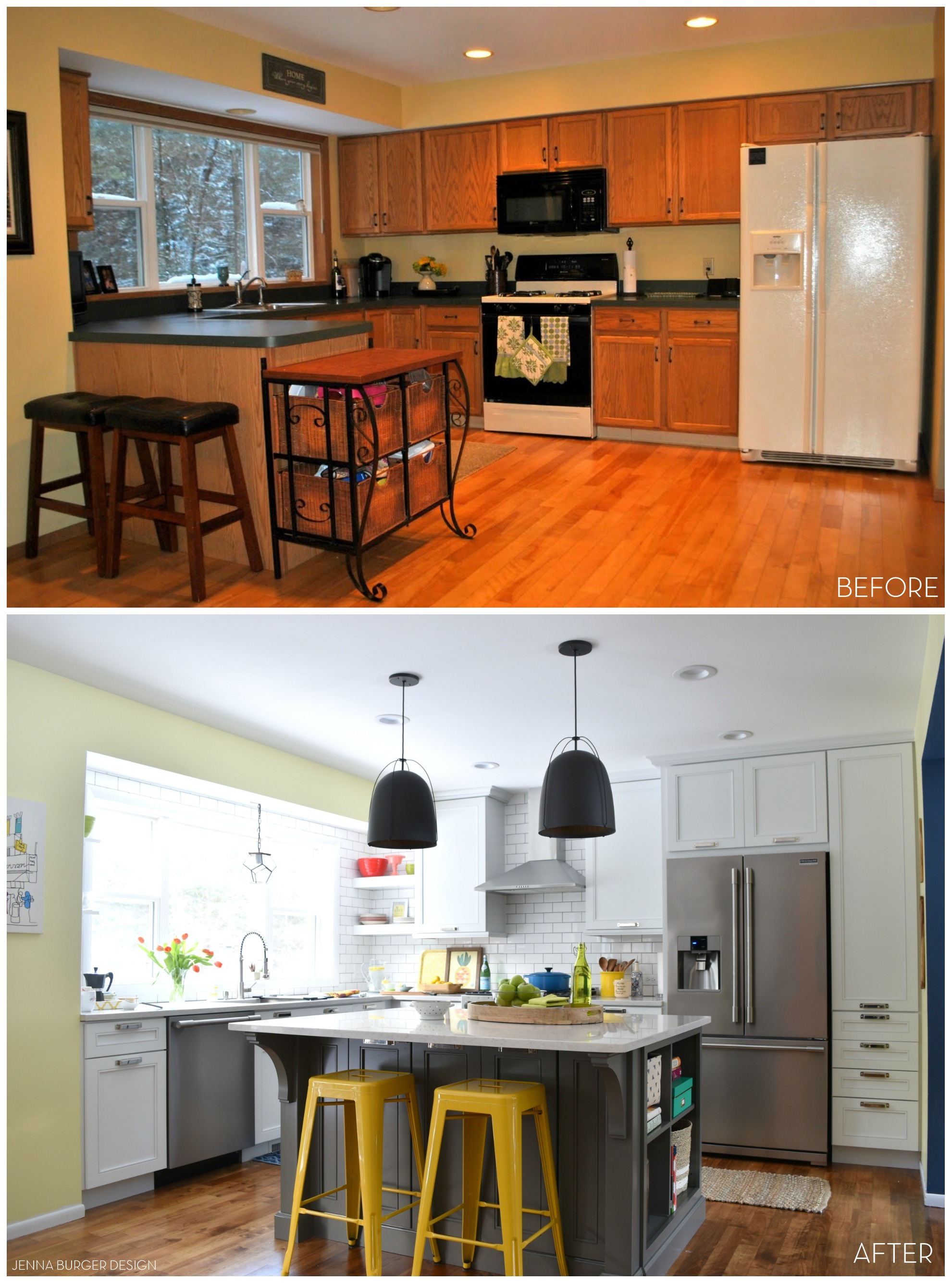
The kitchen, the hub of our new house in 2010 seemed fine.  The cabinets were in fine shape, the counters weren’t pretty but functional.  A few months in, we changed the hardware + the sink, and called it done.

Until…  2 years later and I was itching to freshen it up.  A $300 kitchen revamp + new appliances left us happy campers.  We were in love.  The do-it-yourself upgrade on a budget was perfect.  At that moment it reflected us.

>>> TO SEE THE DIY KITCHEN MAKEOVER CLICK HERE

In the 3 year time gap from then to now, our lives have turned upside down – all for the good!  When we bought our home, we had just came off a really rough patch with the economy affecting our jobs.

Thankfully things have changed a lot…

KITCHEN MAKEOVER REVEAL: before and after kitchen renovation with white & gray cabinets, open shelving, subway tile backsplash, quartz countertops, and layers of color. This kitchen is gorgeous! Check out the entire renovation process @ www.JennaBurger.com

Fast forward… the Misters job has been stable & growing + I’ve been able to continue expanding my blog + business – designing LOTS of other peoples homes.  Life has been good. Real good.  And truly grateful.  And the time had come for US to get the kitchen of our dreams.  It was finally our turn. Surreal, but true.  I wanted – and needed – a gourmet kitchen of my own.  And here it is.  Finally complete and still pinching myself with excitement.

WELCOME to our kitchen

This kitchen could not have been possible without the assistance + backing from my friends at Lowe’s, Kraftmaid, and Frigidaire.  I’ve collaborated with Lowe’s countless times over the years and I am blessed that they never ask questions and always believe.  I strive to execute outside-of-the-box creations which in turn inspires you, my amazing & dedicated readers.  That’s what I’m here for. That’s what I do… Inspire. And that’s what I hope the take away is with the new kitchen space I designed.

Enough chit-chat, come on in…

KITCHEN MAKEOVER REVEAL: before and after kitchen renovation with white & gray cabinets, open shelving, subway tile backsplash, quartz countertops, and layers of color. This kitchen is gorgeous! Check out the entire renovation process @ www.JennaBurger.com

Where to begin, is the question…

The inspiration for the color palette came from a piece of art.  I snagged this canvas from Ikea last year and at the time it was meant for the living room, which I had been in the process of remodeling. I loved the white background layered with bold pops of color – yellow, blue, raspberry, green, turquoise.

I was drawn to it’s simplicity, yet intricate focus on detail.  And that’s exactly the vision I wanted the kitchen to evoke – clean, simple, and BOLD.

KITCHEN MAKEOVER REVEAL: before and after kitchen renovation with white & gray cabinets, open shelving, subway tile backsplash, quartz countertops, and layers of color. This kitchen is gorgeous! Check out the entire renovation process @ www.JennaBurger.com

This was the mood board I created…

Kitchen Design Board - Plan of Action

… And months later, I feel I’ve achieved just that.  I’m content.  This new kitchen truly evokes everything I am and everything my style is.

KITCHEN MAKEOVER REVEAL: before and after kitchen renovation with white & gray cabinets, open shelving, subway tile backsplash, quartz countertops, and layers of color. This kitchen is gorgeous! Check out the entire renovation process @ www.JennaBurger.com

From edge to edge, here it is…

KITCHEN MAKEOVER REVEAL: before and after kitchen renovation with white & gray cabinets, open shelving, subway tile backsplash, quartz countertops, and layers of color. This kitchen is gorgeous! Check out the entire renovation process @ www.JennaBurger.com

The cabinetry in the new kitchen is by Kraftmaid, one of several cabinet companies displayed at Lowe’s.  I chose the Kraftmaid line of cabinets for a range of reasons. Not only does Kraftmaid have an extensive selection of cabinet styles + colors, their attention to detail is exquisite, as well as the craftmanship of their product.  When I started the design process for this renovation, I was quite impressed with all the ‘bells & whistles’ that they offer (many of which come standard with their cabinetry) + the variety of storage solutions they offer.

More on the details of the kitchen + cabinetry in a post coming soon.

KITCHEN MAKEOVER REVEAL: before and after kitchen renovation with white & gray cabinets, open shelving, subway tile backsplash, quartz countertops, and layers of color. This kitchen is gorgeous! Check out the entire renovation process @ www.JennaBurger.com

When the process of the remodel began, the intention was to remove the soffit above the upper cabinet and the soffit above the window.  Unbeknownst to us in the beginning stages, the soffit above the window is a beam that is holding up the back of the house and couldn’t be removed – obviously.  What we WERE able to do was have a higher ceiling in the window section, which allowed the new subway tile to continue up and around the entire window, which really heightens the space.

Instead of having a lower cabinet under the soffit, it was decided that open shelves would be best – for aesthetics + function.

I love the open + airy feel that the 10″ deep  thick shelves give to this section of the kitchen.  Plus the 3″ thick shelves are ultra beafy (I confirmed this many times with the contractor) so they hold all the large dishes + small plates and bowls.  Super easy to access and grab.

KITCHEN MAKEOVER REVEAL: before and after kitchen renovation with white & gray cabinets, open shelving, subway tile backsplash, quartz countertops, and layers of color. This kitchen is gorgeous! Check out the entire renovation process @ www.JennaBurger.com

On the other side of the window, the left side, there are two additional shelves with decorative corbels.  These shelves are only about 7″ deep and can’t hold as much weight, so they’re perfect for glasses + smaller light-weight bowls.  Again, so easy to access.

KITCHEN MAKEOVER REVEAL: before and after kitchen renovation with white & gray cabinets, open shelving, subway tile backsplash, quartz countertops, and layers of color. This kitchen is gorgeous! Check out the entire renovation process @ www.JennaBurger.com

As we continue around the kitchen, the range + exposed hood are flanked by 2 closed upper cabinets that now are full height to the ceiling and hold the glasses (left cabinet) and pantry food (right cabinet).

Continuing the subway tile backsplash up the wall behind the hood was an absolute.  Again, another way to heighten the overall space and not have the wall start / stop at a certain point.

KITCHEN MAKEOVER REVEAL: before and after kitchen renovation with white & gray cabinets, open shelving, subway tile backsplash, quartz countertops, and layers of color. This kitchen is gorgeous! Check out the entire renovation process @ www.JennaBurger.com

KITCHEN MAKEOVER REVEAL: before and after kitchen renovation with white & gray cabinets, open shelving, subway tile backsplash, quartz countertops, and layers of color. This kitchen is gorgeous! Check out the entire renovation process @ www.JennaBurger.com

In the new kitchen, the refrigerator moved about 18″ to the left to create a full depth pantry that touches the side wall.  Ahhh, it’s wonderful.  Singing-from-the-hilltops incredible!  I love it because there is so much storage.

KITCHEN MAKEOVER REVEAL: before and after kitchen renovation with white & gray cabinets, open shelving, subway tile backsplash, quartz countertops, and layers of color. This kitchen is gorgeous! Check out the entire renovation process @ www.JennaBurger.com

The 24″ deep pantry is the same depth as the refrigerator + cabinet above and holds some of the small appliances like the coffee maker + toaster.  The coffee maker sits on a roll-out shelf and there is an outlet in the cabinet back, which makes mornings so easy for brewing our cup of joe.

KITCHEN MAKEOVER REVEAL: before and after kitchen renovation with white & gray cabinets, open shelving, subway tile backsplash, quartz countertops, and layers of color. This kitchen is gorgeous! Check out the entire renovation process @ www.JennaBurger.com

KITCHEN MAKEOVER REVEAL: before and after kitchen renovation with white & gray cabinets, open shelving, subway tile backsplash, quartz countertops, and layers of color. This kitchen is gorgeous! Check out the entire renovation process @ www.JennaBurger.com

Also in the bank of pantry cabinets is a charging station for our various electronics including the cell phones, ipads, etc.  Another outlet was installed for these components in the back of the cabinet and a grommet was drilled in the back of the drawer for the wires to pull through.

Having a ‘home’ for all these kitchen essentials has really cleared off the counters to leave open space for what a kitchen is really used for… cooking.

KITCHEN MAKEOVER REVEAL: before and after kitchen renovation with white & gray cabinets, open shelving, subway tile backsplash, quartz countertops, and layers of color. This kitchen is gorgeous! Check out the entire renovation process @ www.JennaBurger.com

Talking about cooking, I basically prep + do everything for our meals on the island.  The Island.  The huge island that I always dreamed of and still can’t believe I have.

It’s wonderful.

KITCHEN MAKEOVER REVEAL: before and after kitchen renovation with white & gray cabinets, open shelving, subway tile backsplash, quartz countertops, and layers of color. This kitchen is gorgeous! Check out the entire renovation process @ www.JennaBurger.com

The Kraftmaid cabinetry on the perimeter cabinets is Dove White and on the island is a deep + rich grey/blue hue called Greyloft. Never having an island before, I didn’t know what to do with myself when it was installed.  It provides so much storage and in the island is also where the microwave now sits.

KITCHEN MAKEOVER REVEAL: before and after kitchen renovation with white & gray cabinets, open shelving, subway tile backsplash, quartz countertops, and layers of color. This kitchen is gorgeous! Check out the entire renovation process @ www.JennaBurger.com

On the far end of the island that faces the living room, I chose to have open shelves instead of closed cabinetry.  I thought it would be the perfect spot for my many cookbooks + basket storage for dishclothes, cloth napkins, etc.

KITCHEN MAKEOVER REVEAL: before and after kitchen renovation with white & gray cabinets, open shelving, subway tile backsplash, quartz countertops, and layers of color. This kitchen is gorgeous! Check out the entire renovation process @ www.JennaBurger.com

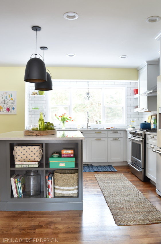
Having open shelving also allows the ability to bring color into the kitchen.  Instead of the solid, one-tone look of cabinets, open shelving adds depth and a way to introduce color.

Another way to bring in color amongst the sea of white was on the walls.  The old kitchen paint color was yellow and for the new wall paint I chose a light gray.  Wrong choice.  In the end, I went back to yellow, but this time the sunshine yellow color is a completely different hue – much more lighter & brighter.

And check out the colorful + bold wallpaper in the dining room. It adds a gorgeous focal point to the overall open space.

KITCHEN MAKEOVER REVEAL: before and after kitchen renovation with white & gray cabinets, open shelving, subway tile backsplash, quartz countertops, and layers of color. This kitchen is gorgeous! Check out the entire renovation process @ www.JennaBurger.com

The marble-looking countertops are quartz and truly complete the clean + simple aesthetic of the kitchen.

KITCHEN MAKEOVER REVEAL: before and after kitchen renovation with white & gray cabinets, open shelving, subway tile backsplash, quartz countertops, and layers of color. This kitchen is gorgeous! Check out the entire renovation process @ www.JennaBurger.com

And let me not forget to discuss the lighting…

I am a major light-aholic!  Lighting is SO IMPORTANT.  Lighting makes a statement and with my home, I wasn’t going to skimp.

Go Big or Go Home!

Being completely honest, I had a difficult time choosing the right lighting.  With the cabinetry hardware being polished nickel, I questioned the lighting style + finish.  In the end, I chose these amazing matte black dome style pendants from Rejuvenation for over the island.

KITCHEN MAKEOVER REVEAL: before and after kitchen renovation with white & gray cabinets, open shelving, subway tile backsplash, quartz countertops, and layers of color. This kitchen is gorgeous! Check out the entire renovation process @ www.JennaBurger.com

And for the light above the sink, I decided on this open style glass pendant from Shades of Light.

They are both amazing, compliment each other perfectly, and overall I am in love with the many different finishes in this kitchen.

KITCHEN MAKEOVER REVEAL: before and after kitchen renovation with white & gray cabinets, open shelving, subway tile backsplash, quartz countertops, and layers of color. This kitchen is gorgeous! Check out the entire renovation process @ www.JennaBurger.com

There you have it…

We have to look at a before & after comparison.  Check out how far this space has come in 6 years…

KITCHEN MAKEOVER REVEAL: before and after kitchen renovation with white & gray cabinets, open shelving, subway tile backsplash, quartz countertops, and layers of color. This kitchen is gorgeous! Check out the entire renovation process @ www.JennaBurger.com

Do you see how / why I’m in disbelief that this makeover really happened?!

Here’s another walk down memory lane view…

KITCHEN MAKEOVER REVEAL: before and after kitchen renovation with white & gray cabinets, open shelving, subway tile backsplash, quartz countertops, and layers of color. This kitchen is gorgeous! Check out the entire renovation process @ www.JennaBurger.com

This has been a strenuous – what big renovation isn’t? – but wonderful renovation process.  I won’t lie, I’m glad it’s DONE, but I can’t ask for anything better. And that is a project labeled SUCCESS.

RESOURCES

I’ve showed you what the kitchen looks like, and now it’s time to share the scoop on the sources…

Cabinets
Perimeter Cabinets: Kraftmaid, color – Dove White, door style – Cayden
Island: Kraftmaid; color – Greyloft, door style – Cayden

Appliances
Frigidaire: Smudge-Proof Stainless

Countertop
Quartz: Silestone, color: Lagoon

Cabinet Hardware
Kraftmaid, Fordham Bin Pull, Polished Nickel

Backsplash
Tile: Allen + Roth 3×6 white subway tile; Grey grout color

Paint Color
Wall Paint: HGTV Home by Sherwin Williams, color – White Citrus, finish – satin

Pendants over Island
Rejuvenation, Haleigh Wire Dome Pendant 12-inch, oil rubbed bronze

Pendant over Sink
Shades of Light, Clear Glass Prism Pentagon Pendant

Sink + Faucet
Lowes, Vigo 32″ x 19″ Stainless single-basin Undermount with Industrial Faucet

Wallpaper (in dining area)
Anthropologie, Frosted Kaleidoscope

Accessories
Pineapple Art – Hobby Lobby
Blue Geometric Rug – Target
Sisal Runner – Target
Bowls – Crate & Barrel, Homegoods
Cutting Boards – World Market
Yellow Industrial Barstools – Target

I think that wraps it up.  Something you liked and want details on… email me!

If you want to see all the posts documenting the kitchen renovation, here they are from start to finish:
Wonderful White Kitchen Inspiration
Kitchen Remodel: Before + Plan of Action
Demo Day: Steps for Demolishing the Kitchen
Kitchen Progress: Staining Hardwood Floors
The Cabinets Arrive + Get Installed
Natural Quartz Countertops in the Kitchen
10 Countertop Materials to Consider for the Kitchen
Subway Tile Installation + Choosing the RIGHT Subway
Kitchen Backsplash Tile Options + Inspiration
Choosing a Paint Color + Wallpaper for the Kitchen and Dining Room
Kitchen Renovation: The Appliances
Dissecting the Details
Kitchen Renovation: REVEAL + RESOURCES

DISCLAIMER: THIS KITCHEN RENOVATION IS A COLLABORATION WITH LOWE’S, KRAFTMAID, FRIGIDAIRE, AND HGTV HOME BY SHERWIN WILLIAMS.  ALL OPINIONS + SELECTIONS ARE MY OWN WITH THE ASSISTANCE OF THE LOWE’S DESIGN TEAM.

How to Get the ‘Fixer Upper’ Look in Your Home

I’m mildly obsessed with the show Fixer Upper. Who isn’t? I haven’t met anyone that doesn’t love the hugely popular HGTV design show.

The farm.

The goats.

That house.

Her gorgeous design style (and her boots).

His humor + wit.

Their love + playfulness.

Come on, it’s all perfection!

Who doesn't love the HGTV show Fixer Upper with Joanna + Chip Gaines?! Check out these 5 Ways to Get the 'FIXER UPPER' style in your home. Inspiration round up by www.JennaBurger.comPHOTOS VIA: DESIGN MOM, HOOKED ON HOUSES, POP SUGAR, HGTV.COM

Joanna and Chip – yes, we’re on a first name basis – are over-the-top outgoing, down to earth, and just plain ole’ REAL – if that’s not how they are in real life, they’re incredible actors.  They just click with viewers and I, like most of you, become 110% wholeheartedly engaged as soon as I turn on the show. Even my kids love it.

BUT ASIDE from the couples fun loving personality, their design style is equally simple, chic, clean and most important of all, meaningful. They truly create homes that their clients – and us viewers – drool over.

To score a meeting with the fabulous design duo might be tricky, unless you live in their neck of the woods in Texas, but that doesn’t mean you can’t achieve a similar aesthetic in YOUR HOME.

You too can get the ‘fixer upper’ look. Here are 5 ways to do it…

Who doesn't love the HGTV show Fixer Upper with Joanna + Chip Gaines?! Check out these 5 Ways to Get the 'FIXER UPPER' style in your home. Inspiration round up by www.JennaBurger.comLet’s break it down…

NEUTRAL HUES

Once Chip finishes the shell, Joanna swoops in to put her magical touches on the interiors to truly make the renovated house into a home.  Most of the spaces that Joanna creates are a neutral color palette using varying shades of taupe, beige, gray, cream, white, and maybe a few accents of green and/or blue are thrown in.  This chic, yet comfortable farmhouse, industrial aesthetic that she creates feels modern, but lived-in.  It feels new, yet old.

The beauty of choosing a neutral palette throughout the home is to create flow + cohesiveness.  Each room isn’t just a room on it’s one, but the multiple spaces become one; it’s the whole versus just the part. Layers of color can be introduced upon the neutrals, which can easily be swapped out with the changing seasons & holidays.  But overall, neutral is quiet & serene.  With the hustle + bustle of our lives, a calm palette is what’s needed to relax & rejuvenate.

Choosing a neutral color palette can be challenging because there needs to be substance in other ways.  And that oomph is brought in through texture, which leads to the next idea for getting the fixer upper style

Who doesn't love the HGTV show Fixer Upper with Joanna + Chip Gaines?! Check out these 5 Ways to Get the 'FIXER UPPER' style in your home. Inspiration round up by www.JennaBurger.com

VIA BHG.COM

Who doesn't love the HGTV show Fixer Upper with Joanna + Chip Gaines?! Check out these 5 Ways to Get the 'FIXER UPPER' style in your home. Inspiration round up by www.JennaBurger.comVIA BHG.COM

Who doesn't love the HGTV show Fixer Upper with Joanna + Chip Gaines?! Check out these 5 Ways to Get the 'FIXER UPPER' style in your home. Inspiration round up by www.JennaBurger.com

VIA BHG.COM

TEXTURE

When using neutrals, texture is a must to introduce balance + depth.

So what does that mean & how do you do it?  Add texture using pillows made of differing materials. Introduce chippy, distressed furniture.  Maybe something with a glaze overlay. Bring in elements from the outdoors.  Try a large wood bowl on the dining table or a rustic sign from a local vintage shop.  Dimensional items add interest and texture will balance the neutral.

Who doesn't love the HGTV show Fixer Upper with Joanna + Chip Gaines?! Check out these 5 Ways to Get the 'FIXER UPPER' style in your home. Inspiration round up by www.JennaBurger.com

VIA BHG.COM

Who doesn't love the HGTV show Fixer Upper with Joanna + Chip Gaines?! Check out these 5 Ways to Get the 'FIXER UPPER' style in your home. Inspiration round up by www.JennaBurger.com

VIA BHG.COM

ORGANIC ELEMENTS

From potted plants in a vase resting on a book to an entire greenhouse in the center of the home, Joanna consistently designs spaces introducing organic elements from the great outdoors.  Whether using reclaimed wood to create a kitchen island or hanging floating wood shelves on a wall paired with industrial plumbing pipe, bringing the outdoors in is a huge component if trying to achieve the fixer upper look.

Who doesn't love the HGTV show Fixer Upper with Joanna + Chip Gaines?! Check out these 5 Ways to Get the 'FIXER UPPER' style in your home. Inspiration round up by www.JennaBurger.com

VIA BHG.COM

Who doesn't love the HGTV show Fixer Upper with Joanna + Chip Gaines?! Check out these 5 Ways to Get the 'FIXER UPPER' style in your home. Inspiration round up by www.JennaBurger.com

VIA BHG.COM

WORDS 

From their own home to their clients homes, the Gaines duo consistently incorporates sayings, signs, quotes, and everything in between with words.

Words are powerful.  Words make a statement. And in the homes they create, words equal meaning.

Who doesn't love the HGTV show Fixer Upper with Joanna + Chip Gaines?! Check out these 5 Ways to Get the 'FIXER UPPER' style in your home. Inspiration round up by www.JennaBurger.com

HOME DESIGNED BY JOANNE + CHIP GAINES, VIA HGTV.COM

Who doesn't love the HGTV show Fixer Upper with Joanna + Chip Gaines?! Check out these 5 Ways to Get the 'FIXER UPPER' style in your home. Inspiration round up by www.JennaBurger.com

VIA LIZ MARIE BLOG

Who doesn't love the HGTV show Fixer Upper with Joanna + Chip Gaines?! Check out these 5 Ways to Get the 'FIXER UPPER' style in your home. Inspiration round up by www.JennaBurger.com

HOME DESIGNED BY JOANNE + CHIP GAINES, VIA HGTV.COM

Who doesn't love the HGTV show Fixer Upper with Joanna + Chip Gaines?! Check out these 5 Ways to Get the 'FIXER UPPER' style in your home. Inspiration round up by www.JennaBurger.com

HOME DESIGNED BY JOANNE + CHIP GAINES, VIA HGTV.COM

THE DETAILS

The most important and often the most challenging part is pulling it all together with the details.  From lighting to wall decor to accessories, the details are what pull it together to make a home complete.  Joanna has impeccable taste + an incredible eye to add just enough to blend the new with the old.  Elements that she introduces are meaningful and collected.

A house doesn’t become a home overnight.  Take your time.  Enjoy the hunt. Be inspired.  Be creative. Have fun.  Add in aged elements amongst the new + sleek. Create a space that is liveable + comfortable, yet not stark + bare.  Don’t be afraid.  What’s the worst that can happen if you put a nail hole in the wall? Make mistakes and learn from them – I’ve made plenty.

I adore this quote that Joanne shared, “I like to encourage women to always remember that their home is a reflection of their hearts and of their families, not a magazine or like someone else’s lifestyle. Keep it true to who you are. It’s important you love your home and that your children are inspired by it. I learned in our recent move that it’s not about the curb appeal or amenities…it’s about the spaces you create and who you create them for.”

So true!

Who doesn't love the HGTV show Fixer Upper with Joanna + Chip Gaines?! Check out these 5 Ways to Get the 'FIXER UPPER' style in your home. Inspiration round up by www.JennaBurger.com

VIA BHG.COM

Who doesn't love the HGTV show Fixer Upper with Joanna + Chip Gaines?! Check out these 5 Ways to Get the 'FIXER UPPER' style in your home. Inspiration round up by www.JennaBurger.com

VIA BHG.COM

Who doesn't love the HGTV show Fixer Upper with Joanna + Chip Gaines?! Check out these 5 Ways to Get the 'FIXER UPPER' style in your home. Inspiration round up by www.JennaBurger.com

HOME DESIGNED BY JOANNE + CHIP GAINES, VIA HGTV.COM

What makes the fixer upper style different?

As I was gathering inspiration for this post, I realized what sets the fixer upper style apart.  Even though the overall spaces Joanna designs are neutral, they are so engaging, warm, and full of life.  They evoke a sense of welcoming – exactly what a home should feel.  New furniture is mixed with old.  Modern blended with vintage. Function integrated with aesthetically beautiful.

Joanna’s style is not really unique, yet it totally is because of how it all comes together to read as one.  It’s not about the individual items in the room, but instead how each item is brought together to create the whole.  Her compositions are just simple, thoughtful, and meaningful.

20 words that describe the fixer upper style

Simple

Clean

White

Texture

Eclectic

Industrial

Shiplap

Farmhouse

Metal

Wood

Serene

Old

Organic

Aged

Rustic

Meaningful

Family-Friendly

Welcoming

Dramatic

Calming

I truly enjoyed putting this post together – more so than I thought I would – and dissecting the aesthetic of a designer I truly admire (and kinda want to be – yes, I’d love to have goats and live on a farm in a big ole farmhouse!).  So many of you love the show Fixer Upper, as do I, but I think we are not only drawn to the gorgeous homes + beautiful rooms that are created, but the whole package of the Gaines pair.

Are y’all ready to see your fixer upper?

Who doesn't love the HGTV show Fixer Upper with Joanna + Chip Gaines?! Check out these 5 Ways to Get the 'FIXER UPPER' style in your home. Inspiration round up by www.JennaBurger.com

VIA HGTV.COM

Kitchen Renovation: Paint + Wallpaper

You know if we’re at the point of talking about paint, it has to almost be complete.

That’s right… we are mere days away from wrapping up the kitchen renovation and I still can’t believe it’s real.  When I look over to our kitchen area and my eyes see an entire new space, I want to cry.  It’s so good!

Kitchen Renovation: Choosing a paint color for an open concept floor plan + adding accents of wallpaper. Follow along on this before + after kitchen remodel @ www.JennaBurger.com

One challenge I had when creating the plan of action for the kitchen was the paint color for the walls.  After living with the mustardy-yellow for 5 years, I new light + neutral was the right direction – but then along the way my thoughts changed.  keep reading…

This is the old color.

Old mustardy-yellow paint color that had to go!

The first floor of our home is an open concept plan, so basically it’s one room that leads to the next, that leads to the next. There has always been a different paint color in each room, which I feel defines each of the spaces bringing uniqueness and character.

Creating definition, but at the same time a flow with various paint colors can be challenging, but if a color palette is set that works well together, the result can be gorgeous.

Of course, that’s what I was striving for >>> VARIATION + FLOW

THE PAINT STORY

After the kitchen cabinets were installed, the Lowe’s independent contractors got to work on painting the kitchen + dining room walls because it’s one large open space.

Painting the walls

I chose a paint color that was a light grey tone.  It was a pretty hue, but once all the walls were covered, I knew it wasn’t right. Because the kitchen flows straight to the family room that also has grey-toned walls, the definition that I wanted to achieve was gone.

Big Mistake – eek. 

What to do?  Leave it + live with it for a while?

I knew leaving it wasn’t the answer.  After a few days, of living with it, I chose a new color.  It was the first time ever that I got small color sample pods to put on the wall.  It was the right decision and seeing the colors at various times throughout the day was key to choosing the best paint hue for the space.

Color Change…

Kitchen Renovation: Choosing a paint color for an open concept floor plan + adding accents of wallpaper. Follow along on this before + after kitchen remodel @ www.JennaBurger.com

As soon as the ‘new, new’ color went up, I felt at peace.  Yes, that’s it.  And who knew, back to yellow – but a very different hue of yellow – would be the right color?!

For the walls in the kitchen + dining room, I chose to use the color White Citrus HGSW1237 by HGTV Home by Sherwin Williams, which is available at Lowe’s.  The sheen is eggshell (one step up in sheen from flat) and I used their Showcase line of paint.

White Citrus HGSW1237 by HGTV Home by Sherwin Williams

The color on the wall is just gorgeous and brings all the spaces together.  It’s not very far off from the last yellow paint color, but at the same time, it feels so new + fresh.  To sum it up, this White Citrus paint color is a light buttery + sunny hue with subtle green undertones.

Sherwin Williams has always been a favorite paint of mine to use.  The quality is like no other.  I’ve used a lot of paint in my day, and have come across a lot I will never use again.  When I was introduced to the HGTV Home collection by Sherwin Williams, I was intrigued because it was available at Lowe’s, a place I always shop.  So the big question I had… Is the quality the same as the Sherwin Williams brand it’s always been or did they ‘change the formula’ for the big box store?

I had the opportunity to speak with a rep for Sherwin Williams, who has worked with them for over a decade and he assured me the quality is the same and their collaboration with Lowe’s was a ‘next step move’ to continue their growth and brand awareness to a new market.  Basically, they want to reach even more people and by being in Lowe’s (versus just their own stand-alone store), they hope to do that!

I was skeptical about the quality, but I will say I had a great experience using the Showcase line of HGTV Home paint.  It went on smoothly with a roller AND a brush. Most paint takes 2, maybe 3 coats, to get full coverage on the wall, but this paint went on in one coat yet it wasn’t thick and goopy.  Of course, I went over it with a 2nd coat, but it really wasn’t needed.

THE PAINT RESULT

The yellow hue defines the kitchen + dining room space, yet flows with the neutral colors in the family room beyond…

Kitchen Renovation: Choosing a paint color for an open concept floor plan + adding accents of wallpaper. Follow along on this before + after kitchen remodel @ www.JennaBurger.com

Next to the kitchen is the living room / office which is a deep navy hue, and the yellow works beautifully with that as well…

Kitchen Renovation: Choosing a paint color for an open concept floor plan + adding accents of wallpaper. Follow along on this before + after kitchen remodel @ www.JennaBurger.com

Kitchen Renovation: Choosing a paint color for an open concept floor plan + adding accents of wallpaper. Follow along on this before + after kitchen remodel @ www.JennaBurger.com

THE WALLPAPER

I heart wallpaper and really wanted to use it somewhere in the new kitchen space. At the same time, I always wanted to define the bay area in the dining area with a different paint color.

How about ditching the paint idea and instead add wallpaper in the bay nook? YES, perfect solution.

I found this incredible bold + colorful wallpaper from Anthropologie.  The rich colors of orange, blue, yellow, gray, raspberry perfectly summed up all the colors in my home… I had to have it!

Kitchen Renovation: Choosing a paint color for an open concept floor plan + adding accents of wallpaper. Follow along on this before + after kitchen remodel @ www.JennaBurger.com

Once it was delivered a few days later, I got to work.

I primed the walls first.

Prime the walls before wallpapering!

Then installed the wallpaper which took about 3 hours total for this bay area.

Adding wallpaper can add drama and definition to a space. Use a bold pattern in a small area or subtle pattern in a large space. Either way, it will bring beautiful depth and texture to a room. Check out this new kitchen and dining room by www.JennaBurger.com

Want to know how to hang wallpaper?  Check out these WALLPAPER TUTORIALS

Hanging a Bold Wallpaper in the Bathroom

How-To Hang Wallpaper Like a PRO!

How-To Hang Wallpaper using Paste (in the powder room)

I’ve shared enough wallpaper tutorials, so I’ll spare you the details of the process, but this is the result…

Kitchen Renovation: Choosing a paint color for an open concept floor plan + adding accents of wallpaper. Follow along on this before + after kitchen remodel @ www.JennaBurger.com

Kitchen Renovation: Choosing a paint color for an open concept floor plan + adding accents of wallpaper. Follow along on this before + after kitchen remodel @ www.JennaBurger.com

And there you have it.  Mistakes were made.  Sleepless nights were had (well kinda), but the Paint + Wallpaper ARE DONE!

Another checkmark on the to do list.  Next up are the final details and then the reveal…

If you want to see all the posts documenting the kitchen renovation, here they are from start to finish:
Wonderful White Kitchen Inspiration
Kitchen Remodel: Before + Plan of Action
Demo Day: Steps for Demolishing the Kitchen
Kitchen Progress: Staining Hardwood Floors
The Cabinets Arrive + Get Installed
Natural Quartz Countertops in the Kitchen
10 Countertop Materials to Consider for the Kitchen
Subway Tile Installation + Choosing the RIGHT Subway
Kitchen Backsplash Tile Options + Inspiration
Choosing a Paint Color + Wallpaper for the Kitchen and Dining Room
Kitchen Renovation: The Appliances
Dissecting the Details
Kitchen Renovation: REVEAL + RESOURCES

DISCLAIMER: THIS KITCHEN RENOVATION IS A COLLABORATION WITH LOWE’S USING HGTV HOME BY SHERWIN WILLIAMS.  ALL OPINIONS + SELECTIONS ARE MY OWN WITH THE ASSISTANCE OF THE LOWE’S DESIGN TEAM.

2015 Year In Review… A Look Back

Where did the year go?!

Another year here and gone.

It feels like yesterday that I was putting together last years end-of-year recap…

check out recaps from years past: 2014, 2013, 2012, 2011

2015 was another fantastic + rewarding year.  Highlighted with many firsts, it was an exciting + busy year of new projects for our home and for clients.

2015 Year in Review of Jenna Burger Design. Filled with Top Posts + great DIY projects, www.JennaBurger.com

As always, it’s fun and a bit bittersweet to take a stroll down memory lane, but let’s do it. Here’s a recap of the last 365 days

JANUARY started off by coming up with something (a goal, I guess you could say) for what to focus on as the year kicked off.  Living with Intention (a great post that I try to read often) was set forth to truly find the meaning + purpose for tasks set in front of me.  There were many moments where I lost focus over the 12 months, but I’ve tried and will continue to in the year ahead.  With intention in the forefront of my mind, I set forth to clean up + clear out and put together a few round up posts for organizing.

Also for the first month of the year, I shared the reveal of a bathroom project I had tackled, dished on plans for a coming project – the living room, and shared details of 2 national magazines that I was featured in.

All-in-all, January was a wonderful month and set the stage for the 11 after it.

Organization Posts - Get organized in the new year!

[organization posts all in one place]

Bathroom Reveal

[bathroom makeover reveal]

FEBRUARY continued to be a great month in which I started to share some of the nitty-gritty details of the bathroom renovation (creating a simple shelf and one-of-a-kind kids modern fingerpaint art)  + the process of the living room transformation (choosing a black paint color + how to make black walls work).

DIY: Simple Wood Shelf

[simple wood shelf with decorative brackets]

How To Make BLACK WALLS Work in Every Room of the Home

[how to make black walls work in every space of the home]

[favorite black paint colors]

By MARCH was ready to start thinking of Spring, so I shared ideas+ inspiration for freshening up the home for the season, making the house FEEL + LOOK instantly clean, storage solutions using baskets, and 5 favorite surfaces to spray paint.

It also was an exciting month because I was finally able to share details on a kitchen I designed in collaboration with Better Homes and Gardens for the specialty publication Kitchen + Bath Makeovers.  This was year #2 for the cover project.  It was a pretty awesome partnership!

6 Ways to make a Home Feel + Look Instantly Clean

[6 ways to make a home feel + look instantly clean]

5 Surfaces to Spray Paint

[5 surfaces to spray paint]

APRIL strolled in and it was time to finally share the reveal of the living room makeover + resources.  Also for this 4th month of 2015, I shared a client kitchen and living room makeover that I was apart of, how I organized our garage, and our simple spring mantel. Oh and I forgot… I painted our front door (check out the color if you haven’t seen it).  It was a busy month!

Living Room Makeover Reveal

[living room makeover reveal]


Getting Organized in the Garage

[getting organized in the garage]

MAY came with another revamp in our home, but this was a fairly quick one… the laundry “closet”.  It was a horrid space before and now it’s a dream (to me).  It’s amazing how a not-so-lavish laundry can be given new life to look + function so much better!  After the makeover, I shared my 5 favorite ways to revamp a laundry room on a budget – don’t miss them!

after1

[laundry room makeover]

[5 ways to revamp a laundry space on a budget]

May also brought the nice weather so we were finally able to get outside and enjoy the beauty of Spring. With it brought projects, of course.  We tackled, not only, jazzing up the front porch but also adding a stone border to our flower beds (what a difference!) and creating some beautiful outdoor living spaces!

JUNE came and we were still focusing on the outdoors.  We tackled a big project by adding a stone base to the foundation wall in the front of our house to add curb appeal.  It looks so good.

Spring Front Porch with Stone Veneer added to Foundation

[spring porch with stone veneer on foundation]

June also brought about the start of Year 3 of the Creating a Meaningful Home Blog Series.  The incredibly talented + outgoing Mandi of Vintage Revivals kicked off the series and once again, it was a fantastic series filled with fellow Bloggers friends who opened up their homes to show us how they’ve created meaning in the home.

Create a Meaningful Home blog series: Year 3

Vintage Revivals kicks off Year 3 of the Creating a Meaningful Home blog series

[creating a meaningful home: Year 3]

JULY was busy on the blog, but quiet on the homestead. The blog was filled with more of my favorite friends sharing their stories.  In my little spare time while the kids were off on summer break, I had a moment to sit + inspire with a post on decorating with mirrors… it’s a good one!

Ideas for to decorate with MIRRORS!

[decorate with mirrors]

AUGUST vamped up again with some new projects, specifically my office that I spiced up + organized using pegboard (my new favorite thing for every room).  I also went garage salin’ and found the most interesting things

Office Revamp using pegboard for organization

[office revamp using pegboard for organization]

SEPTEMBER arrived.  It was bittersweet to see the summer end – it was a great one – but we welcomed the Fall with open arms by creating a festive front porch with new-to-me wicker chairs and a colorful turquoise table.

Festive Fall Front Porch with COLOR![festive fall front porch with COLOR]

OCTOBER was greeted with a new furniture makeover, a cute Halloween craft, and another project using my favorite pegboard.  Also in October I started as a content creator for Better Homes and Gardens (see all my posts here) and the process of renovating our kitchen began with me sharing a round up of Wonderful White Kitchens!

Jenna Burger, BHG Content Creator

[my better homes & gardens bio landing page]

Dreamy Wonderful White Kitchens roundup, www.JennaBurger.com

[dreamy wonderful white kitchens inspiration]

NOVEMBER began with me finally sharing details about the upcoming kitchen renovation + 2 client projects reveals – beautiful budget bathroom makeover + a stunning stained kitchen.  As the month continued, I shared details on our kitchen makeover, starting with the staining of the hardwood floors. As the month winded down and the Holiday decorations started to go up, I gave you a preview of our home decorated for the Holidays by sharing pictures of the Christmas Mantel.

Tips + Steps for staining hardwood floors! www.JennaBurger.com

[steps for staining hardwood floors]

budget bathroom makeover, a MUST-SEE before & after makeover by www.JennaBurger.com

[beautiful budget bathroom makeover]

DECEMBER, which we are still enjoying for the last hours, has been an interesting month.  Decorating for Christmas (don’t miss my home tour) + the kitchen remodel (cabinet installation + countertops) kept us busy at the beginning of the month, but as the month winds down it’s been fairly quiet, which is bizarre. I know it’s going to vamp up again and be crazy very soon, so instead of fretting over the peace, I am going to enjoy it!

Christmas Home Tour by www.JennaBurger.com

[christmas 2015 home tour]

And there you have it… a recap of the last 365 days!  As another year comes to a close, I’m going to raise my glasses (or my computer mouse) and be thankful for all that’s been blessed to me.  My wonderful journey continues and with each day new + exciting opportunities arise.  As always, in turn, I will do what I know I was put here for and that is to inspire & create greatness.

Cheers to 2016 my friends!

Decorating with Southwest Style

Geometric patterns.

Rich colors.

Artisan-created goods.

All characteristics that epitomize the aesthetic of Southwestern style.

A mix of refined bohemian and Spanish styles, Southwestern decor incorporates warm hues + natural elements like wood, iron, and leather, making the beautiful, rugged style a favorite for those from the ‘burbs to the city.

New post up on BHG.com

Click to read the full article on >>> Southwest Style Decor

Decorating with Southwest Style Decor! Round up post on www.JennaBurger.com

Check out my bio page on Better Homes and Gardens

More content coming soon to be featured on BHG.com!