Last week I was vying to create something for my front door to transition the time between now and Christmas.
I’ve had my Fall wreath up for a while and I was ready for a lil’ change. Then while driving over the weekend, I spotted a large wood star on an old, distressed barn. It got me thinking and inspired my latest creation… a Stick Star which I’m now donning on my apple green front door.
In the front of my home is a 20’+ weeping willow tree and it’s beautiful in the summer, but this time of year with all the wind, the soft, thin branches often easily break off leaving lots of piles. When cleaning up the yard on Sunday, we collected a bunch of branches and I knew they’d be perfect for the foundation of the stick star.
With my son helping out, we collected a good pile of branches and I started out making my new door decor. With my ruler in hand, I trimmed the soft branch to 30″ long. And cut 49 more to have a total of 50.
The branches didn’t have to be exactly 30″, but close to it. After 50 were cut, then I broke them into 5 groups of 10. The 5 groups were used for each “leg” of the star.
This was a dry run and I was pretty happy with the direction it was looking. Surprisingly it actually looked like a star, ha!
It was time to put it together!
I disassembled the star mock-up and separated each star “leg”. Using floral wire (or any thin wire would do), I tied each end of the stick grouping so it was secure and “one”.
Once each “leg” was secure on each end, I put them together to create the star. Once the star was layed out, I secured them together with more floral wire.
Since the floral wire is close to the color of the sticks, it really isn’t visible unless you are close to the arrangement.
And honestly within about 10 minutes, it was done. It was really simple to create and something different than I’ve ever created before. And I have to say, once the sticks are together in a bunch, they are really secure as “one”.
It still needed something though, so I trimmed a few branches and berries from my yard and tucked them within the branches.
This pretty and easy to create stick star can be used all year round and dressed up for any occasion. It can be used on a door (like I used it for), indoors, or outdoors.
For my stick star door decor, I cut a 3″ strip of burlap, attached it with floral wire to the back of the branches and secured the top onto the head of the door with push pins. There’s no damage to the door and it can easily be switched out.
And here is the result…
My stick star was super simple to create and didn’t cost a penny! The perfect door decor for the coming Holidays or any time of year. I just love simple, just stylish creations!
I’ve shared my ideas and thoughts on how to create a well styled bookcase and today I’m back sharing simple, affordable, and stylish tips on how to create a beautiful table vignette (or any horizontal surface – could be a dresser, buffet, window sill, etc). I just love the word vignette – it sounds so she-she and regal – but getting down to basics, it simply means a pulled together and balanced composition (that’s my meaning, not Webster’s, so please don’t head to your dictionary and quote me- hehe).
A well-styled table vignette is the perfect way to add warmth, interest, and unique character to your home. Inexpensive elements can easily be introduced to create a beautiful and balance composition. It’s really not about the value of the items you display (I have things that have cost mere pennies) , but instead how it’s put together!
Let’s get inspired (and dissect)…
To start off, this vignette atop an antique dresser is fun because of the variety of color. I like color, but that’s my opinion. Color isn’t always needed to achieve a well-styled vignette, but I would suggest adding in a splash here or there – a small dose is better than nothing. This composition works so well because of the layers, as well as varying heights and sized objects – 3 key elements to achieving a stylish vignette. The overall setting is engaging and interesting because of the different textures and unique objects. Vignette via House and Home
Tip 1. Once you’ve chosen your perfect horizontal table to create a vignette, clear everything off. When decorating ANYTHING, it’s a must to start with a blank slate. It’s not only easy to add elements and move them around, but also to see the space in a different way – believe me, it works! I start every revamp (a room or a vignette) by clearing out and then bringing elements in.
Basically a beautiful vignette can be created on any horizontal surface, even a nightstand. Don’t you just love this space? I sure do! In this vignette there is a little pop of color and it goes a long way. It’s nice to make a nightstand look pretty, but I come from the school of thought that it also has to be functional. Meshing the two isn’t difficult. One favorite way is to use a decorative or antique bowl for holding jewelry, which can be layered on top of the book(s) you’re reading. Of course you need lighting – again the lamp is not only functional, but also adds height to the table. Additionally, flowers bring a touch of freshness to a simple vignette. Inspirational Vignette found via Cape Code Collegiate
If you’ve noticed, there is a common theme with each of the three above pictures, and it’s my 3 key elements again – layers, varying heights, and varying sized objects. Instead of a lamp in this vignette, this space has a tall plant filled urn with layered black and white framed photos behind. In front is a nice-sized tray filled with colorful boxes (there is the pop of color again), with more interesting objects of varying sizes and heights to the right.
Tip 2.Choose an anchor: Starting with and positioning an anchor object is the ideal way to begin a vignette. What’s an anchor object? A lamp, floral arrangement, sculpture, etc – basically the dominate piece in the vignette. It’s the focal point of the horizontal surface and brings height to the overall composition.
Tip 3.Layer: Add elements – pictures, artwork, accessories – from the back to the front of the horizontal surface. If there is a wall behind, have something large (picture, photo, mirror) on the wall or a smaller grouping, then layer objects in front on the surface. Again start with the anchor object and layer around. Ideas: Position small pictures in front of large ones. Add a small bowl, vase, or accessory on top of a stack of books. Create a grouping of candles layered in front of each other.
A simple and elegant side table next to the bed. Again the lamp is the dominate feature in this vignette with layered pictures leaning against the wall. Books are layed on their side with a small flower arrangement atop. This table isn’t overloaded with “stuff” (what nightstand should be?), but all the elements are here to create a well-styled table vignette. Vignette via Traditional Home
Love this entryway by my friend, Pamela. It has all the elements to create a complete composition. She started with her large mirror behind, then added a beautiful tall lamp in front to anchor the vignette. Continuing, she introduced inexpensive elements of varying heights and layered them on the top of the table, as well as on the shelf underneath.
A little bit different type of vignette, but still using the same techniques. The large bowl filled with rope is such a strong element in this vignette and is nicely balanced with 2 other elements – a smaller rope filled glass jar and an interesting sea creature (do you know what that is? looks kinda like a porcupine). This grouping has awesome texture and would be simple and inexpensive to create! Vignette found via Pinterest (original source unfound)
Tip 4. Varying Heights and Sizes: Accessories and elements used in a vignette shouldn’t be all the same height and size – that would just look strange. Play with the idea of introducing objects where some are smaller, some are larger, some are thin and tall, some are short and stout. This will allow the layering to be more obvious and easy to create.
Just as you were probably getting comfortable with the idea of 1 major object, layer, and size variation, I throw you a curve-ball.
This table vignette has 2 major focal objects. But it works because they’re the same. If you had one lamp and one large vase on the other said that would have been dominance overload, but this nautical composition works. Also because of the intense main objects, the center accessories are minimal which gives a nice balance. Vignette Inspiration found via Brunch at Saks
Tip 5. Mix it up: Introduce different kinds of interesting elements / objects. Display a mixture of books, accessories, collectibles, DIY creations, and photos.
Tip 6. Display in odds: For some reason, designing in odd numbers (3 or 5 work best) makes better sense than even numbers. Plus you can create a great layered composition with 3 rather than 2.
Tip 7.Affordable Vignettes: Creating a well-styled vignette doesn’t have to be expensive. Honestly it could cost you nothing depending on what you already have on hand. I’m always changing and revamping my vignettes by “shopping my home”. I move objects and accessories from table to table and purchase new pieces when I see something eye-catching and/or on sale. I rarely go to a store specifically to find something. 9 out of 10 times, I see something I like, buy it, and somehow incorporate it now or in the future. Aside from shopping-your-home, Craigslist, thrift stores, estate sales, garage sales, and of course discount stores like Home Goods or TJs are great go-to hot spots.
Tip 8.Enjoy and trust yourself: Just go for it! Don’t hesitate and say you’ll do it later. Go for now and you’ll be so satisified once it’s done. Again, clear everything off to start fresh and new. Then start layering and moving things around. Trust yourself in knowing what you like. Use the images I provided to help you or find inspiration in magazines and pinterest of course. And if you need extra help, I can always be of assistance!
Creating a table vignette can be thought of as tricky or challenging for some, but once those anxieties are lost a beautiful display can be achieved – patience and practice helps too! Hopefully my tricks, tips, and ideas have helped you to create a well-styled table vignette.
If you’re interested in creating a well-styled bookcase, click to this post:
Many of us have a door in our home that leads to the garage. It’s a metal door and so it’s magnetized, leaving the perfect opportunity to jazz it up, bring color into the room, and display kids artwork, coupons, or much more.
I’m always looking for new nooks and crannies to organize and make life easier! The entrance door to the garage is a perfect spot because it’s the way many of us enter and exit our homes.
As I mentioned (and gave you a sneak peak on) the other day when sharing my new foyer floor, our foyer space is not only the entrance area, but also the spot where the powder room, laundry, coat closet, and pantry are located. Lots of functions in just one area and a place I spend alot of time in (mostly doing laundry!)
The door before was a blah white and with the old darker floor, it was a cavernous hallway. Once deciding to paint the door, I chose the same color as my front door – Valspar Olive Tree WV34010. I really love the cheerful apple green color and with all the other vibrant colors going on, adding another hue would be overload.
So here’s the before & after…
It’s amazing what a little paint can do! I started off by grabbing a small trial size container of Valspar paint at Lowe’s. Since the door has no texture, I used a foam roller to apply the paint. It took quite a few coats – about 5 in all.
Once it was finally done, the space already looked so different, but it still needed more.
I had seen this cute idea a while back and thought it would be fun to try it out on this door.
I wanted to make “sections” for the kids artwork, plus a spot for pictures, coupons, and/or school announcements and invitations. Using a ruler and pencil, I outlined the “sections”.
And then painted over the lines with chalkpaint in old white.
Okay, so after it was done, I wasn’t loving the result. I liked the look in the inspiration picture, but it wasn’t working with my white-against-green door. Onto idea #2.
Isn’t it truly incredible what a little paint can do?! Plus this is such a nice area to display some of the kids artwork, especially since the new refrigerator is stainless and non-magnetized.
Do you have a splash of color on your garage entry door? Do you hang anything on it?
I hope you had a nice weekend and if you’re in Sandy’s path, stay safe! We’ll see what she brings our way later today and tomorrow.
In the meantime, I spent much of last week working on my next Lowe’s Creative Team challenge. This month’s project was a “create anything” project and it was the perfect opportunity to redo the foyer floor. This project has been one that I’ve wanted to tackle since moving into our home. The difficulty always has been, how.
The entrance into our home is not only the foyer, but also the space that leads to the garage, our laundry room, pantry, coat closet, and powder room. As being the major entrance and exit path into the home + all these important spaces, I couldn’t grasp the idea of a long period of downtime for this area. With 2 kids and a busy schedule, it was mere impossible to not make this an easy 1 day project. So that’s where the how came in. How could it happen?
Well about a year ago, I learned about Groutable Luxury Vinyl Tile. This treasure has changed my life and saved a whole lotta headaches! I shared my first LVT project earlier this year when I redid my parents floor, and since have used it in many other spots like my bathroom and the kids.
When the time came to tackle this project, it was really the only product that would provide the desired look of ceramic tile (you would never know it’s vinyl) , plus the quick turnaround of starting and finishing in ONE DAY.
What’s incredible about this tile is that once it’s finished, it looks and feels EXACTLY like ceramic tile. You would never know it’s vinyl. Believe me, I would not use something that has a fake look!
My existing floor was in really good condition. None of the tiles were cracked or chipped, and the real reason for the new floor was to aesthetically update the space.
If you plan on tackling this project, it’s important to evaluate the condition of your existing floor. You may need to remove the existing floor or put down a leveler before installing the new floor. Chat with your local Lowe’s customer service peeps. My local guy was really helpful in directing me in the right direction.
To start off, I gathered my supplies for the tile installation part:
Triangle Ruler
X-acto Blade
Spacers ( I used 1/8 spacers)
A pencil
Snips
Cutting surface
There are various ways to start laying the tile. Most commonly, experts say to start the first tile in the center of the room, but for me I wanted a whole tile when you walk into the front door, so I started at that point. Since the room isn’t a perfect square, there really is no “center”.
Installing the tiles is really easy. Similar to regular peel-and-stick tiles (even though these luxury vinyl tiles are much thicker and more durable), you do just that…
Peel the backing off the corner edge (not the entire tile).
Using spacers, lay down the tile starting at the corner edge.
Once the tile is positioned in place, peel off the remainder of the paper backing.
For my foyer floor, I layed as many whole tiles first, then went back and tackled all the tiles that needed to be cut afterwards.
For the tiles that need to be cut, here’s how I tackled them…
Mark the cut with a pencil.
Use a triangle to draw a line and mark the cut.
Score the tile surface 2-3 times with an X-acto blade.
Gently snap the tile where it was scored.
For difficult, none straight cuts, here’s how I tackled them…
Sketch the design to be cut on the tile surface.
Cut out the design using an X-acto blade.
See if it fits and make needed adjustments.
Stick it down. It doesn’t need to be perfect because once it’s grouted, many imperfections aren’t obvious.
I put together a quick video (it’s pretty amateur, so don’t poke fun please) of how I cut the pieces if you need more know-how!
Ok, so once the tiles are set, you can move RIGHT ON TO GROUTING. That’s one of the beauties about groutable vinyl tile – there’s no downtime or waiting like with ceramic tile or natural stone.
To prep for grouting, it’s important to cover the areas where you don’t want grout. Basically that’s the base mouldings around the room. For this, I find it easiest and best to apply painters tape around the perimeter of the room.
Onto my favorite part because at this point, you’re more than halfway done 🙂
For the grouting steps, I gathered my supplies of:
Bowl of water
Tile sponge (one side has a sponge, the other side is abrasive)
Tile float
Luxury Vinyl Tile Grout
The tiling process for vinyl tile is exactly the same as if it were ceramic, but the grout itself is different. There is specially made pre-mixed grout specific for luxury vinyl tile. I used pre-mixed grout made by Precision Components which I found at Lowe’s in the same section as the groutable vinyl tiles. This premixed sanded acrylic grout has “good flexural strength and adhesion†and is recommended to use over traditional cement grouts.
*Don’t use sanded grout that you mix yourself!
I started applying the grout by the stairs, so I knew I could back out of the space without stepping on what I just grouted. Even though it’s okay to walk on the tiles, the grout does need time to set and dry. Once ready to apply the grout, I found it best to use a low angle and then a higher angle to wipe the excess away. Once the joint is filled with grout, you want to wipe as much away as possible so not to have huge clumps of grout left on the tile – it just makes more work to clean up.
Once you’ve got a section of about 3′ x 3′ covered in grout, use a damp sponge to wipe away the grout.
You can easily notice the areas that have been grouted and the areas that haven’t (yet).
Once the grout is completed, I took the tape off. It’s very important – and I’m only sharing this from a bad experience – to remove the tape when the grout is still somewhat wet otherwise once it’s hardened it’s near impossible (been there, done that).
Once the tape is off, the floor was done! YES. Major Project COMPLETE. This is a huge checkmark off my DIY list. Here’s the result…
This is the hallway that leads to the garage with the doors to the washer/dryer on the left and the doors to the coat closet/pantry on the right. I recently added a splash of color to this door and since it’s metal, it’s been a great place to display the kids artwork, coupons, etc. I’ll share more on that in a future post.
Do you see a little something sitting at the front door? That’s our new little 4 month old kitty. She’s so cute and she loves the new floor – hehe!
Groutable Vinyl Tile PROS and CONS
Affordable – Luxury Vinyl Tile runs about $1.00 – $2.00 sq. ft. and compared to ceramic or natural stone, it is very inexpensive. The tiles which I purchased from Lowe’s were $1.18 and the premixed grout (for my 200 sq. ft. space, I used 2 tubs) cost $8/each. Ceramic tile is available in a range of prices, but usually starts at $2 per sq. ft. , so the savings right there is 50%.
No Experience Required – And I’m completely being honest with you. It’s easy and if you’ve never tiled before, you can do it! I think a person with little experience can complete this project with ease. Measuring and cutting is really the most difficult part of the project, so take your time and measure correctly! Installing ceramic tile is not difficult, but it is tricky and experience is helpful. Cutting ceramic tile can often be difficult and time consuming. For prior ceramic tile projects, I’ve used tile snips, a tile cutter, and a wet saw. A wet saw is the best for cutting ceramic tile, but it’s not easy – I’ve made alot of mistakes. In my estimation, ceramic tile would take about double the time for installation compared to installing groutable vinyl tile.
Grout Right Away – Immediately after you install the groutable vinyl tiles, you can start the grouting process. This makes the entire process possible to complete in one day. With ceramic tile, after you finish laying it, you have to let the adhesive dry for 24 hours before grouting, which results in a 2+ day project, so essential ceramic tile takes double the time.
Availability and Selection – I purchased this groutable vinyl tile at Lowe’s, but other home improvement stores also offer similar products. The selection is not as vast as ceramic tile (which is a con), but I was surprised by the wide range of colors and textures.
One important part to mention is that the surface must be level underneath. If there is any flexibility in the subfloor, ie: gaps between the tiles and the subfloor, then the grout could crack and pull away from the tiles – this could happen with ceramic tile and LVT. Overall though, it’s a great product with an amazing result. As being a huge part of our home, this new floor sure brings a smile to my face!
Onto the giveaway, which is HUGE!
Now’s your chance to try this project in your home or something completely new and different. Lowe’s is generously giving one winner a $100 Gift Card to their store – how cool?!
This is the first giveaway that I’m using rafflecopter, so please email me if you’re having trouble – jburger.design@gmail.com (fingers crossed it works!).
Disclosure: I am part of the Lowe’s Creative Team and was provided with a Lowe’s gift card to purchase items for my project. I was also compensated for my time to use the products. No one told me what to create, what to buy, how to use the product, or what to write. All opinions are 100% mine!
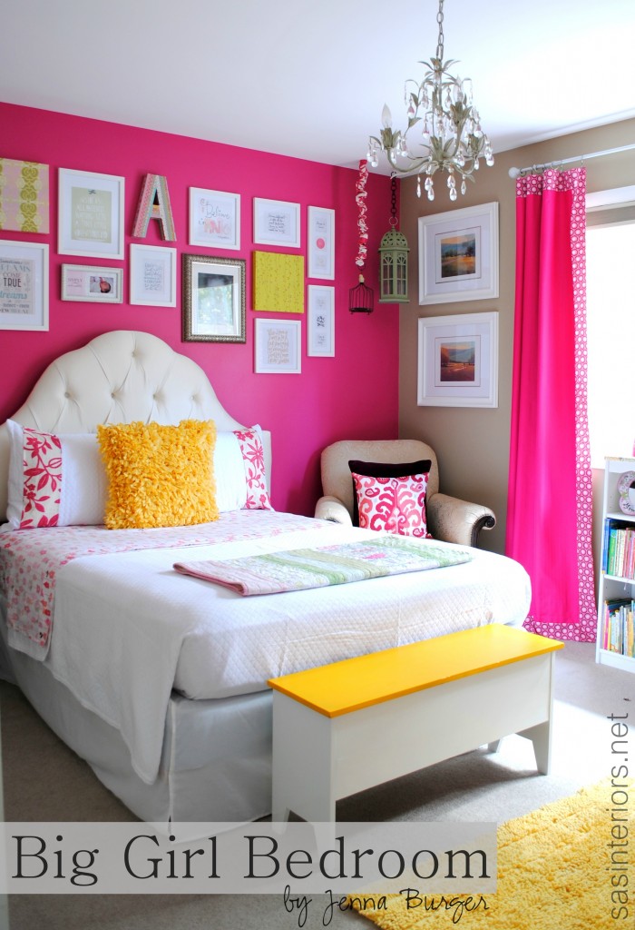
It was a beautiful space, but since turning 3, she was in need of a big girl room with a big girl bed. Many of the elements in her room stayed, while others got “jazzed up” a bit.
Here was the room concept…
and, here’s the result…
My favorite element in the room is definitely the new tufted headboard – and I have to confess, I didn’t make it, but instead bought it. It’s an off-white scalloped headboard and pops against the strong and vibrant fuschia focal wall. When I chose the color for the space, which was painted before honeysuckle was named Pantone’s Color of the Year in 2010, I was hoping it would “live” through my daughter’s growing ages and stages. Thankfully I can stay it has. It sure was nice to start the work in her room without having to repaint.
My other love in this room is the new kids play tent that I created in the corner of the room to the right as you walk in. It was the ideal little nook to add height, drama, and a little secret hideaway.
The corner cabinet was in the nursery space before, but I revamped it by adding fabric and ribbon within the 4 panels. By measuring and cutting pieces of drop cloth, I added ribbon trim surround and then secured it with a pretty thumbtack in each corner. Then to finish the look, I reused the bird wall appliques from the nursery and added them to the drop cloth panels. It was a fairly easy update and softens the look of the cabinet.
The leaning book rack is part of “A’s” old crib. I love this idea, but can’t take credit for it. I saw it on Lindsay’s blog a few months ago and filed it away (in my head) for this new room. I love for Miss A to see the actual book covers and similar to the pallet shelves I made for my son’s room, I love how the book covers bring so much color into the space.
And lastly above, I mounted “A’s” baptismal dress and hat into two different sized white framed shadow boxes. (I gotta give the mister credit for this one – it was his idea)
I have a soft spot for quotes and inspirational words.
I often share special sayings on my FB page and my Great Quote board is a favorite on Pinterest. For a while, I’ve been wanting to create an inspiration wall.
When the ideas started to flow for this room, I knew “A’s” room was the best opportunity to display all the wise words said by wise people. There’s no symmetry to the wall (which allows the possibility for the wall to grow), and I mostly stuck with simple white frames while adding in a a few pictures and fabric wrapped canvases.
The “before” room was a combo of fuschia with soft greens, but for this new space I wanted it to be even more pow and decided a bright yellow would be the perfect addition. And just a little goes a long way.
For the windows, they got a slight update as well. First of all, I took the curtain rods and spray painted them a glossy white finish. They were silver with clear ball finials purchased from Ikea about 5 years ago for my son’s first room. Since I took them off the wall for the update, I also thought raising them higher was a must. To reuse, but change the curtains / drapery panels, I added a 3″ decorative trim band to the top, side, and front of the curtain. This gave them a designer, custom look for pennies. A tutorial on how to do this is coming soon!
Lastly, I painted all the mouldings – window trim and base trim – in the room to white and what a BIG difference that made.
I also needed another spot for more books. I upcycled an old wood bookcase from the basement, sanded it down and painted it white. Then to add a little pizazz to the top, I purchased this pretty decorative paper from a store in my home town. I then added a few coats of mod podge to protect it, and it was completely revamped!
To sum up all the details, here’s a breakdown…
1. Thrift Store Nightstand – was previously used as a sidetable in the nursery and is now a nightstand 2. NON-DIYed headboard, but I love it – Wayfair tufted high arch headboard 3. Quilt and shams – Joss and Main (sale expired) – I added a large fabric band at the edge of each sham; Yellow pillow – Homegoods; Sheets – Target on sale for $12 4. Washi Tape Initial (click here for tutorial) 5. Birdhouses – hung from ceiling and added a fabric cover to the chain 6. Inspiration Wall – white frames from AC Moore; Square fabric covered canvases from nursery 7. Pillows on side chair – plum colored pillow from Crate and Barrel; Ikat pillow made by me with fabric from Duralee 8. Window Panels – fuschia panels purchased for nursery from Bed, Bath, and Beyond. I added a 3″ decorative trim band at the top, side, and bottom (click here for tutorial) + used white spray painted on the old silver rod and raised it to be higher. 9. Bench with hinged top – found at a garage sale last year. It was wood which I primed and painted white on the sides and yellow on the top
10. Corner Cabinet – Added fabric & decorative ribbon in panels 11. Reused crib mobile – DIY created crib mobile using a stick and fabric birds 12. Framed baptismal dress – Shadow box purchased from AC Moore to display baptismal dress and hat 13. Crib Railing Book Display 14. DIY: Kids Play Tent (click here for tutorial)
I have to say, I just love spending time in this new totally girly room with my big girl… and she loves it too! Thank you for checking out the reveal of this room makeover. I’ve got a few DIY tutorials coming up for this space, plus my first Lowe’s Creative Team challenge projectlater this week.
The makeover has been takin’ a wee-bit longer than anticipated, not because of design challenges (thankfully) but because of her actually using the room (to sleep, to play, etc.), lol. I tackle many of my projects while the kids are fast asleep and dreaming, so to actually work in her room has been challenging.
Thankfully I had some time this past weekend to get my hands dirty and this is a project that I just finished up and couldn’t wait to share… Washi Tape Initial Wall Decor.
Have you heard of washi tape (don’t be embarrassed to say no)? Until recently, I didn’t. I had seen this crafty goodness all over the web but didn’t actually know what it was or how to use it. So what did I have to do? Buy it, of course!
Here’s the DL on washi tape It’s basically pretty patterned tape. Imagine typical tape with a pattern. So it’s easy to add to anything to dress it up a bit -paper, a present, anything…
I recently was asked to check out the new online craft store, Consumer Crafts. While searching the site I found a huge selection of washi tape, plus this awesome large initial letter that I had been searching for, for a while. Since not using washi tape before, I didn’t really know what I was getting myself into it, but in the end, I…. well you’ll just have to keep reading to see what I thought.
Once my package arrived (within a day or two – it was amazing how fast my supplies came), I laid everything out – Large initial letter, washi tape, and mod podge (I was initially thinking of using duct tape, but opted not to) – and got to work.
The most difficult part of using the Consumer Crafts website was stopping myself from filling my basket with $100s of dollars of stuff – they really have everything pertaining to crafting! Once I narrowed down my list, and got started on my project, I was good as gold. The colors in my daughters room are vibrant and strong, so the colors of the washi tapes were perfect.
I began at the edge of the “A” with a fun pink and white striped tape, wrapping it around at the top and bottom.
I continued with different washi tape styles and added them edge to edge on the diagonal parts of the “A”, and then continued taping the inner and outer edges.
Lastly, I tackled the connector of the “A”. Washi tape is fairly thin, so it’s easy to cut. I lightly laid out the tape, then using an X-acto blade, trimmed the edge.
Within about 10-15 minutes, the washi tape was done. YAY! To seal it all, I added 2 coats of Mod Podge in Matte – another goodie I ordered from Consumer Crafts.
A few hours later it was dry and DONE!
So my thoughts on washi tape is that it’s GREAT! It’s just like tape with added color and cuteness. I might never use ordinary tape again.
Have you ever used washi tape before? If so, what have you created with this crafty goodness?
Disclaimer: I was given a gift card to order product and test-out the online craft store, Consumer Crafts. I was also compensated for my time to use the products. No one told me what to create, what to buy, how to use the product, or what to write. All opinions are 100% mine!
I hope you had a great weekend and are enjoying the first officially days of Fall – the leaves are starting to change here, how about in your neck of the woods?
Like usual, I’ve been knee deep in creating new DIY projects and one in particular that I just finished up has been on my to-do list for a long time. It took me a while to figure out how to make it, but thankfully I’m thrilled with the result, and the main reason is because it cost less than $10 to make – {complete score}!
I’ve gotta give credit for the technique on how to create this Subway Art to Cheri of I Am Momma – Hear Me Roar and Monica & Jess of East Coast Creative. Both gals created completely different projects, yet both used the same idea of creating an image and having it printed as a blueprint (a thin black & white 24″ x 36″ paper) at Staples for less than $4 – Crazy awesome right?!
Here’s how I did it so you can create a similar travel sign or something completely different using the same cheap blueprint technique…
Using Picasa (my favorite free photo editing program), I started off with a clean white collage using the highest resolution possible and then cropped it to a 24″ x 36″ size so the text would print as clear as possible (at a large scale). A while ago, I had wrote a list of vacation spots that the mister and I have traveled to together over the years and started adding them to the collage in a variety of different fonts. (want to see a few of the fonts I used? Check out my favorites!).
Once I created this collage using my computer, I pulled together the rest of my supplies:
(1) 24″ x 36″ Blueprint from Staples for – $3.60
(1) 24″ x 36″ 1/4″ piece of plywood – $4.00
Spray Glue – $2.50 +/- (50% off with AC Moore coupon)
Mod Podge & Brush
Black craft paint & brush
2 pieces of scrap wood or pallet boards
After my stop at Staples to get my inexpensive print, I then headed to Lowe’s to get a piece of plywood. I found a 3′ x 3′ piece and then had them cut it down to my exact size of 2′ x 3′. Important note: The blueprint might not be exactly to size, so you may want to measure that first before cutting the plywood. I didn’t, but the plywood was only about 1/16″ larger and I sanded the edge with my orbital hand sander, so it fit to size.
To adhere the blueprint to the plywood, I decided on the Aleene’s Tacky Spray which I purchased at AC Moore. I was thrilled with their products that I tried out last year, and thankfully this spray glue worked like a charm!
To stick the blueprint to the plywood, I started at the top edge and sprayed a thin, even coat of glue, just like spray paint, from one side to the other side. Then lined up the corner of the blueprint to the corner of the plywood.
Once the top edge of the print was on, I continued to add the glue in small sections – again spraying from one side to the other.
Once the blueprint was fully on the plywood, I added a coat of Mod Podge to protect the paper surface. I applied the MP from side to side just like the spray glue.
I didn’t forget the sides – it’s a must so the paper doesn’t rip or curl.
Almost done, but I have to admit there were some wrinkly spots once the Mod Podge dried…
Oops, I thought I adhered the blueprint so well. No worries, I then got out my handy-dandy orbital sander and sanded the edges and top surface of the print. I also added in a few “wear marks” to give the sign a distressed look.
Almost finished… to complete the look and to hide the plywood side, I used a black craft paint and painted the 4 edges of the sign.
The sign is complete…
…but wait, we’ve gotta mount & hang it! To give the sign some depth and importance (plus it was slightly bowed because the plywood is thin), I added two vertical pallet pieces to the back. Using short nails with a small head, I hammered them through the sign into the pallets. Then added picture hooks and wire.
Then it was really done!
So fun, So easy, and less than $10 – you can’t beat awesome, personalized wall decor like that!
I’ve been loving the cool temps over the past few days, have you? For me, there’s no transition time once September hits. A switch goes off in my head that says “Fall, Fall, Fall”. Thankfully I haven’t dug out the sweaters yet, BUT I did gather some decor for my newest mantel for the coming season.
Autumn is almost here and after sharing a fun roundup of Fall Fireplace Mantels earlier this week, I’m ready to reveal mine. But before we begin, I have a confession to make… I never showed you my summer mantel. I had great intentions to, but it never happened. No worries, because for Fall I didn’t change much and basically the reasoning is that I just love it. This years Autumn Mantel isn’t overly “themed” and actually isn’t really “fallish”. Basically I kept it simple and added a few festive elements. Take a look…
The change from my Summer mantel to now wasn’t that different or difficult. Since you didn’t see the Summer mantel, this is what it looked like. With the addition of the starfish for the warm months and the simple switchout to pumpkins and ghords for Fall, the mantel was updated in minutes.
I have to say, I’m really happy with the simplicity and monochromatic look of this year’s Fall Mantel. For this mantel, I shopped my home for everything, except one piece – the tall white jar. I had been on the search for something like it and when I saw this beautiful pierced ginger jar at TJ Maxx a few months, I snagged it up – it was attractive and for under $20 it was a must-have! It’s height and detail bring so much character to the mantel. Don’t ya think?!
All the other elements in this Fall decor were seen in last years mantel or were someplace else around the house. The white pumkpins were a great score last year and weren’t always white. If you recall, this is what I did…
It’s amazing what a little white craft paint can do!
In continuing my simple white aesthetic, I spray painted the candle stick white as well. In my other mantels, it was brass, but not anymore. Continuing, my estate sale found mason jars are still filled with lentils and beautiful, bumpy, bright orange ghords were added throughout. I had to add some color. right?!
Those tall glass jars are killer – loved them since the day I bought them which was a gazzillion years ago (more like 10+) from Crate and Barrel. Ya gotta love the Crate!
The birds are another recent find that I purchased at a local home store. They are dark brown, similar to the mantel color and almost blend right in, but they are so cute and add a whimsical touch to the mantel decor.
I think it’s so important to add varying heights and layers when creating a mantel. Think of your mantel composition as a wave – it should go up and down as it moves across. Need more tips on mantel decor? Check out my post on How-To Decorate a Mantel. Looking at others mantels will also help inspire and give ideas. That’s where my roundup comes in handy!
Here’s the overall Fall Mantel.
You might have noticed in some of the pictures that there’s somethin’ different on the wall? Yup, that’s new. There used to be a mirror there, but that got revamped and moved to the dining area. In it’s place is a new distressed stained sign, which was easy to create and is an awesome backdrop. Want to create something similar? Here’s how…
Create a Distressed Stained Sign
1. Measure and cut lumber to the size desired (I used (3) 2″ x 12″ x 48″ piecesof pine)
2. Use (2) horizontonal pieces of lumber to secure the vertical pieces (I used (2) 2 x 4, but any size lumber would really work)
3. Distress the sign using a chain, hammer, nails, etc. to add as much or as little distressing as desired
4. Stain your sign. I used the stain that I had leftover from my staircase which was Ebony, but you can use a lighter stain depending on the depth of color you want to achieve.
Pretty simple, right?! I love how it brings height and depth to the space, yet still creates a great backdrop to the mantel decor. And against the burnt orange wall, it really makes a statement.
Simple and Chic Autumn Mantel. Yes, I’m happy 😉
Have you started your decorating for Fall yet? I’ve got my mums and ghords, and this weekend we’re headed to the apple orchard. O, do I LOVE Fall!
If I could sum up my Summer in DIY terms, it was all about painting. From the staircase to my office chair, from the white shelves to the new blue room, I think there was 2 (or maybe even 3) weeks straight that I had a paintbrush in-hand everyday! Honestly, I’m kind of sick done with painting for awhile. Anyway, alot of projects got accomplished and one in particular were the oak stained wood mouldings that I painted white. All I can say is… WHAT A DIFFERENCE!
The staircase project was what did it and started the process of updating the mouldings. It’s something that I wanted to undertake for a long time, but just didn’t know where to begin. Once I started painting the stair risers and balusters, I realized that painting the trimwork wasn’t too difficult, so I just continued around the room. Even though the staircase was time consuming, the result was completely worth the effort and I knew I would feel the same way once the mouldings were finished.
To start off, I applied painters tape to the wall so only the mouldings (theareas that I wanted to paint) were exposed.
Here’s a snapshot when I painted the area around the window in the living room.
* Sidenote: My walls were already painted, but if you’re undertaking this project and your walls are NOT painted or you plan on changing the wall color, then paint the mouldings first. Believe Me, It’s much easier! So you would reverse the step I just mentioned. Paint your mouldings first and once they are dry, tape the moulding edge (or buy a moulding paint gadget), THEN paint the wall color.
okay, moving on…
Once the tape was up, I was ready to paint. Using my favorite Purdy brush, I applied one coat of Kilz Primer (I’ve heard good things about gripper primer too, but haven’t tried it yet). I didn’t bother with sanding because even though the mouldings were stained, there was no gloss or sheen to them. They were at the point of needing to be restained (to protect them) or painted (as I did). IF you’re undertaking this project and your mouldings have a gloss finish, giving them a light sand is probably a good idea.
Primer for the mouldings is really important. At one window I didn’t use it (by accident – it was late at night – you know the rest…) and you could see the orange color of the stain coming through the paint. No matter how many coats of paint I applied, the orange tint always showed. Now with primer, you may still get the orangey color, BUT when you go to apply the paint color, the orange color won’t come through because the primer will block it. Primer truly is amazing stuff!
After the one coat of primer, then it was time to paint. I continued with the paint I used for the staircase which was, Snowfall White by Benjamin Moore (thanks BM for providing the paint!).
Here’s a snapshot of the first coat of paint.
In most areas, I applied 1 coat of primer + 2 coats of paint, but in some areas I did use 3 coats. It really depended on the finish look after 2 coats.
Once the painting was complete, it was time to remove the tape. I’ll forewarn you – Don’t quickly pull off the tape because you’re freshly painted mouldings might get ruined. When the paint was dry (to the touch – it takes about 20-30 days to fully cure), I pulled off the tape and some of the paint came to. To avoid that from happening, I used an X-acto blade to score the corner of where the moulding and wall meet…
…then removed the tape.
At this point, I noticed that some of the paint bled under the painters tape – so annoying, right? I’ll tell ya, I tried lots of different ways to avoid this, but nothing worked. I even googled it, and I found nada. If you know a secret way, will you share? Until then, this is what I did that worked best.
After removing the tape, I took the wall paint color and my Purdy angled brush, and slowly dragged it down the wall where the wall and moulding meet. It worked perfectly!
And that’s about it… Not too difficult, just alittle time consuming. But believe me, the result is SO worth it. Take it room by room – that’s what I’ve done. Honestly, not all my rooms are completely finished, but most are and the result is so satisfying!
Here is the before and after of the living room…
Want to see some more?
Do you remember when I updated the door hardware? Check out how fresh it looks with the newly painted white mouldings…
And here’s one more. Do you remember the DIY built-in coat rack behind my front door? Well here it is now surrounded by freshly painted mouldings…
What a refreshing update! Well I have a few more painting projects that I worked on over the Summer that still need to be shared, so check back soon!
What painting projects did you work on this past Summer?
I recently shared my newly styled bookshelves, but before I added all the colorful books and stylish accessories, I gave the bookcases a much needed makeover.
Since painting the space deep blue, the once faux-wood bookcases got lost in the dark hue of the walls, and they were ready for a transformation. A crisp, fresh coat of white was the perfect solution to make a statement.
I purchased these two bookcases from Walmart about 2 years ago. Each were around $100 and were not the best of quality (duh, look at the pricetag). Anyway, they fit the bill at the moment, but recently the shelves started to bow. Aside from the decision to paint the bookcases, I also needed to make a few updates so they would last a few more years – I’ll get to more on that later in the post.
Before starting the process of painting the laminate, I did a little research on the process and the first article I saw was Lindsay’s post when she transformed her TV cabinet. It was just what I needed to get me started.
Here’s the bookcase before…
To begin, I gave each bookcase a good sanding with my orbital sander (hands down, my favorite power tool). These bookcases are made of a particle board-like composite with a faux-wood laminate exterior. It was important NOT to sand too much because otherwise the surface would get ruined (since it’s essentially paper), but at the same time it was important to get them ‘roughed-up’ so the paint would absorb into the surface.
Then the next key step was to prime all the surfaces. Like usual, I used Kilz Primer which blocks, seals, and preps the surface for the paint to adhere to the surface. Primer is important, but especially when painting over laminate (as I described above). Unlike wood, laminate is a smooth, non-porous material, so it really needs something to ‘grab’ on to – primer will do the trick! It’s suggested that primer takes 7 days to completely dry – you can take that advice if you’d like, but I didn’t (shame, shame on me, I know). BUT, I did wait about 4 days before painting to really make sure the surface was good-to-go!
My good blogging friend, Diane, recently wrote a post on Gripper Paint. She uses the Glidden brand (Kilz brand has a similar product), and even though I haven’t tried it, this is another great product to use as a primer. The name says it all.
Sidetrack Steps…
At this point of the project, I made the decision to make a few much-needed updates to the structure and look of the bookcase. Instead of moving on to directly painting the bookcase, I decided to replace the shelves and the backing material.
As I mentioned before, the shelves were really bowing – alot – so I took a trip to my hardware store and had a long piece of 2×12 cut into lengths needed for new shelves.
And check out the back of the bookcase… UGLY! It was basically paper and when I started to paint the surface, it started warping even more. Once the decision was made to upgrade the back, I crumbled the paper-backing with one hand…
To fix the backing, I had a thin piece of plywood cut to size. Then the Mister and I flipped the bookcase onto it’s front and nailed the plywood to the perimeter of the bookcase back. (This step might seem difficult, but please be assured it wasn’t – this was probably one of the easiest steps throughout this project).
Now back on track…
After sanding, priming,and making a few updates, it was time to PAINT!
I used a brush for the corners and a roller for the flat surfaces. In certain areas, I used a brush first, then went over the same surface with the roller to achieve a smooth, stroke-less surface. Here’s the bookcase with the first coat of paint…
Here’s a tip. If the surface isn’t sanded or not sanded enough, then the paint will bubble (because it’s not adhering to the surface). Check this out…
This is a No-No!
I’ll be honest, these bookcases took about 3-4 coats until I felt they were fully covered. And even after they were dry to the surface, I didn’t put anything on the shelves for at least a week. Paint takes about 30 days to fully cure and with the heavy books and accessories sitting on them, the last thing I would want would be to have them ruined or peel!
And this is the result…
So refreshing! Then it was time to add the books and accessories.
And here’s a peak at how the bookcases look fully styled with books and accessories. You can check out more by viewing this post.
Painting laminate wasn’t difficult, but I did find it more time consuming than painting wood. To sum it up, the most important steps are to sand and prime all the surfaces before painting. If you were to skip the 2 steps, your paint would have nothing to adhere to and would most likely peel right off. Going into this project, I wasn’t sure of the result and if the paint would even stay since the surface was so smooth, but with the right preparation, I was thrilled with the outcome.