Tag: Saratoga Springs New York

My First Annie Sloan Experience

Yes, using Annie Sloan Chalk Paint is an experience!

If you have no idea what I’m talking about and/or have no idea who Annie Sloan is, no worries, just keep on reading.  If you do know about ASCP, stick around and see if you’ve had a similar experience (I’d love to hear your thoughts).

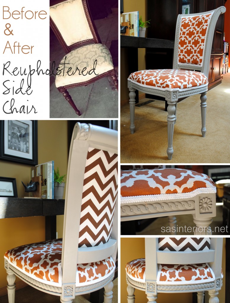
I shared the result of my first Annie Sloan paint project yesterday and the response was unbelievable.  Thank you ALL for your kind comments – I was blown away by your kindness!  If you missed the reveal, I revamped and reupholstered a side chair for my desk.  Before the reupholstery could begin though, I painted the chair frame with my newly purchased Annie Sloan Chalk Paint.  I had never used this paint before and it was quite an experience.  I shared a little about it yesterday, but wanted to go more in-depth with a dedicated post.  So here we go…

I’ll start off by saying, I had some issues and jumped a few hurdles, but got through it. (but keep reading please…)

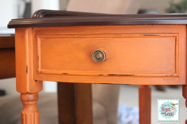
Many of my blogger friends have used the Annie Sloan Chalk Paint and the results are amazing. One that really sticks out in my mind is Erin’s table and it’s probably because of the vibrant orange color with the antique dark wax.  This piece turned out amazing and after reading her post and seeing her pictures, I was sold and had to place my order.

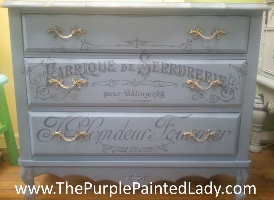
In the meantime, I also (virtually) met Trish of The Purple Painted Lady and saw this piece which blew me away. Trish and I corresponded back and forth a few times.  She gave me amazing tips and techniques on using the paint and wax, so I thought I was on my way.

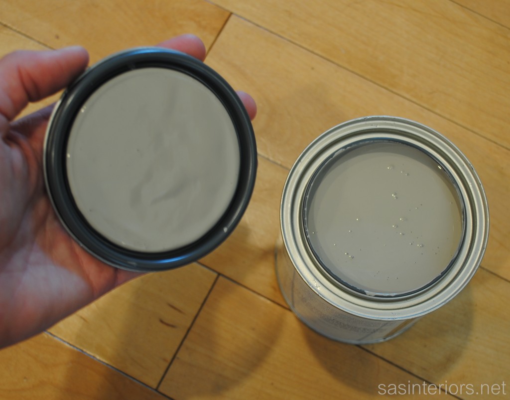
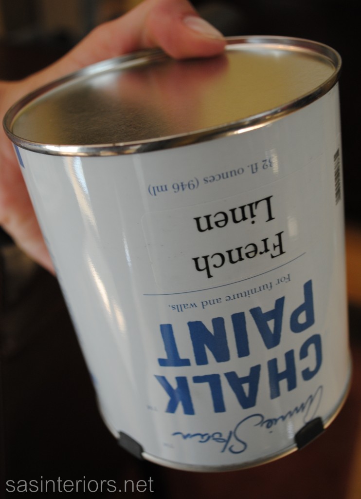
I ordered a quart of the French Linen color, which seemed similar to the taupe hue that can be seen throughout my home, and a can of the clear wax.  My shipment arrived a few days later and an anxiety came over me.  After ALL the many DIY projects that I’ve taken on, I was actually nervous to paint.  Yes, paint.  How could I be nervous??  I think I hyped up the idea of this magical formula so much that my gung-ho attitude went out the door.  And for me, when I’m nervous, things go wrong.  Does that happen to you?

I started off as I was instructed to (by Trish) and turn the can upside down for at least 60 seconds.  Basically, all the good stuff settles to the bottom and needs to be well mixed around. Of course, shake and stir as well.

Then I started painting.  Yup, I started painting WITHOUT stripping, sanding, or priming the existing wood.  That’s the beauty of chalk paint.  It’s designed to adhere to most any surface including wood, concrete, vinyl, and even bathtubs (I learned that from Trish too).  Plus it provides 50% more coverage compared to latex, so the 1 quart can goes a LONG WAY – for this chair, I hardly used any paint.

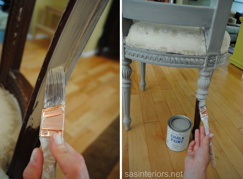
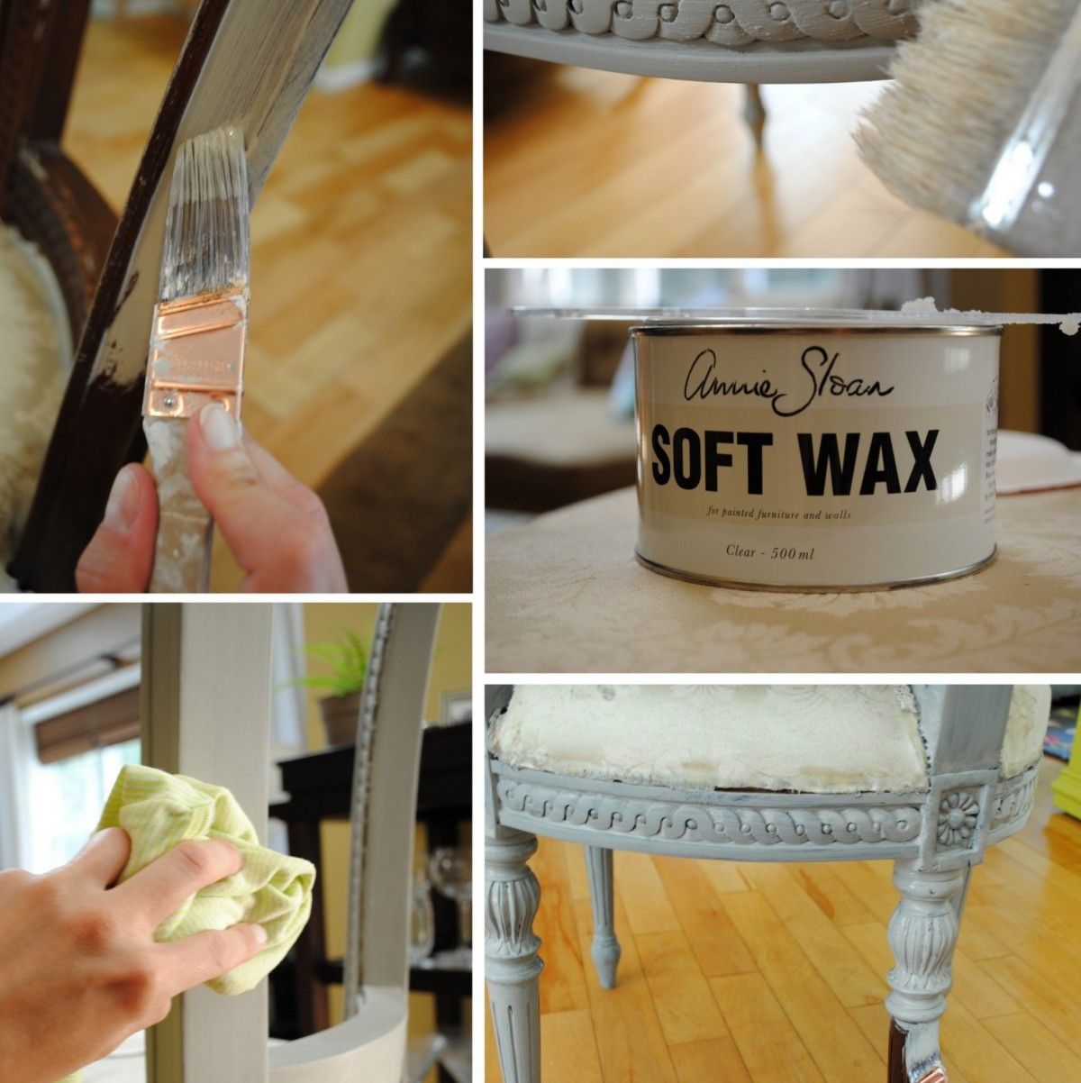
So coat 1 went on just like usual. Using my favorite Purdy brush, I applied a light coat of this gorgeous color.

Then coat 2.

Two coats was just enough for most areas, but a few spots need three.

Done.  Trish stressed that it wasn’t good to paint in the heat, but I was just fine since I was indoors, in the A/C – ideal conditions!

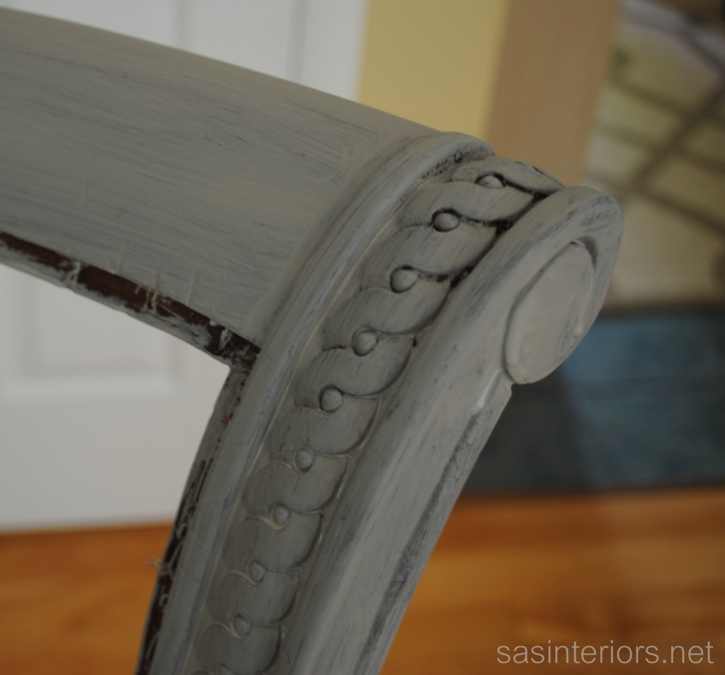
I wasn’t sure what the result of the chalk paint would be.  I was guessing it would be chalky (obviously), but it’s not.  Honestly, if I didn’t know it was chalk paint, I would think the paint was simply a latex… Until it dries.  The finish on the dried chalk paint is very flat and dull.  You can tell it is in need of something for a top coat.  What is that something?  Well, wax.

Why Use Wax?

Chalk Paint™ is very porous and the wax will penetrate the paint and literally fuse with it making it very strong. Waxing the paint provides protection. Chalk Paint™ in nature- is a very flat chalky finish and over time could be effected by oils from your skin, stains from beverages, dirty fingertips. They can permanently stain the paint. The wax finish is what seals and protects your piece. – The Purple Painted Lady

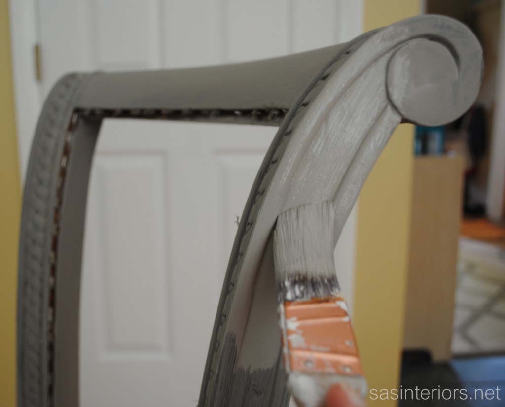
A day later, I jumped in and started the wax process.  I’ve painted before, but have never applied wax.  Not even car wax, so I was definitely entering unchartered territories.  Again, I was nervous, but sucked it up and followed the steps (once again stated by Trish).

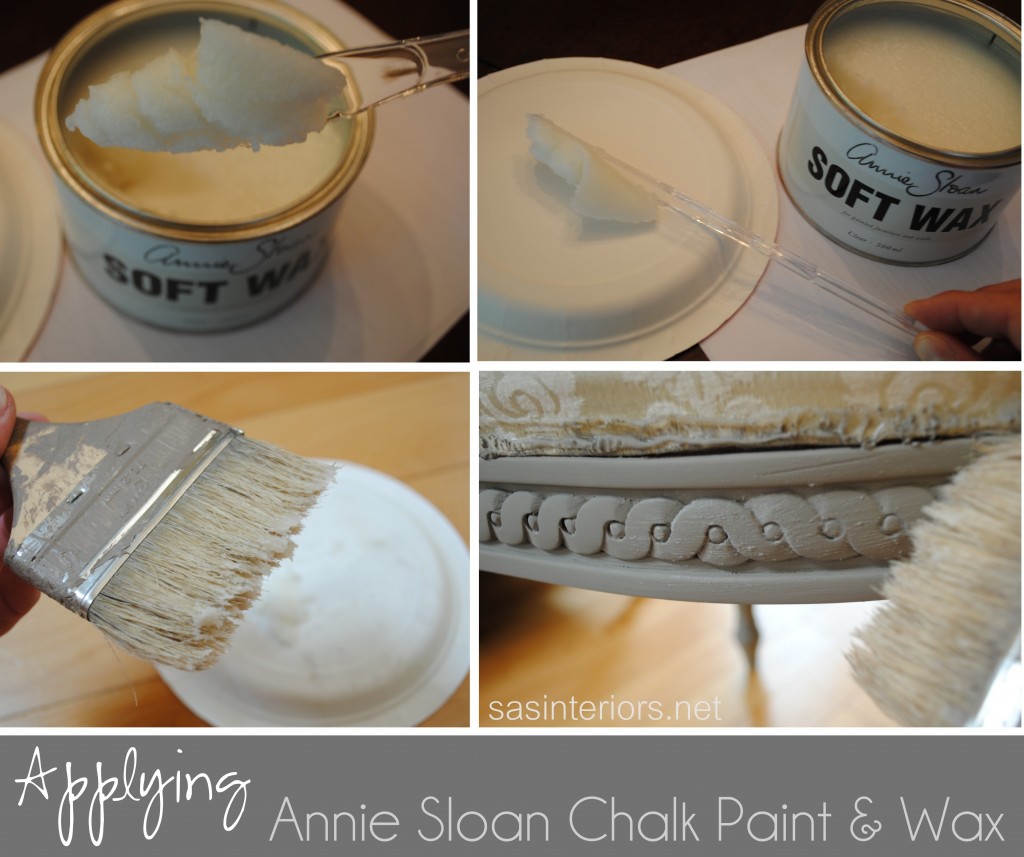
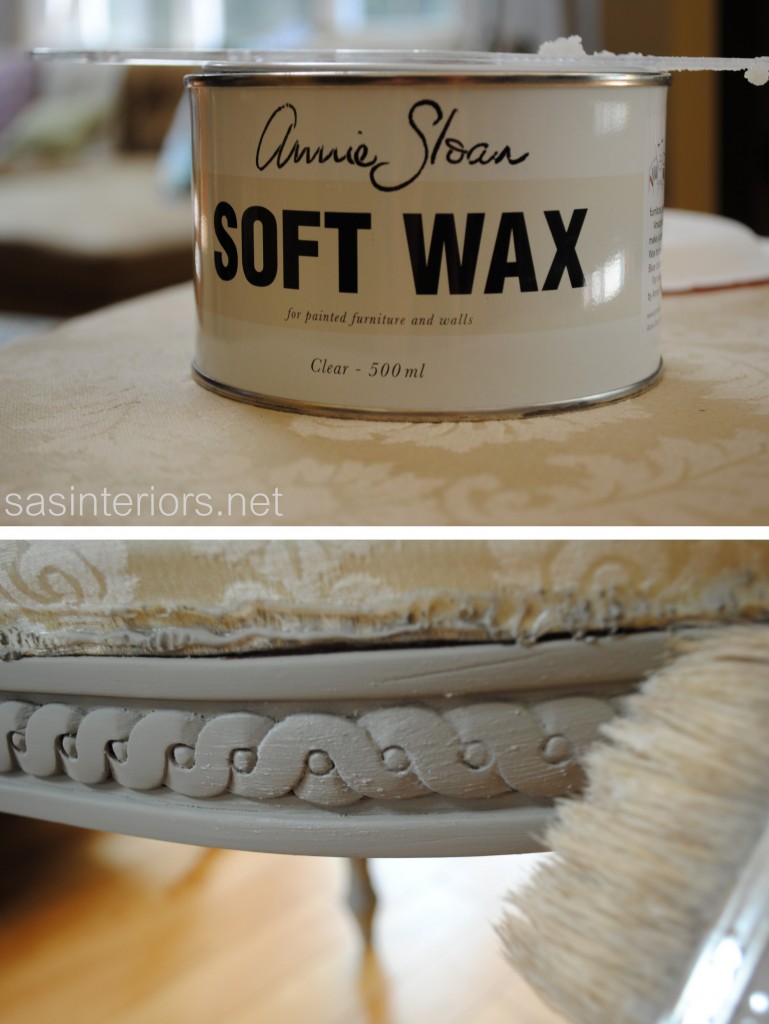
The wax is smooth, kind of like Crisco, and should be applied in “very thin, uniform coats”.

Remember this – VERY THIN, UNIFORM COATS

This is the basic process –

  1. Start by taking a spoonful of wax.
  2. Put it on a paper plate.
  3. Dip the end bristles of your brush* into the wax.
  4. Apply the wax in the same direction as the painted brush strokes

* The brush you choose is important.  It CAN’T be a new brush and really should be a specific wax brush.  I used a well-worn brush that was leftover from my fence project.  I really should have used a true wax brush, but being the frugal gal that I am, decided not to get it with my purchase (probably a mistake). As I always preach suggest, the right tools make the job much easier.  I guess I haven’t learned my own lesson yet…

FYI – These instructions are for applying clear wax only, not the dark wax.  That has a whole set of different directions that I haven’t even looked at yet.

Trish at The Purple Painted Lady has an AMAZING Q + A on her website and every issue / problem that you may run into is on there.  She gives a very thorough step-by-step of how to apply the wax, so it’s a MUST READ!

But of course, I ran into an issue.  Here goes.  I applied the wax, waited a few hours, but it still was tacky.  I waited another 24 hours, but it was STILL tacky.  What did I do wrong?  I immediately sent an email to Trish and this was the subject line: Need HELP with wax! (that should get her attention, right?)

Like always, I heard back from her right away with a thorough explanation and she directed me right to her Q+A page.  I scrolled down and found my answer.

Thankfully “my issue” is one of the most common… too much wax!  I went over the wax with a cloth and a few days later, it was all dry and smooth to the touch.

Boy, what an experience, but I’m glad I stuck with it and learned from my mistakes. Trying something new always has it’s hurdles, but once you get over them, it’s often smooth sailing.  I’m thrilled with the result of my newly reupholstered chair and every time I look at it, I have a chuckle about the days when I wanted to pull my hair out figuring out what I did wrong.

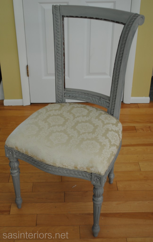
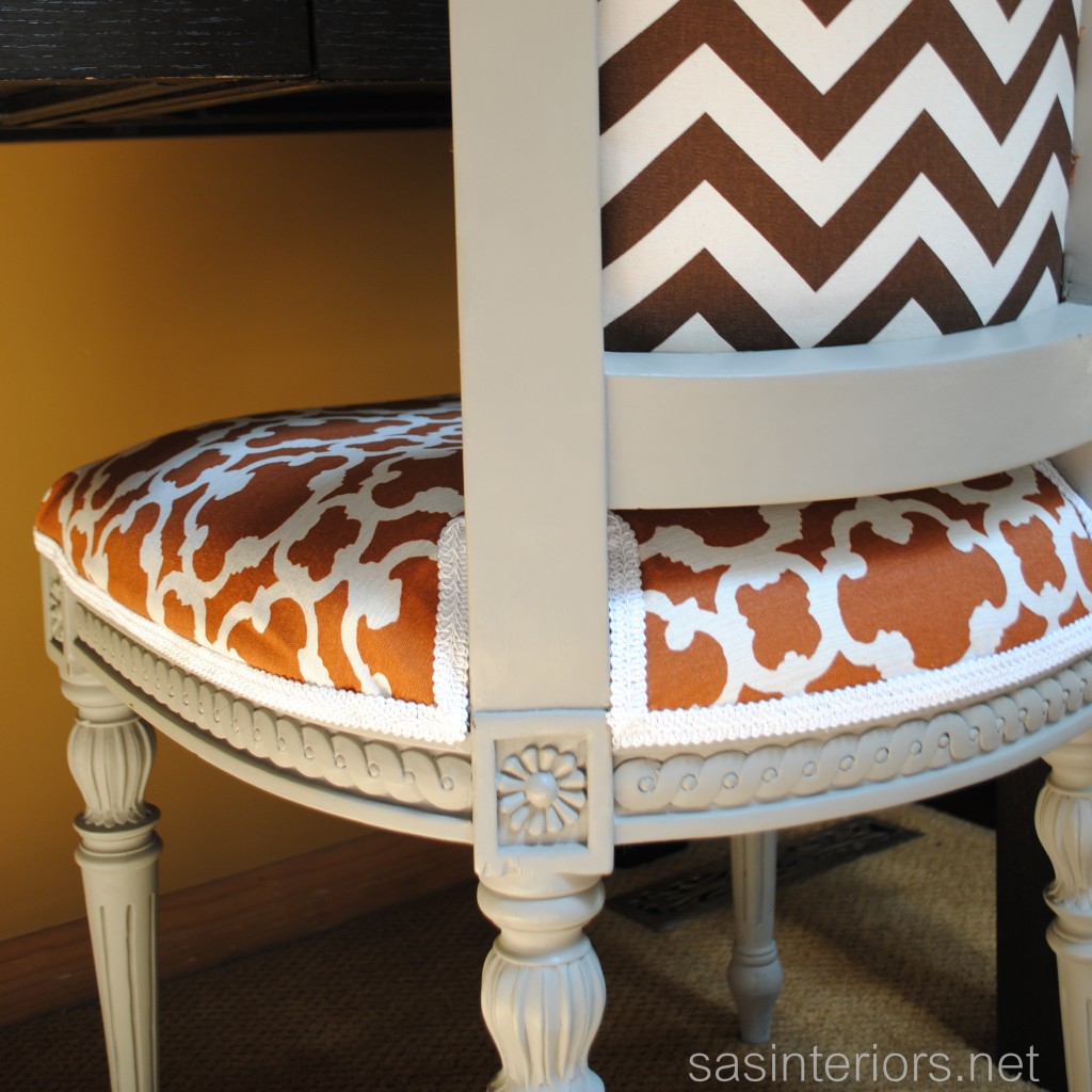
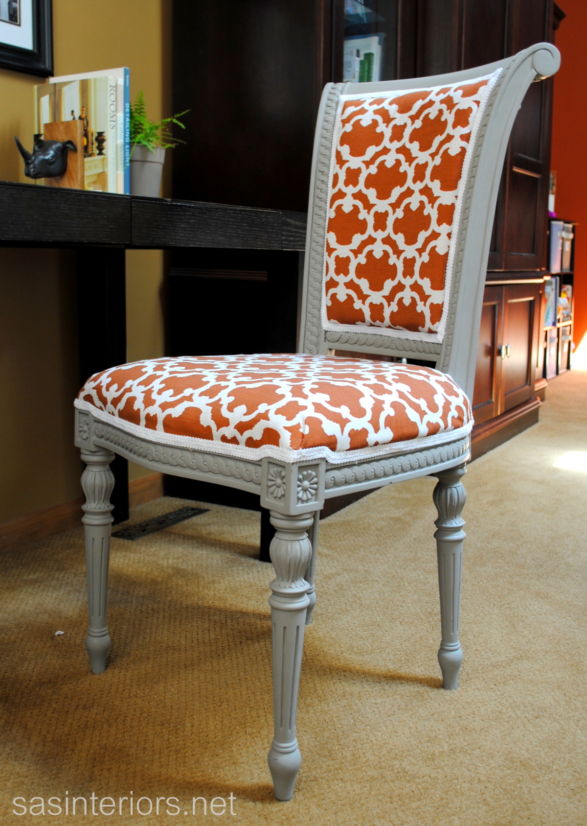
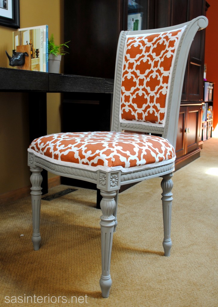
And here’s the finished result.

I’ve received quite a few questions on, “Is the Annie Sloan Chalk Paint worth the cost?”.  It’s difficult to say depending on the look and style piece you want to achieve. With the bonus of no stripping, sanding, or priming, plus how much this paint covers compared to latex paint, it’s worth to give it a try!  You may just fall in love…

Since I’m still a novice ASCP user,  I’d LOVE to hear about your experiences with this magical formula. What issues have you had if any and how have you overcome them?  Do you love the paint or don’t think it’s worth the cost?  Please Share!

If you want to check out my reupholstery tutorial, click here.  And if you’re interested in learning alot more about how to apply the chalk paint and wax, click here to visit Trish’s website.
DIY: Reupholstered Side Chair

I’ve always had the desire to attempt the process of reupholstering a chair.  Quite a few of my blogger friends did and the results were amazing, but I was still reluctant – Could I really do it? 

After reading this post, for some reason, “it” clicked and I was on-board.  My mission of finding a chair had started.  I needed something new anyway for my desk since I’ve been using this chair which has no seat padding and gets uncomfortable after a while. It took some time, but one day when on a thrifting adventure with my mom, I spotted it and bells started to ring.

Let me start off by saying, I have no upholstery skills, so this is something that absolutely ANYONE can do.  If I can do it, so can you!  Don’t get me wrong, there were quite a few times that I wanted to give up, but I kept chug, chug, chugging along and I’m thrilled with the results of a comfortable, stylish, and inexpensive desk chair.

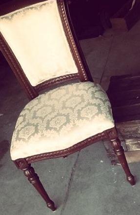
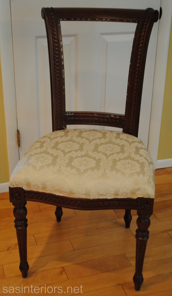
It all started off here…

I began by removing the fabric from the back of the chair.  The old fabric was secured with ALOT of staples (which brought back memories of the carpet on the stairs), so using plyers I (and the mister) removed each and every one.  It took a while and part of the surrounding wood on the chair got slightly damaged, but it ended up being fine since the new fabric and trim covered it later.

The seat upholstery I left since it was in fine condition and the new fabric would cover right over.

Once the fabric was stripped down, it was time to give this chair a paint makeover.  Up until this point, I had never before tried the Annie Sloan Chalk Paint and thought this would be the perfect piece.  Because of the ASCP formula, there is no need to sand before painting and I was ALL FOR THAT! Holla…

I had some hurdles to overcome with the paint and wax, but all in all, I was happy with the result.  My experience with the paint is a story in itself, which you’ll have to wait for later this week. (Click HERE to read about My First Annie Sloan Experience)

Anyway, here is me painting the chair…

Two coats later, I then added the clear wax as top coat.

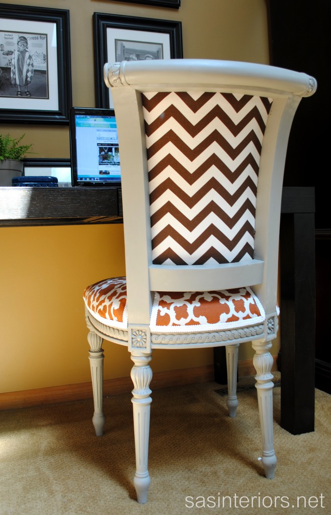
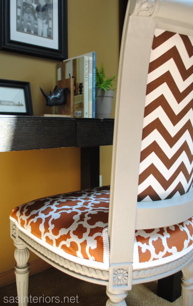
Once that was done and dry (remember, I’ll chat more about my ASCP experience later this week), the reupholstery work began.  I was psyched to start this part of the project.  I chose a brown and white chevron pattern for the back panel, along with a burnt orange and white patterned fabric for the seat and back. The chevron fabric I had leftover from a pillow and table runner, while the orange fabric is a panel that I purchased from Target to use for this project and some new pillows (that I have yet to make – story of my life).

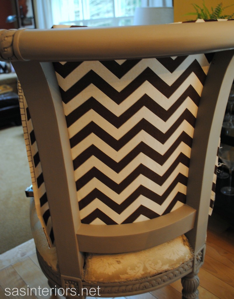
I started with the chevron fabric first and stapled it to the inside of the wood trim surround in place of where the previous fabric was. (this is a few from the front of the chair)

Once the fabric was stapled all around, this is how it looked from the back…

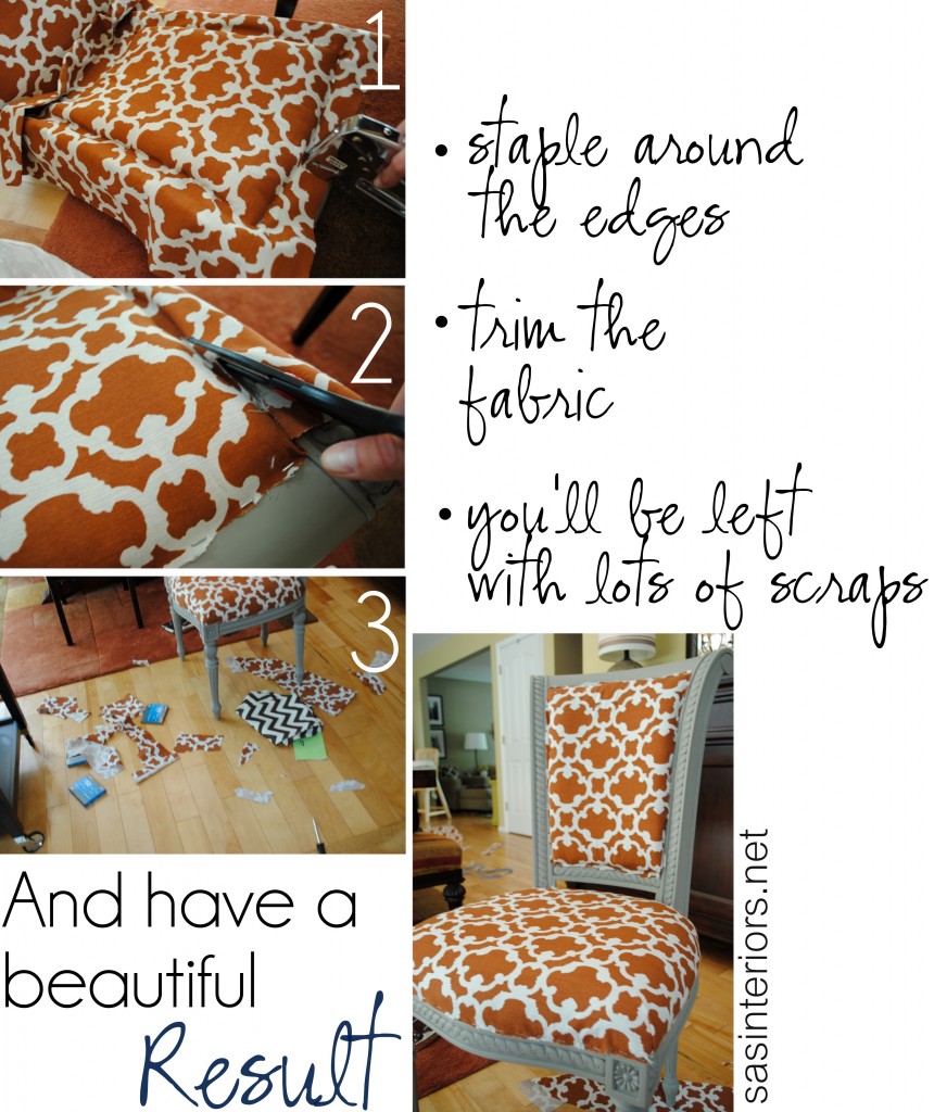
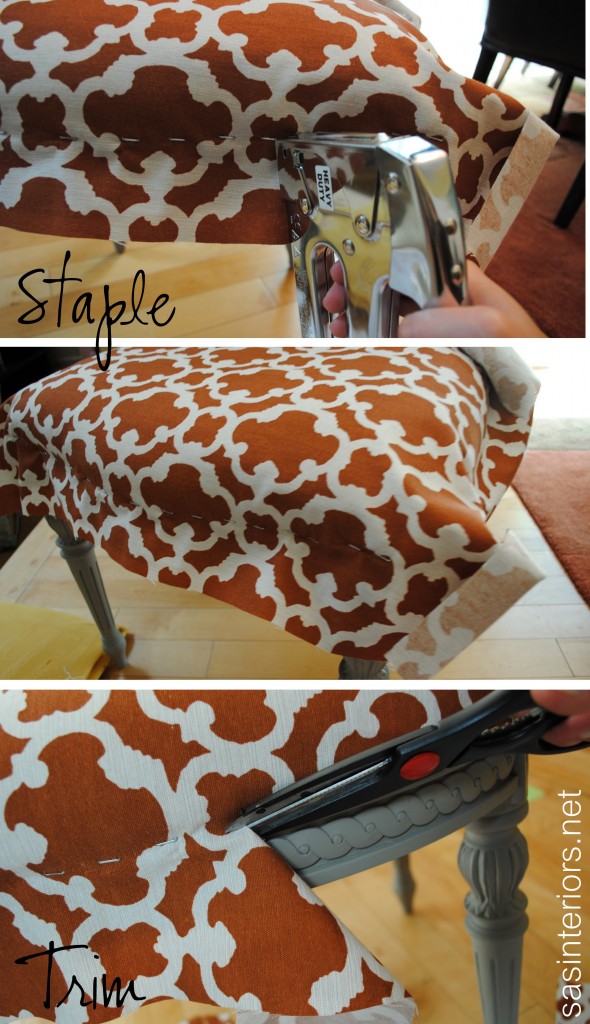
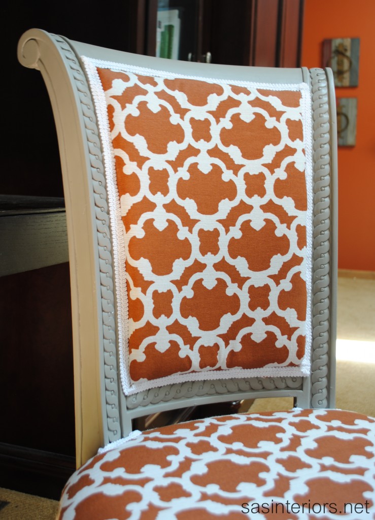
Then it was time to work on the seat and back reupholstery.  I started with the back.  I added back the original foam insert that was previously used, stapled all the way around, and finished by trimming the leftover fabric with scissors.

Then I used the same steps for the seat.

Once I exhausted out my staple gun, this was the result…

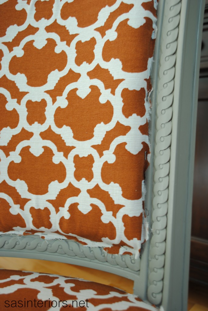
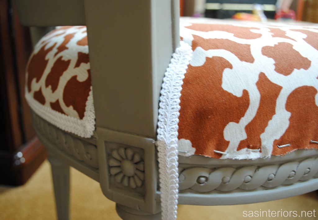
Eek! Those edges don’t look good.  BUT WAIT… here’s how I fixed it.

Trim!

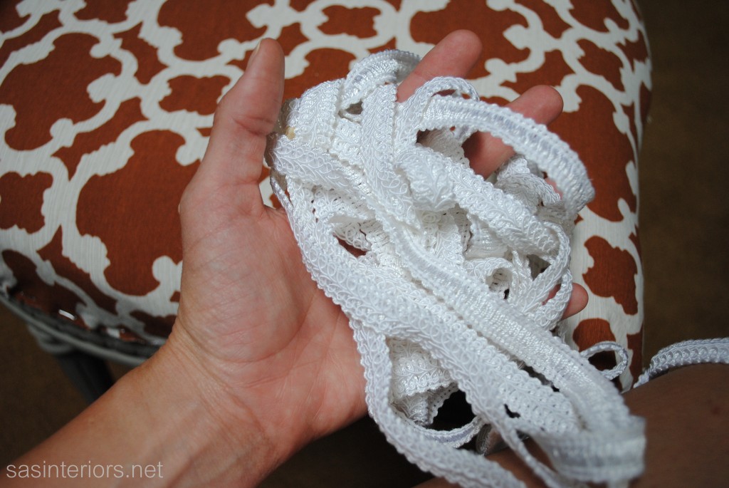
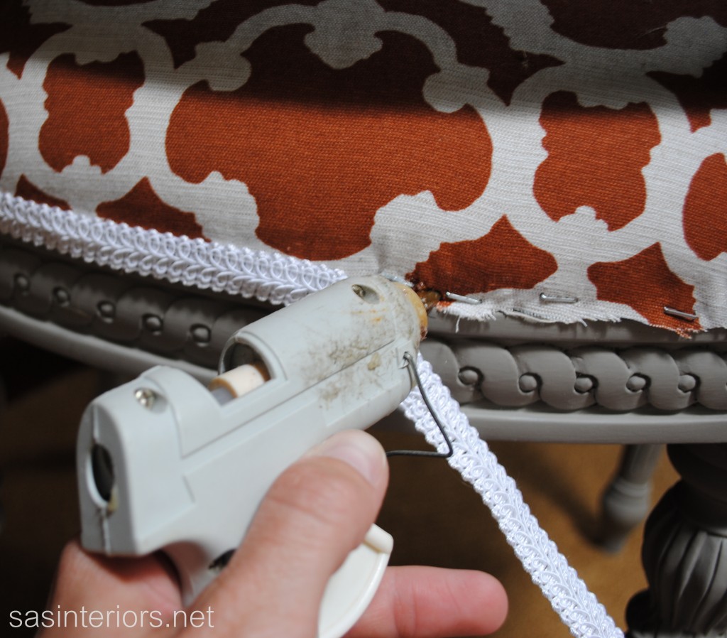
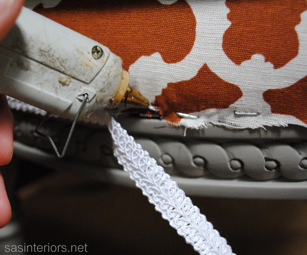
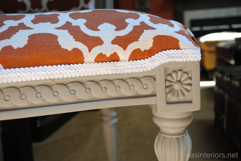
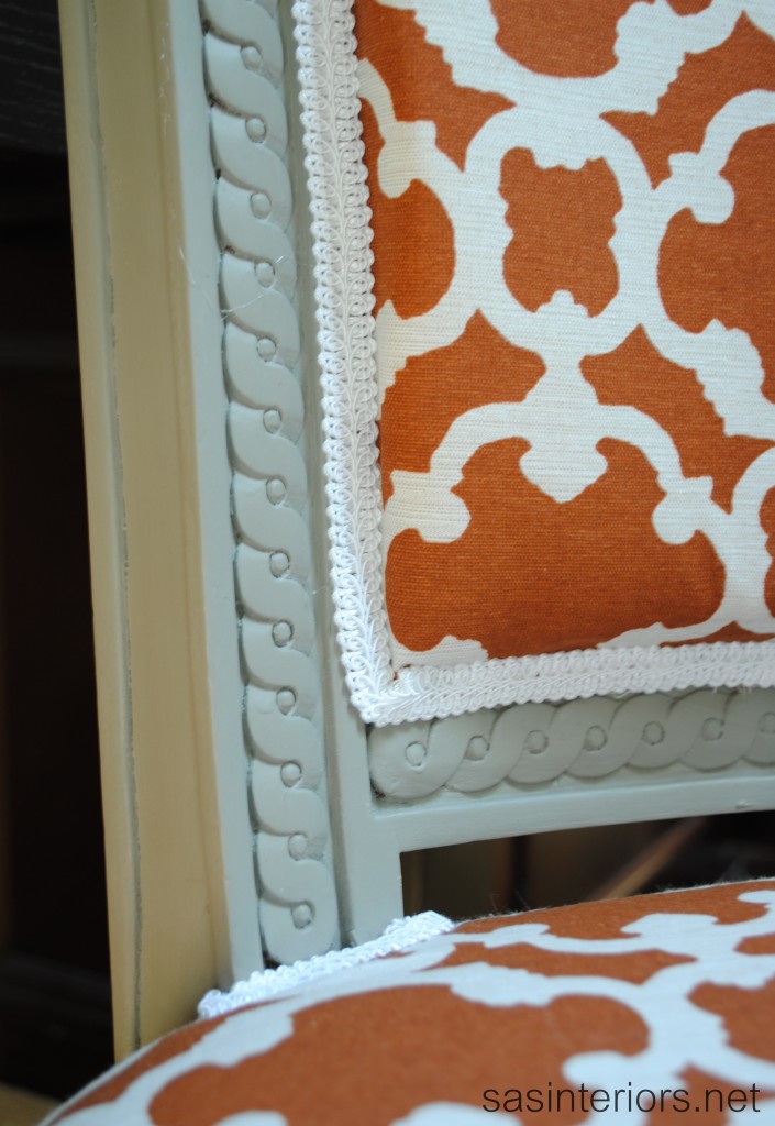
Trim is the key to novice upholstery perfection!  Using a good ole’ hot glue gun, I added the trim surround to cover all the ragged edges of where I used the scissor to trim the fabric.

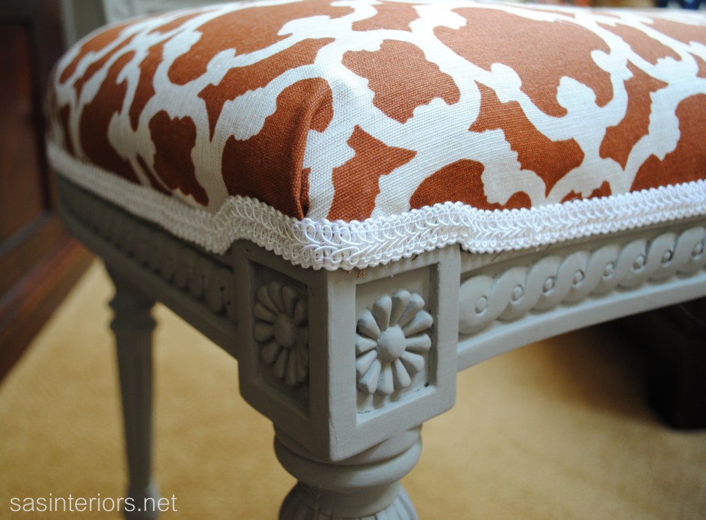
And minutes later, this was the result.

Beauty, right?

I am thrilled with the final upholstery project and glad that through some tough parts (mostly the removal of the old staples and fabric), I stuck with it.  This chair really gives such a fun flair to my office area. The chair is temporarily in this spot while my front room / office space is under remodel.

And here’s me working away (thanks to my 6 yr. old for snapping this shot) …

Have you ever reupholstered a piece of furniture?  Did you find the first time easier or more difficult than you thought? What DIY projects have you been working on lately?

Glass Bottle Turned Candle

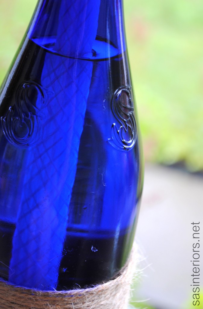
I’ve been working on so many big projects lately (like the stairs, painting, and this chair) that I wanted to take a quick break and create something super quick and easy to share with you. One of my favorite drinks, especially in the summer, is Saratoga Sparkling Water. Since I live in the town where this water is manufactured, it’s available most everywhere and everytime I see the gorgeous cobalt blue bottle, I just stare at it’s beauty.

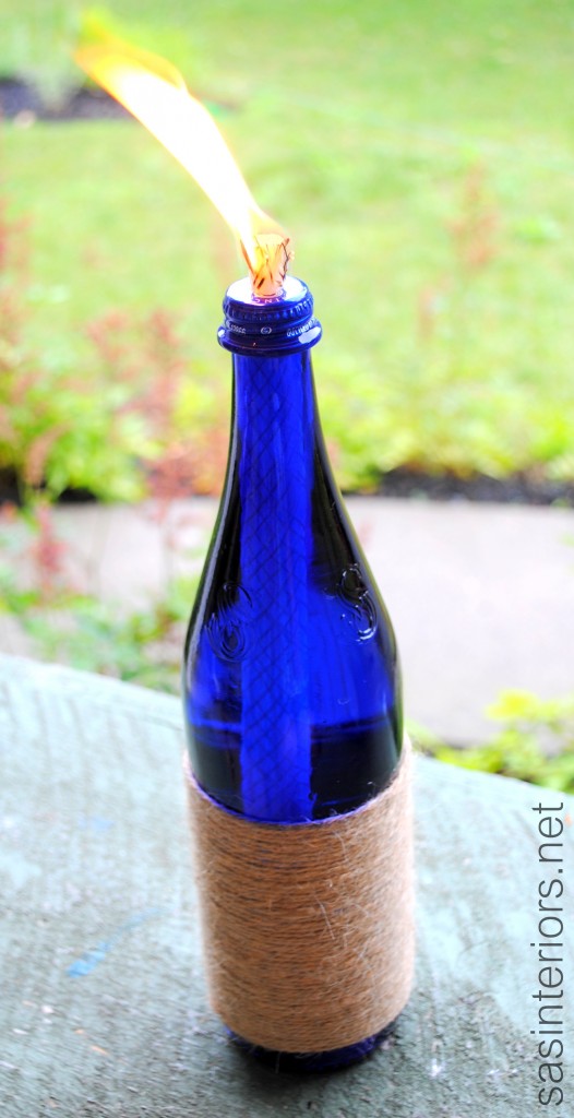
I never get the nerve to throw the bottles away and have been stockpiling them in my garage waiting for a DIY project to pop into my head. And finally, here’s my first creation with the blue beauties…

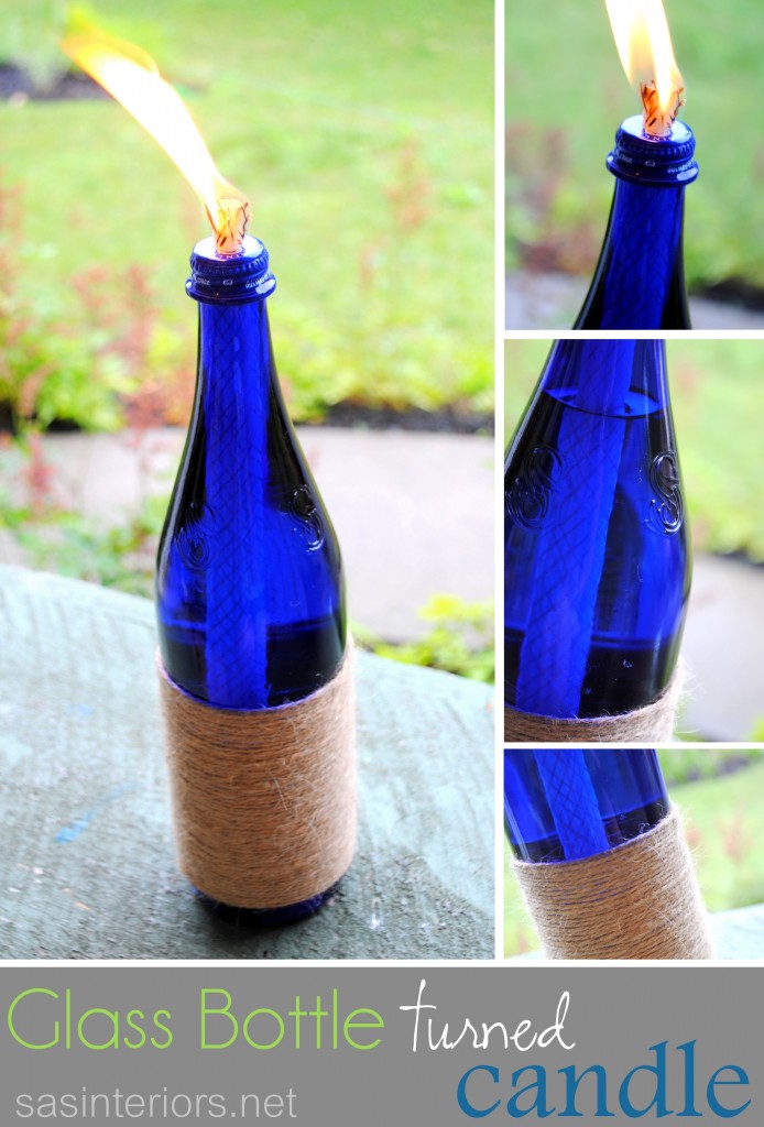
Cute, right?  And it’s uber-easy to make.  Here’s how…

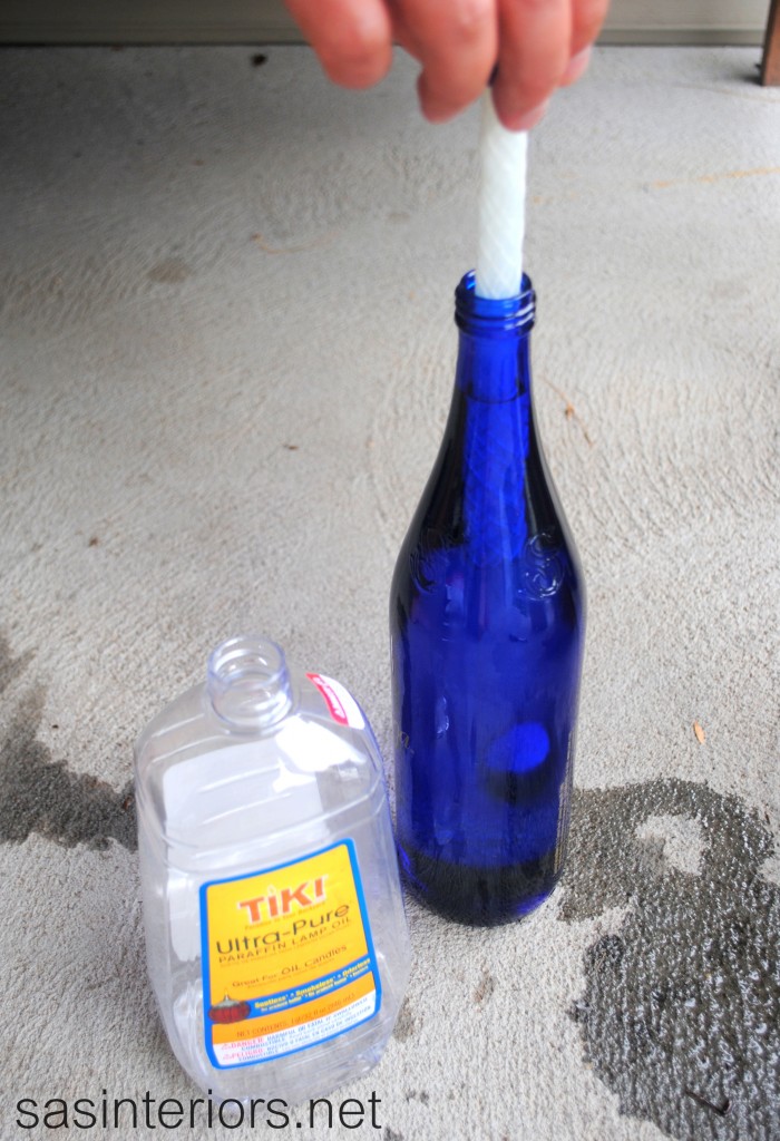
I started off with:

  • my used Saratoga Sparkling Water glass bottle with screw on top *
  • Lamp oil or citronella oil
  • Large Wicks (I found these replacement wicks for tiki torches at Target)
  • twine
  • hot glue gun
  • drill

* other glass bottles like wine bottles, spaghetti jars, mason jars, etc could also work to create this type of a candle. (check out the small Barefoot wine bottle in the pic below)

Once I was finished drinking my sparkly, I had the Mister drill a hole in the bottle cap (sorry no pic here because he did it while I was out n’ about).  The hole should be slightly smaller than the wick so it fits snugly. Once the hole is drilled, the wick went in.

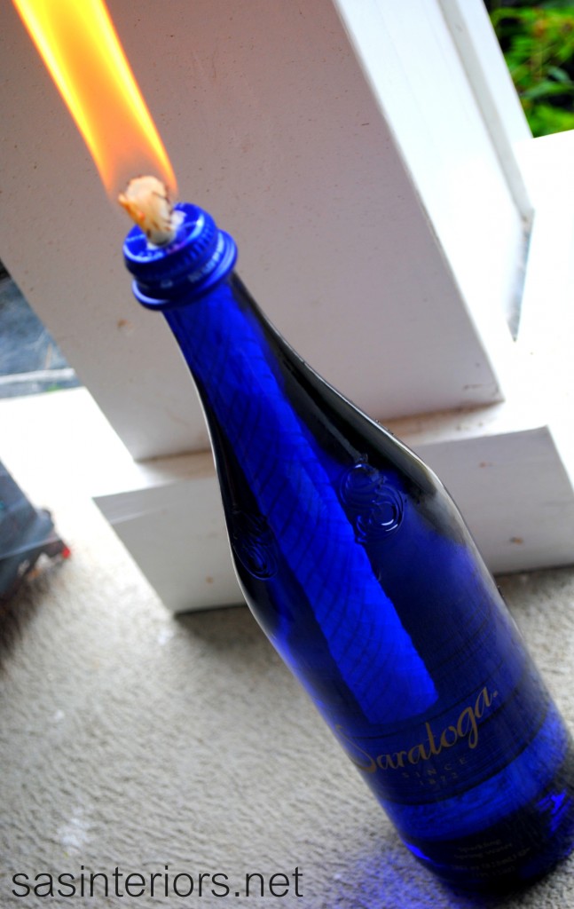
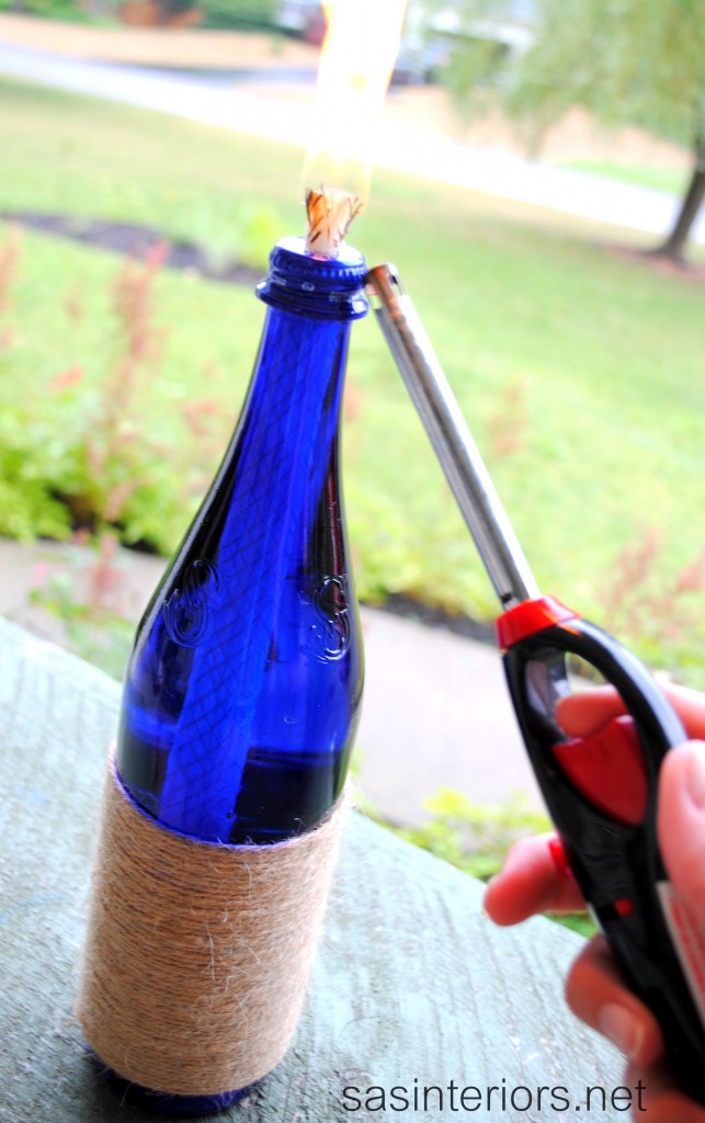
We then filled up the glass bottle with the lantern oil and tested out the new candle.

And it worked!

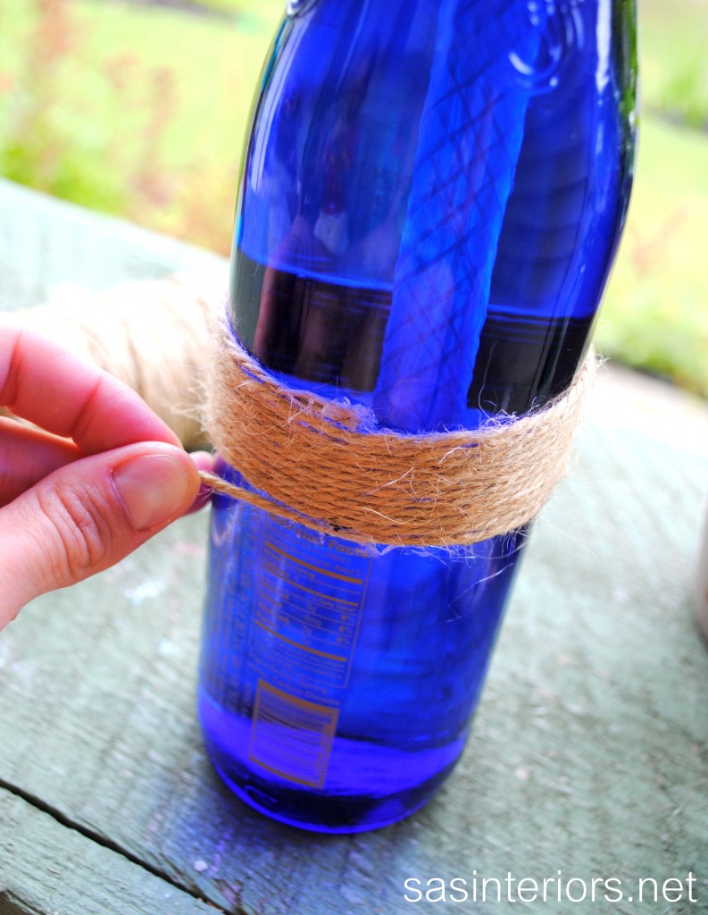
Then it was time to add some bling (nautical bling, not diamond bling).  I love the Saratoga lettering, but decided to add some rope as an accent.  I’m probably the only DIY blogger who hasn’t created something using rope, so here it goes.

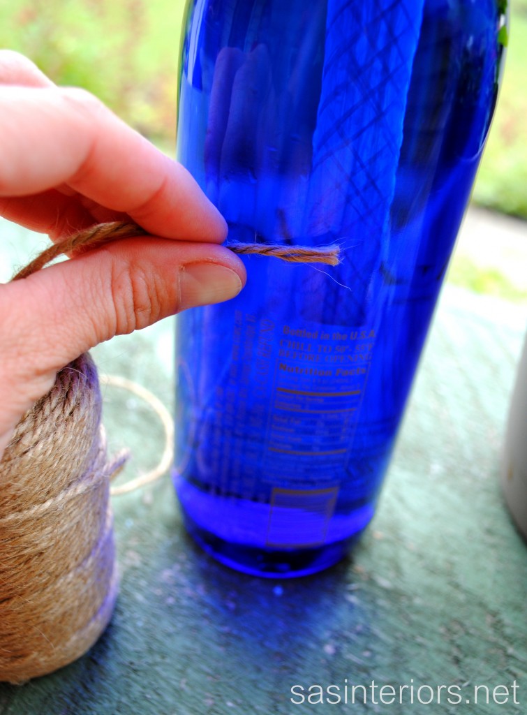
Starting at the back of the bottle, I added a small dab of hot glue and attached the end of the rope.

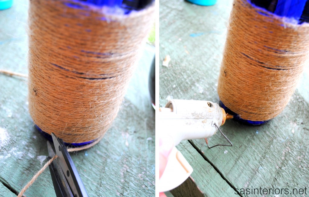
I continued the rope around and around and around…

…and then once I was at the end, I trimmed the rope and added another dab of hot glue.

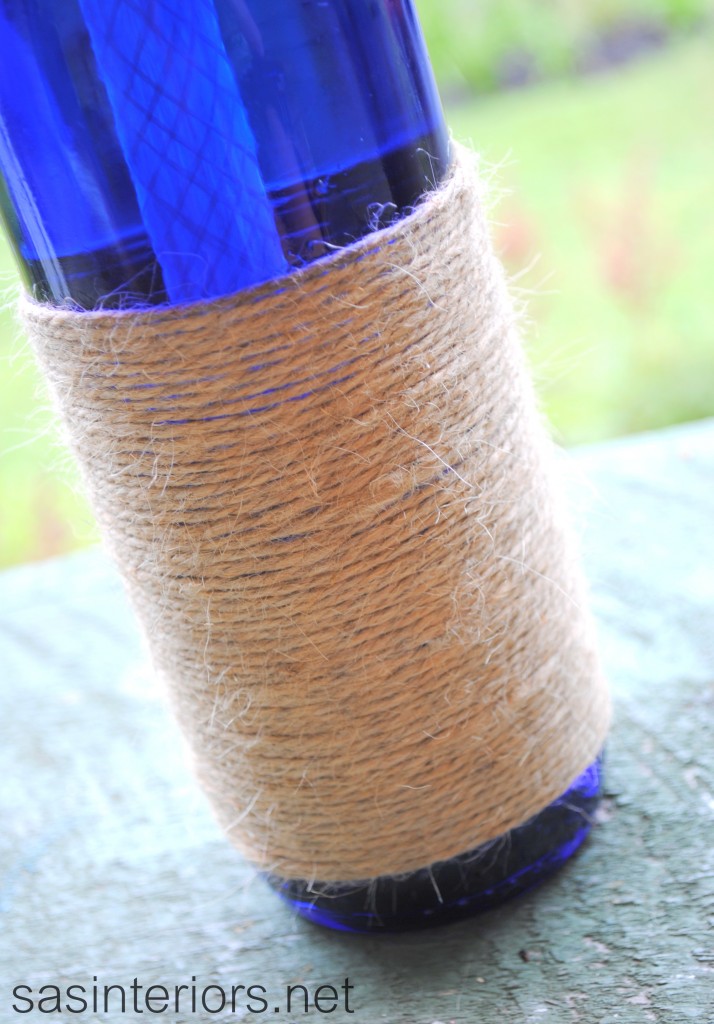
Complete and ready to enjoy!

And here are some details…

Pretty simple to create, right?!

Have you ever upcycled a glass bottle or wine bottle?

I link my projects to some of these parties: Skip to My Lou, Dittle Dattle, Between Naps on the Porch, Today’s Creative Blog, Stories of A to Z, All Things Heart & Home, Savvy Southern Style, House of Hepworths, Finding Fabulous, Creation Corner, The Shabby Nest, Tatertots and Jello, Thrifty Decor Chick, Tip Junkie

Two Toned Mirror with Faux Silver Leaf Detail

Another summer week is underway.  I can’t believe how fast it’s flying by, but I’m excited to be sharing a new DIY project with you – let’s get started…

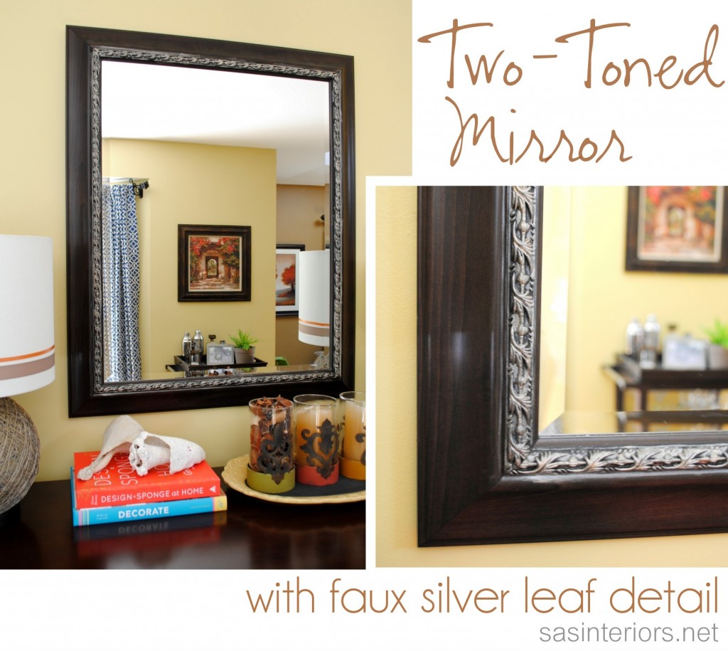
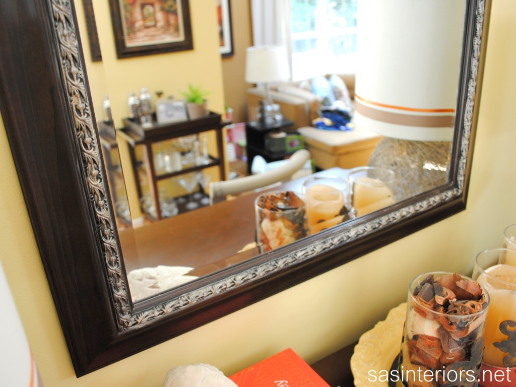
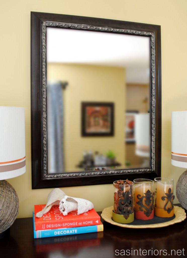
Sometimes a small added detail truly makes a piece look completely new again.  While updating the buffet in my dining room with the new lamps and sunburst mirror, I moved the dark wood mirror that was once over the mantel to this revamped area.  I’ve had the mirror for about 9 years and it was beautiful, but I felt like it needed a little pick-me-up and decided adding a little something around the inner rim would be the perfect update.

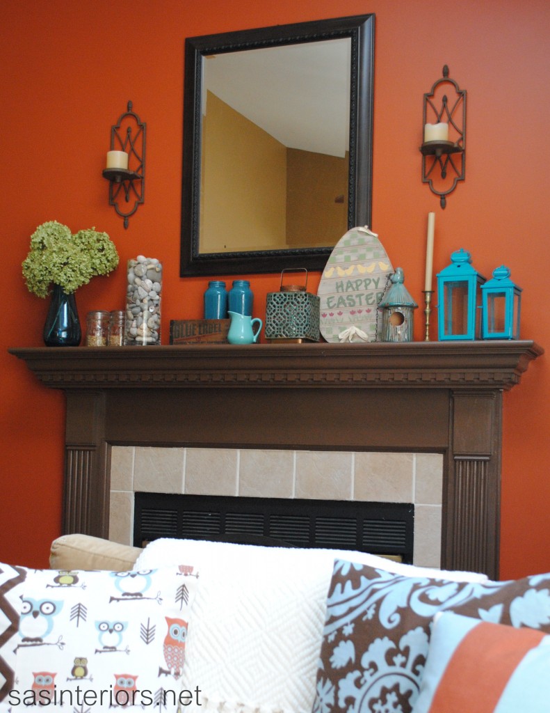
The mirror has been seen in many of my mantel makeovers, like this one decorated for Spring 2012. Since it was in fine condition, I was weary about messing-it-up, but I took the leap of faith anyway. Silver leaf detail was the first thought that came to mind.

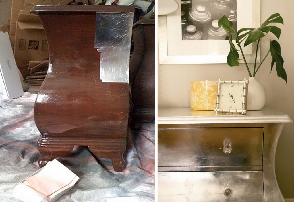
The addition of silver leaf, like in the dresser below by Jenny of Little Green Notebook, adds a beautiful and sophisticated accent, but since I was hesitant about how much detail would be appropriate for this mirror, I decided to use another method to get the silver leaf look, but make it totally faux.

Beautiful and I’d love to give silver leafing a try one day, but for my mirror, the faux way was alot easier and less time consuming.

Faux Silver Leaf

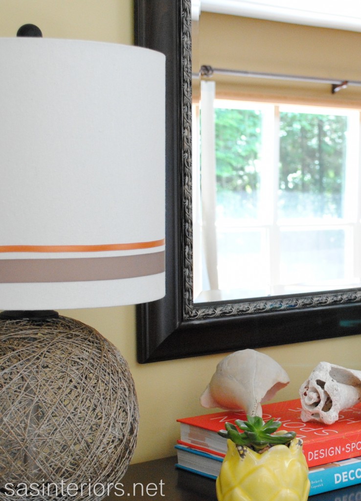
To achieve the silver leaf look, I used Krylon Spray Paint in Caramel Latte, which is the same color used for my lamp revamp – yes the lamps that now site right next to the mirror. LOVE this color. The cap shows it has more of a gold hue than silver, but the result on the mirror edge and the lamps is a more silver / gold combo.

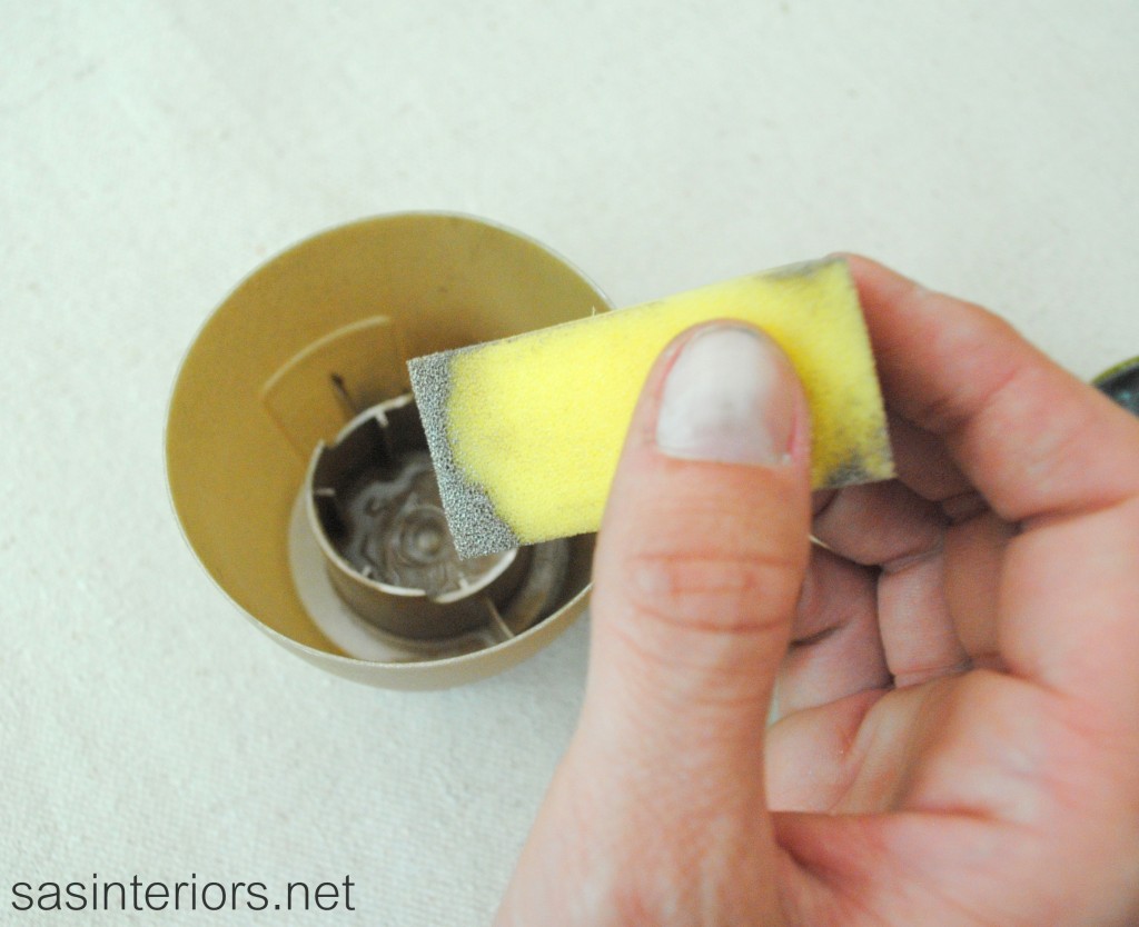
Instead of the traditional way of using spray paint – is there a traditional way? – I, sprayed a small amount into the cap (in a ventilated space, of course)…

…then using a small paint sponge, I dipped the edge into the paint.

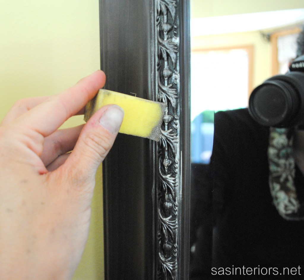
Then I lightly dabbed the sponge onto the leaf detail of the mirror edge.  I went slowly at first not sure of how much would be appropriate.

Well, hello there camera lense staring at me 😉

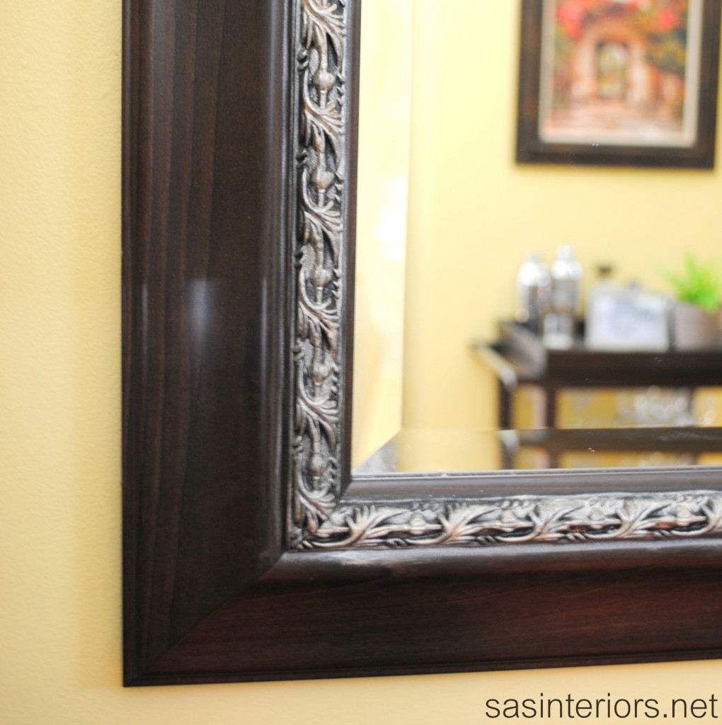
After I knew the look I liked, then I continued around the entire mirror, and this is the result…

The edge detail around the mirror can be seen more now with the newly added faux silver leaf touch, and the mirror is updated enough to look like new. Within 5 minutes this mirror got a complete makeover and it was really easy!  Hanging the mirror wasn’t difficult either with a method I’ve been using for years AND I’m going to spill the beans tomorrow – don’t miss it.

Have you ever used spray paint in a different or unconventional way?  Have you ever updated a piece of furniture with silver leaf?  It’s surely something I’d love to try!

I link my projects to some of these parties: Skip to My Lou, Dittle Dattle, Between Naps on the Porch, Today’s Creative Blog, Stories of A to Z, All Things Heart & Home, Savvy Southern Style, House of Hepworths, Finding Fabulous, Creation Corner, The Shabby Nest, Tatertots and Jello, Thrifty Decor Chick, Tip Junkie


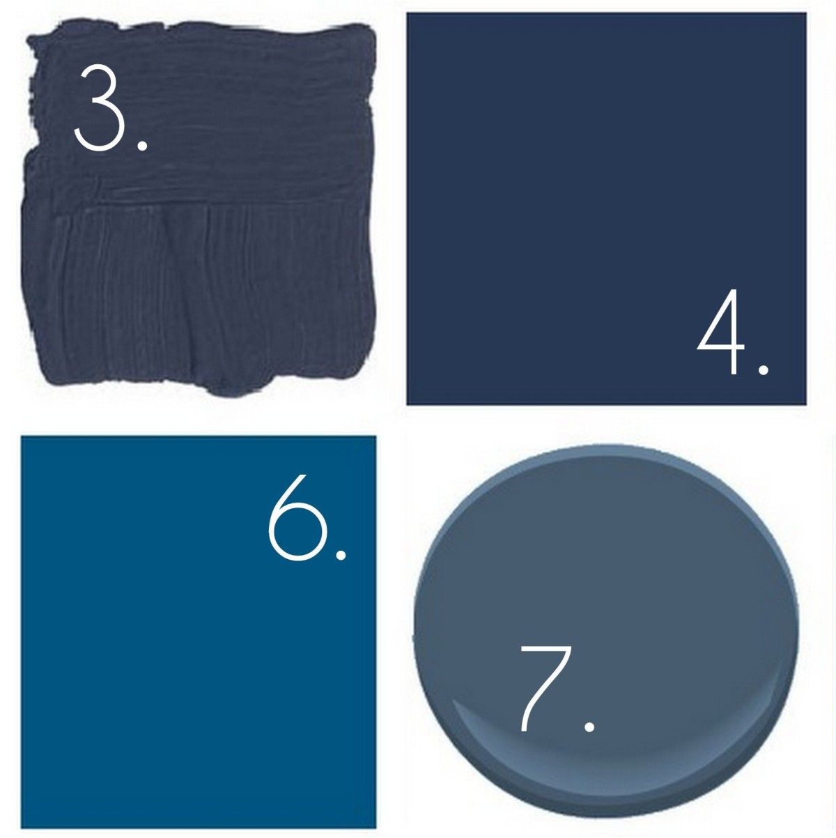
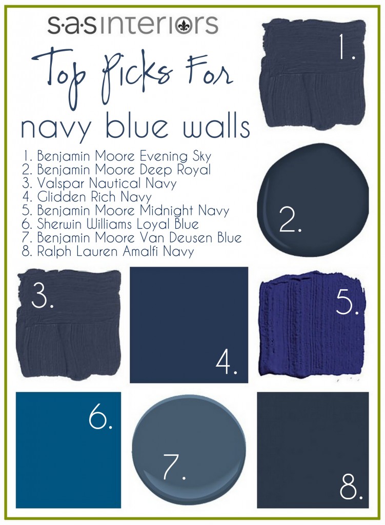
Top Paint Picks for Navy Blue Walls

Yesterday I shared my Royal Blue Revelation and how I’ve been introducing this new-found hue into my home. I’m kinda psyched because not only is this color going to be an accent seen in accessories, but I plan on painting the front room a dark navy.  Yesterday I left you at the point of me knee-deep in color decisions, and today I’m sharing the final color choice, plus my Top Color Picks for Navy Blue Walls.

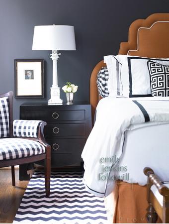
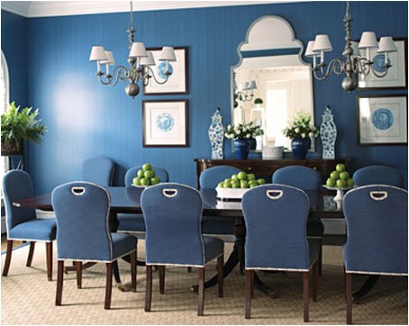
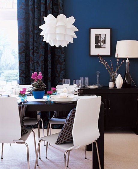
I’ve always had a thing for black spaces – they’re bold, dramatic, and striking – but I’m loving the navy hue just as much (and maybe even better)!  I’ve gathered some inspirational spaces that adorn the blue hue…

Deep blue striking walls with navy accents, photography by Emily Jenkins Followill.

Gorgeous Royal Blue Dining Room featured on House Beautiful.


Crisp white with navy blue is stunning.  The white decor pops off the dark complementing color (source unknown).

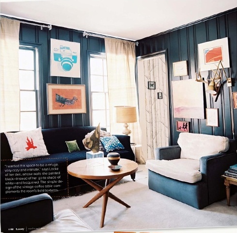
Navy paneling on the walls gives this office/den a cottage look featured on Lonny Mag.

Dark royal blue walls surround this bedroom oasis and I adore the wide striped blue and white rug, photographed by Roger Davies Photography.

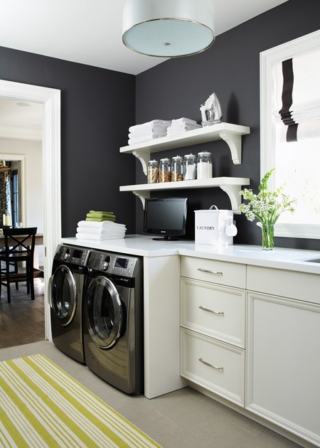
A laundry room that I would never leave.  The white cabinets look amazing against the dark royal wall featured on House and Home.

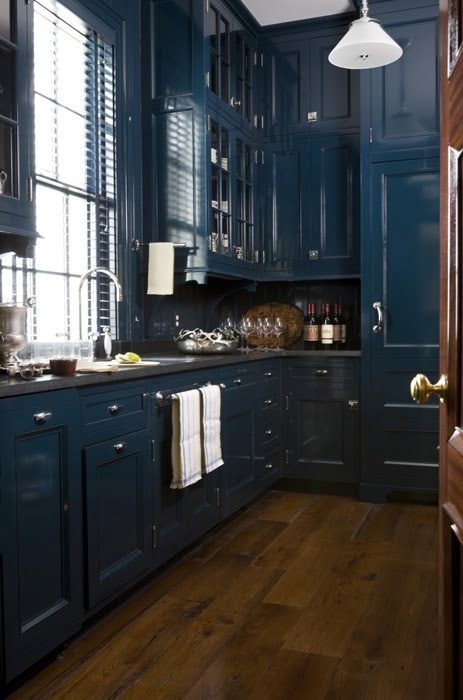
Built-ins are often a shade of white (allowing them to pop off the wall), but the style displayed in this room match the walls – clever!  Love the regal, but inviting aesthetic by Ashley Whittaker.

Hello Bedroom that I would love-to-live-in!  There are so many reasons to adore this space by Brian Watford Interiors, but my favorite is the navy and white oversized nightstand, which is so sophisticated.

Thankfully I’m still in love with my taupe colored cabinets, otherwise this would be my new DIY project for summer.  Could you do navy blue cabinets in your kitchen? (source unknown)

Incredible spaces to die for, right?! So finally the time comes to reveal the final paint choice for my room.  The final color is…

photo by Julian Wass, image via House Beautiful

Boy, do I only wish I knew photoshop better to show you how this new blue hue would look in the room.  Any volunteers to help me out? If not, no worries, it will be done soon enough (I hope)!

Do you like my color choice?  What navy blue hue is your favorite?

5 Minute Lamp Revamp with Spray Paint and Ribbon

For a while, I was on the hunt for a pair of lamps for the dining room buffet. They couldn’t be overly large, but something that would be unique and add a soft glow.  I had brought home a few options, but nothing was quite right.  Then one day when randomly shopping at HomeGoods for another project, I spotted this treasure –>

It wasn’t perfect, but immediately I had an idea up my sleeve.

Could I ever just leave anything alone?  NOPE!

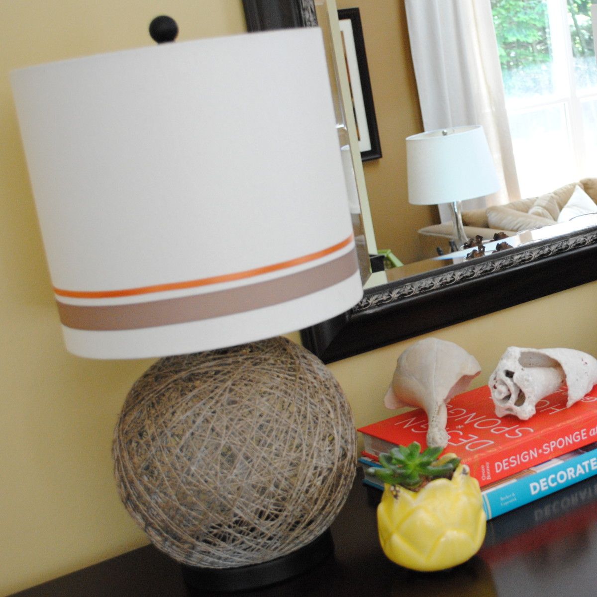
My immediate idea was to spray paint the globe, but I wasn’t sure what color.  Should the lamp be subtle or dramatic?  Since the lamps were a nice piece of change (around $30 x 2), I thought a quieter color would “live” longer.  So, I hit up my favorite spot at my favorite home improvement store and chose a taupe color with a hint of gold.  Interesting, right?

The color name is Caramel Latte  – sounds scrumptious (I must have missed my morning coffee that day and got my fix another way, hehe).

Before starting the exciting transformation, I covered all the areas of the lamp that I wanted to protect.  So ONLY the basket-style globe was exposed and ready.

Now, I was armed and ready! I started off spraying my new fav color on the black globe area of the lamp. Nope, didn’t work. 

I wanted it to be lighter, so instead I first spray painted the globe white (basically as a primer)…

…THEN applied the Caramel Latte Color.  Yes, that’s what I wanted!

Perfection – DONE! well maybe not?

You know me…  I can never leave well enough alone.  I wanted to embellish the shades a little, so I decided to add two rows of ribbon in a taupe and burnt orange color.

Adding Ribbon to Embellish a Shade

  1. At the lampshade seam, dab a small amount of hot glue on the shade and attach one end of the ribbon.
  2. Wrap the ribbon around the entire shade (no need to glue all the way around). Trim the ribbon, fold over the edge so it doesn’t fray, and glue.
  3. Complete!

In about 10 minutes (well, for me it was 20 because I had two), these lamps got a total makeover and are completely unique for my space!

I hope I’ve inspired you with my Lamp Revamp to think-outside-the-box and create or transform something in your home.  Sometimes with a little spray paint and an idea, your options are limitless!

I link my projects to some of these parties: Skip to My Lou, Dittle Dattle, Between Naps on the Porch, Today’s Creative Blog, Stories of A to Z, All Things Heart & Home, Savvy Southern Style, House of Hepworths, Finding Fabulous, Creation Corner, The Shabby Nest, Tatertots and Jello, Thrifty Decor Chick, Tip Junkie

Staircase Makeover: Filling Holes and Staining Treads

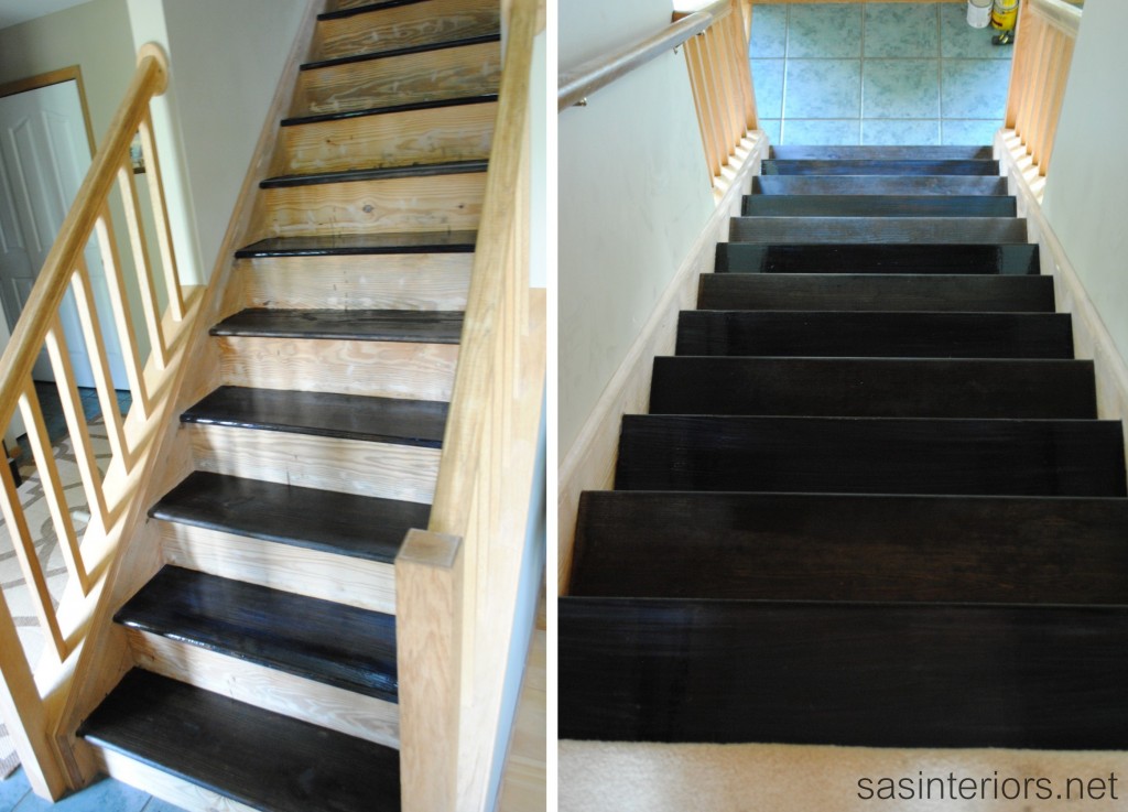
It’s almost been 2 weeks since I posted about the stair makeover, but don’t think I haven’t been hard at work.  The staining took quite a long time and not because it was difficult, but for another reason – keep on reading.  Anyway, I can officially say that the staining is complete and I am at the half way point now (I hope).

This second phase of the staircase makeover covers sanding the stairs, filling the gazillion holes from the carpet tacks and staples, and staining the treads. So let’s jump right in and get started!

Project Details

Duration of Phase Two: 1.5 hours for sanding & filling holes; 2 overall hours for staining / polyurethane (5-10 minutes for each coat)
Phase 2 Difficulty: Easy to Medium
How Many People Needed: 1

The supplies I used for this phase of the project are:

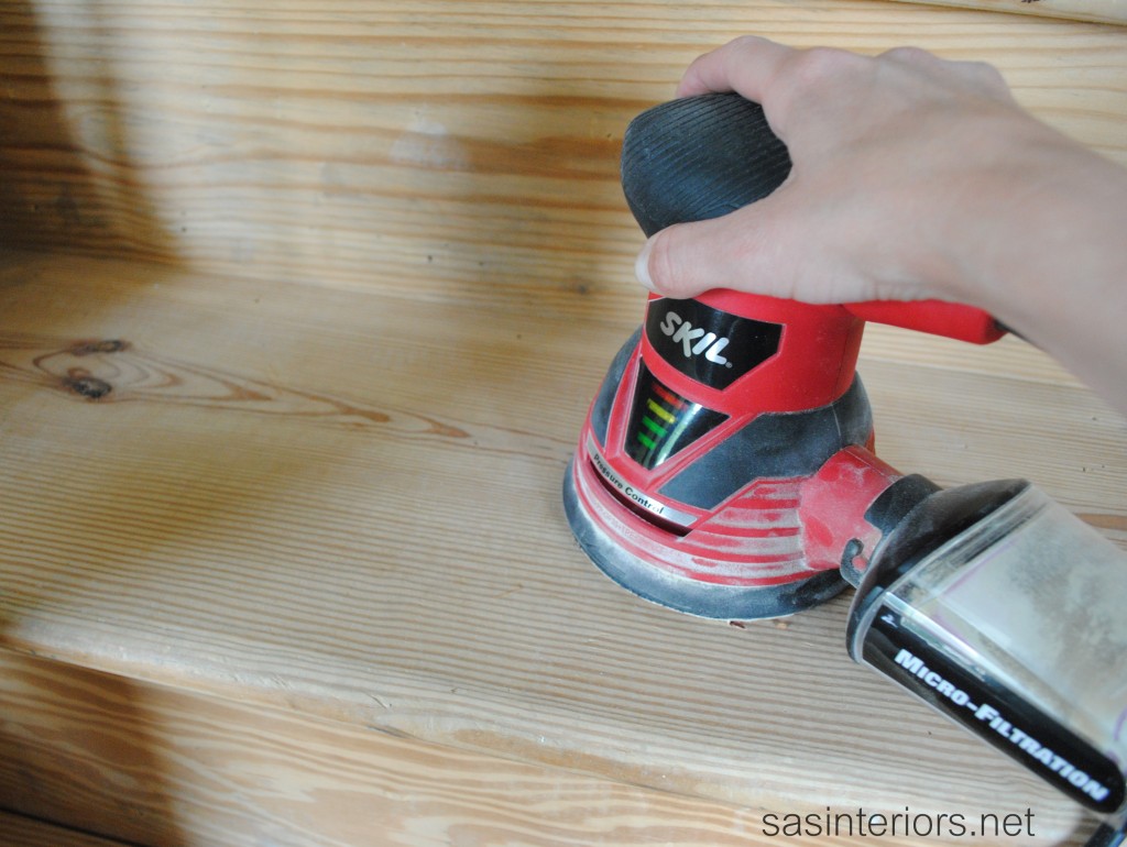
  • Orbital Sander (sandpapering by hand is also possible, but will take longer)
  • Wood Filler (in a color to match the wood)
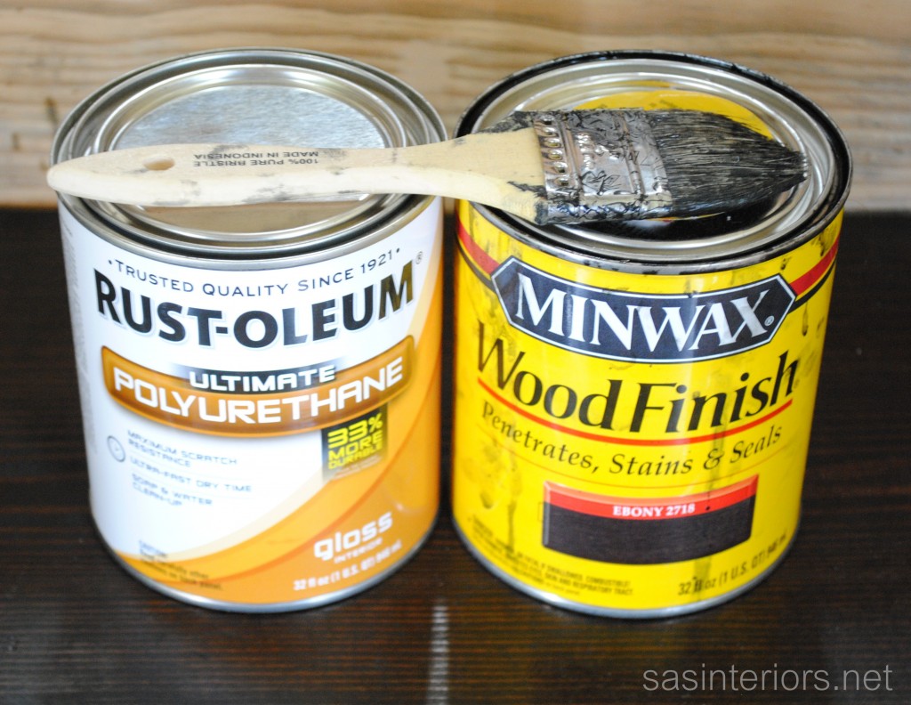
  • Stain – I used Minwax Wood Finish in Ebony
  • Polyurethane – I used Rustoleum (water-based) in a gloss finish
  • Cheap brush or sponge brush that can easily be thrown away
  • Mineral Spirits (if you don’t want to use a cheap brush and instead wash them)

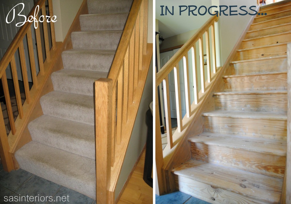
In my last post on removing the carpet and prepping the stairs, I left you off with this…

Once the carpet tacks and staples were fully removed, it was time to sand the stairs.

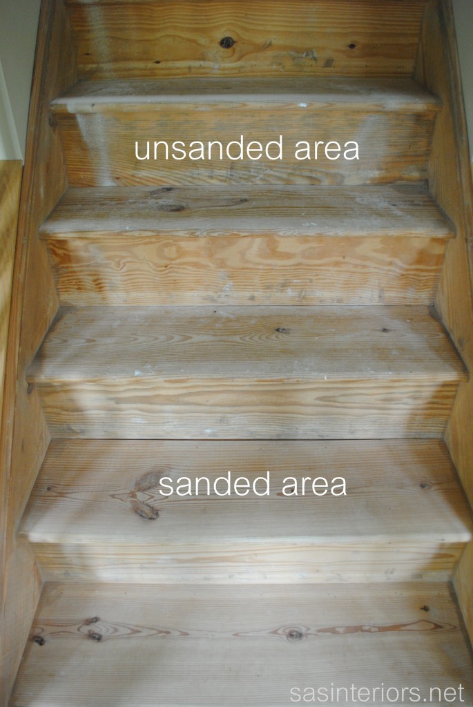
As I mentioned above in the supply list, I used my orbital sander to get a really smooth finish and to take away marks and old paint drippings.  Manually sanding the treads and risers with sandpaper is fine too, but will take longer and is more laborious – if you’re looking to build your arm muscles, this may be your calling 😉

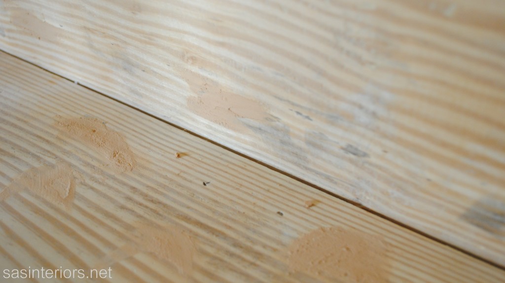
Once the stairs were smooth, I used wood filler to fill in the many holes left from the carpet strip tacks and the carpet pad staples.  There were also a few holes from the natural grain of the wood that I also filled in.

After the holes were filled and the wood filler was completely dried and hard 24+ hours later (it’s important that the wood filler is really dry!), I sanded again.  The wood treads were ready for staining when the stairs were completely smooth to the touch.

Now to the staining process…

I don’t have alot of staining experience, and frankly staining has always scared me.  Unlike painting, it seems so difficult, but thankfully I was proven wrong with this project.

As I mentioned in my last post, I was desiring a really dark stained tread for the stairs, so I chose to use an ebony finish.  Before making the final decision though, I reached out to my blogging bud and the very talented DIYer, Kate of Centsational Girl.  I had showcased her stair makeover as one of my inspirations, and wanted to know what she used for her dark tread.  She told me that she used a product called Duraseal, which has a molasses-like consistency and gave a darker finish because it was less watery than typical stain.  I couldn’t find the Duraseal and was anxious to get started on the staining, so I chose to use Minwax Wood Finish in ebony.  It was the darkest color they had, so I was up for the task of trying it out.  As an alternative, Kate gave me the advice of trying a gel stain which like the Duraseal has a thicker consistency.  I’m a bad girl because I didn’t take her advice, BUT thankfully I’m happy with the result I achieved, so all is good 🙂

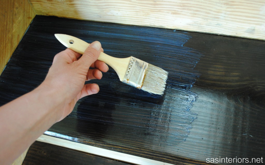
When staining, it’s key to apply thin coats of stain and angle the brush at a 45 degree angle to avoid bubbles.  After cleaning the stairs with a rag to remove any remaining dust from the sanding, I was ready to get started. I used a cheap bristle brush to apply the stain, so I could easily throw it away after the stain applications.

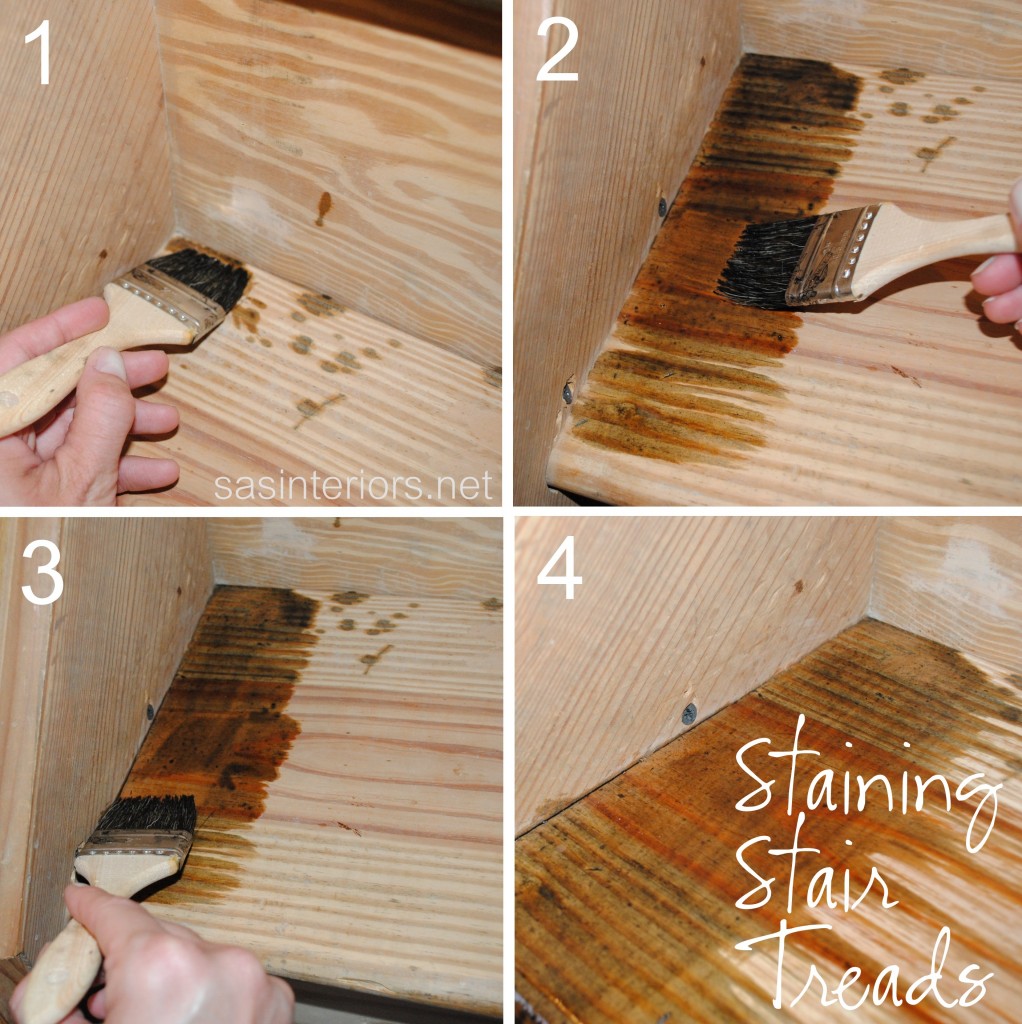
Here are the few steps I took to stain the treads.

1. I started at the corner of the treads.

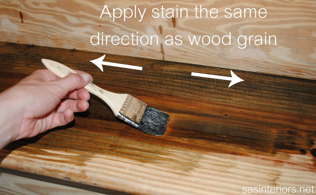
2. I feathered my brush towards the center, parallel to the wood grain.

3. Then I carefully dragged my brush along the edge of the tread and the stair stringer.

4.. After that I feathered the stain in the same direction of the grain again.

The reason for doing these steps is so the tread is thoroughly covered with stain AND minimal stain gets on the stringer (side piece).  For my stairs, I will be painting the stringer white and using a stain blocker beforehand, BUT I was nervous (here comes my apprehension of using stain again) and didn’t want too much stain to get onto the stringer.  Alittle nutty, I know… but it worked.

Continuing with the staining, I applied it to the remainder of the tread in the same direction as the wood grain.

Now that I shared the particulars on how to stain, let me tell you some more details…

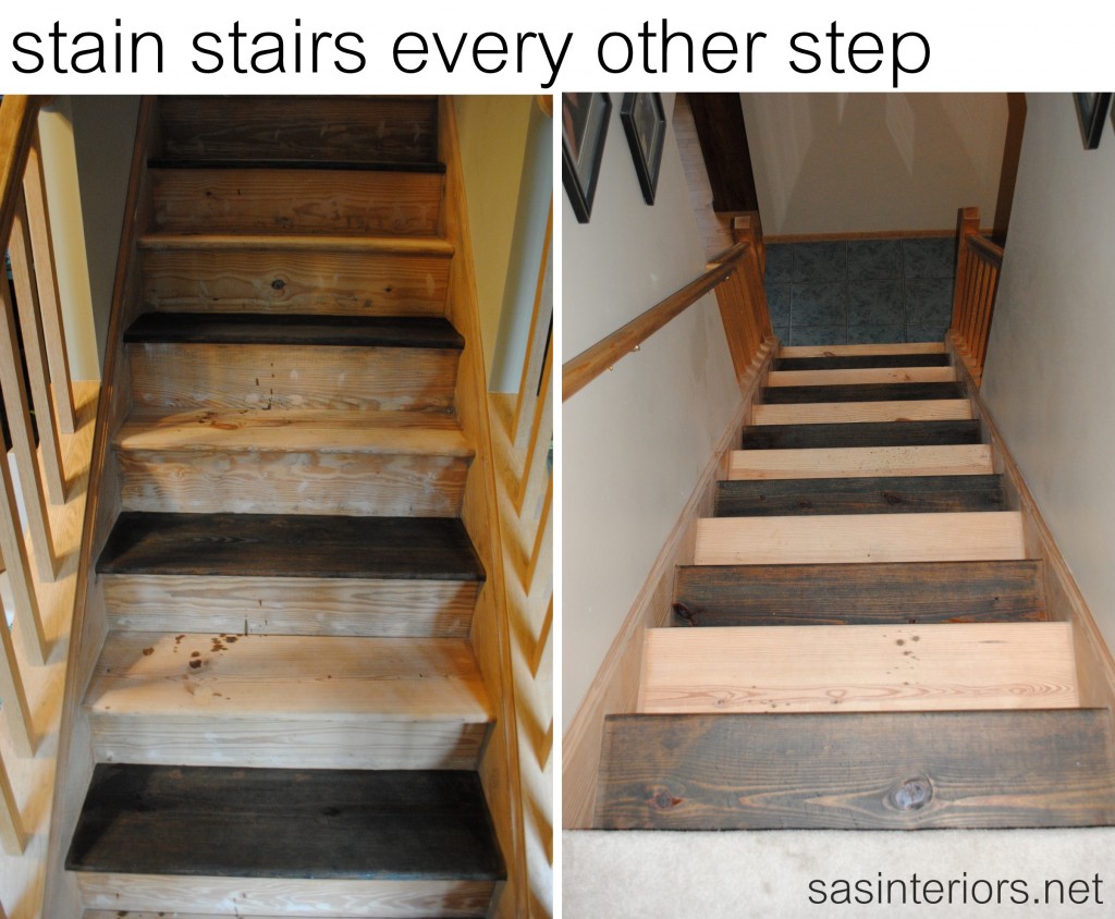
The staining process took a while and the major reason was because we still needed to use the stairs.  What to do??  Well, I ended up staining every other stair so we could still get up to the second floors. We did need to sleep, of course 😉

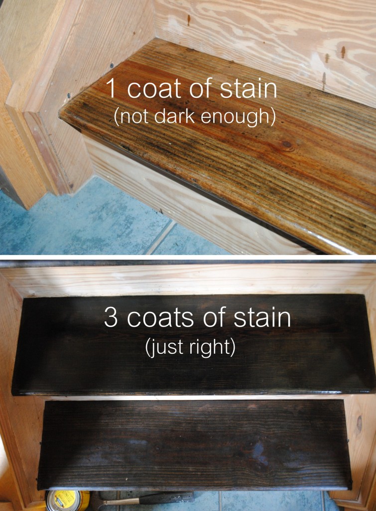
So… because I had to break the project up into two phases, it took longer.  After applying the first coat of stain, it soaked right into the wood, and was dry within about 1-2 hours – there was absolutely no wiping away needed.

Then I applied a second coat of stain, which also soaked right in and took about 1-2 hours to completely dry.  At this point, the stair had a really dull finish to it, but it still wasn’t dark enough for my taste.

So a day later, I added a third coat of stain and that was key!! It took a good day for it to completely dry, but I was happy. Then I was able to move on to the other stairs that were still raw.

The more coats you apply, the darker the result

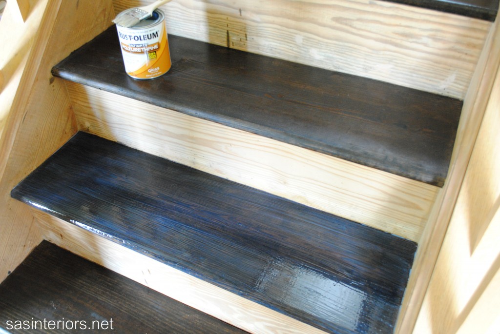
Once the third coat of stain was complete, I sealed the stairs with Polyurethane.  I had tested one small area using a semi-gloss finish, but it wasn’t right, so I decided on a gloss finish.  It gave just enough sheen, but wasn’t overly glossy (if that makes sense).

Kate recommended applying 2-3 coats of polyurethane and this time I took her advice.  After all my hard work, I wouldn’t want these stairs to get ruined!

The polyurethane that I used had a blue tinge when applied (which I freaked out about for only a few seconds), but quickly went away – thank goodness!

And that’s it for the staining process.  This same process and techniques could also be used for furniture.

I got a few comments from readers after my last post that they enjoyed how thorough and explanatory my post was, so I tried to do the same with this – I hope you enjoyed it and learned something new.  If you still have questions, let me know!

It’s really coming along and I’m excitedly anxious to start the next process… painting the risers, banister, baluster, and stringer! Until next time…

Creative Vision Board: Bold Modern Office

Happy Wednesday!  Thanks for stopping by to check out my latest Creative Vision Board.  This new series that I started 3 weeks ago, has been a lot of fun to get my creative juices flowing and keeps me “in-the know” & “up-to-date” on new furniture, accessories, and decor that’s available across the web. Did you know that all the furniture and accessories that I showcase on my Creative Vision Boards are available for anyone to purchase (meaning they’re not to-the-trade only)?  These CVB’s are also a teeny glimpse at what I create for my E-Design clients.

Enough of the chatter, let’s take a look at my latest creation of a Bold & Modern Office

For this week’s Creative Vision Board, I started with the Club Chair in a turquoise colored leather – scrumptious, right?!  In the office, I envision two of these divinely comfortable club chairs off to the side with a black marble-top and silver legged, scalloped side table in between.  What a great place to read a book or review paperwork (or blog, hehe).

Now that you know the starting point for this space, let’s break it down like usual, with my three key factors to create a room – color, texture, and style.

Color

Last week’s CVB was quiet and serene, but since this is a modern office space, it was a must to introduce COLOR!  Starting with the walls, I would use a modern and bold geometric wallpaper on the focal wall behind the white, mirrored credenza. The remaining walls would be covered with wide horizontal stripes in quieter hues of cream and taupe/gray.

The crisp white desk would pop off of the faux cow hide rug which is layered over a dark wood floor and a classic herringbone natural-colored rug. Layers, Layers, Layers!

Other exciting colors in this office would be burnt orange and pistachio, as seen in the ottoman, fabrics, and accessories.

Texture

If you work from home or spend a significant amount of time in your office, it’s important to introduce engaging elements.  One way to do this is through texture.  This office has alot of textural qualities.  From the smooth subtle leather club chair to the faux cow hide rug to the chevron patterned cashmere rug, this office space is filled with texture and pieces you would want to touch all day!

Style

So much style in one space, I wish I could snap my fingers and instantly work in this office!  Don’t you? From classic to modern, this office has a good balance of old and new elements.  One of my favorite pieces in the room is the large, crisp white desk.  The purpose of a traditional desk is there, yet with a modern twist.  It is more open and airy than typical and has a beautiful X-leg.

My Advice to Design a Room Like This

Have fun and be daring when designing an office space. Create a space that is inspiring, engaging, and gets the creative process moving.  This is a room in the house that doesn’t need to be 100% cohesive with the rest.  Yes, bringing in elements from the rest of the house is nice, but you can truly make it a statement on it’s own.

Thanks for stopping by to check out my latest Creative Vision Board.  Has it inspired you to revamp your office?  Have you created an office space that you love being in?

* Creative Vision Board Disclaimer: Some CVBs are created for specific clients and others are created by me to inspire you.  Either way, specific resources are not provided because these are the types of creations that clients pay me for and if I gave the information away for free, no one would hire me.  BUT if you’re interested in specific pieces seen on my Creative Vision Boards or want to create the exact look in your space, you can gladly pay a nominal fee for the resources.  Nothing on my Creative Vision Boards are to-the-trade only and everything can be found on the internet. Also, if you have a question about a specific resource then my One-Question Consult would be perfect for you and/or if you’re looking for a new, custom created CVB, then you might want to take a look at my Jump Start Design option.  If you have a question about anything, email me!

Creative Vision Board: Serene and Sophisticated Bedroom

I’ve been super psyched for Wednesday to arrive so I could share my newest, latest, and greatest Creative Vision Board.  After last week’s Red Hot Eclectic Living Room board started off the series, I was hard at work conceptualizing and creating my latest “room”.

If you’re new to this Wednesday ritual, every hump day (a.k.a. Wednesday) I will create and share a new Creative Vision Board for a room in the home, then I’ll break-it-down explaining how I created the board and how you can create something similar for your space.

Drumroll please for this week’s, Serene & Sophisticated Bedroom Creative Vision Board

For this week’s CVB, I started with the chevron side table lamps (which in reality would be placed in front of the lamps on the nightstand).  Lighting often ‘makes’ a room, and just like last week, it was where I started when pulling this space together.  Because of the mere WOW-factor that these chevron beauties make, the other larger selections in the room took a backseat to compliment this dominant fixture.

Let’s jump in and break down the room even further using my three key factors to make a room: color, texture, and style.

Color

For me, a bedroom should be calming and serene, creating a heavenly oasis to retreat to after a long, exhausting day.  Believe me, I love color, but keep the vibrant hues for the other spaces in the home. With the deep navy and white on the lamp, I decided to introduce other blue tones into the space which can be seen in the rug and pillows.

Additionally to add a pop of color, I introduced the accent color of lime green – just a little goes a long way – that can be seen in the pillows and the garden stool, which would be perfect as a side table next to the chair.

Soft tones for the bedding, window treatments, wallpaper, and wall color are a perfect backdrop for this bedroom.

Texture

Tactile surfaces are a must for me when designing a space.  Whether a soft rug, grasscloth wall, or a high-polished lamp, texture in a room gives great depth and dimension!  A room could be all one color (bo-ring), but when different textures are introduced, it becomes completely engaging.  In this ‘room’, texture can be seen in the bamboo shades, the linen draperies, and the soft leather stool.  Even the chandelier has a textural quality.  Ooo, so much to touch!

Style

From classic to modern, this room is filled with elements of various styles, yet still reads as one cohesive space. One of my favorite elements in the room is the minimal, slightly-retro style chair with the orange and white floral fabric. What a divine chair for reading!

My Advice to Design a Room Like This

Start with the larger pieces in the room – the bed, chair, chandelier – and then introduce soft finishes and accessories that enhance the overall look and compliment the larger elements.  Think about the feelings that you want your bedroom to evoke and introduce colors that will project that aesthetic.

Thanks for checking out my latest Creative Vision Board – what do you think?  Would you love a bedroom like this?  If you have questions regarding any of the specific pieces shown in my Creative Vision Board, you can gladly contact me and we can work together through my E-Design service. Until next week… Happy Decorating!

* Creative Vision Board Disclaimer: Some CVBs are created for specific clients and others are created by me to inspire you.  Either way, specific resources are not provided because these are the types of creations that clients pay me for and if I gave the information away for free, no one would hire me.  BUT if you’re interested in specific pieces seen on my Creative Vision Boards or want to create the exact look in your space, you can gladly pay a nominal fee for the resources.  Nothing on my Creative Vision Boards are to-the-trade only and everything can be found on the internet. Also, if you have a question about a specific resource then my One-Question Consult would be perfect for you and/or if you’re looking for a new, custom created CVB, then you might want to take a look at my Jump Start Design option.  If you have a question about anything, email me!

Painted Two-Toned Desk + Tips on Painting Furniture

I’m just about finished with the updates for my son’s bedroom makeover.  It hasn’t been a huge overhaul, but with rearranging the furniture, adding colorful stripes on the wall, and hanging new DIY pallet shelves, this space has received a welcome refresher.  In the midst of moving around the beds and dresser, I realized  my little man is at the age where he really needs a desk to work at and hold all his creative supplies.

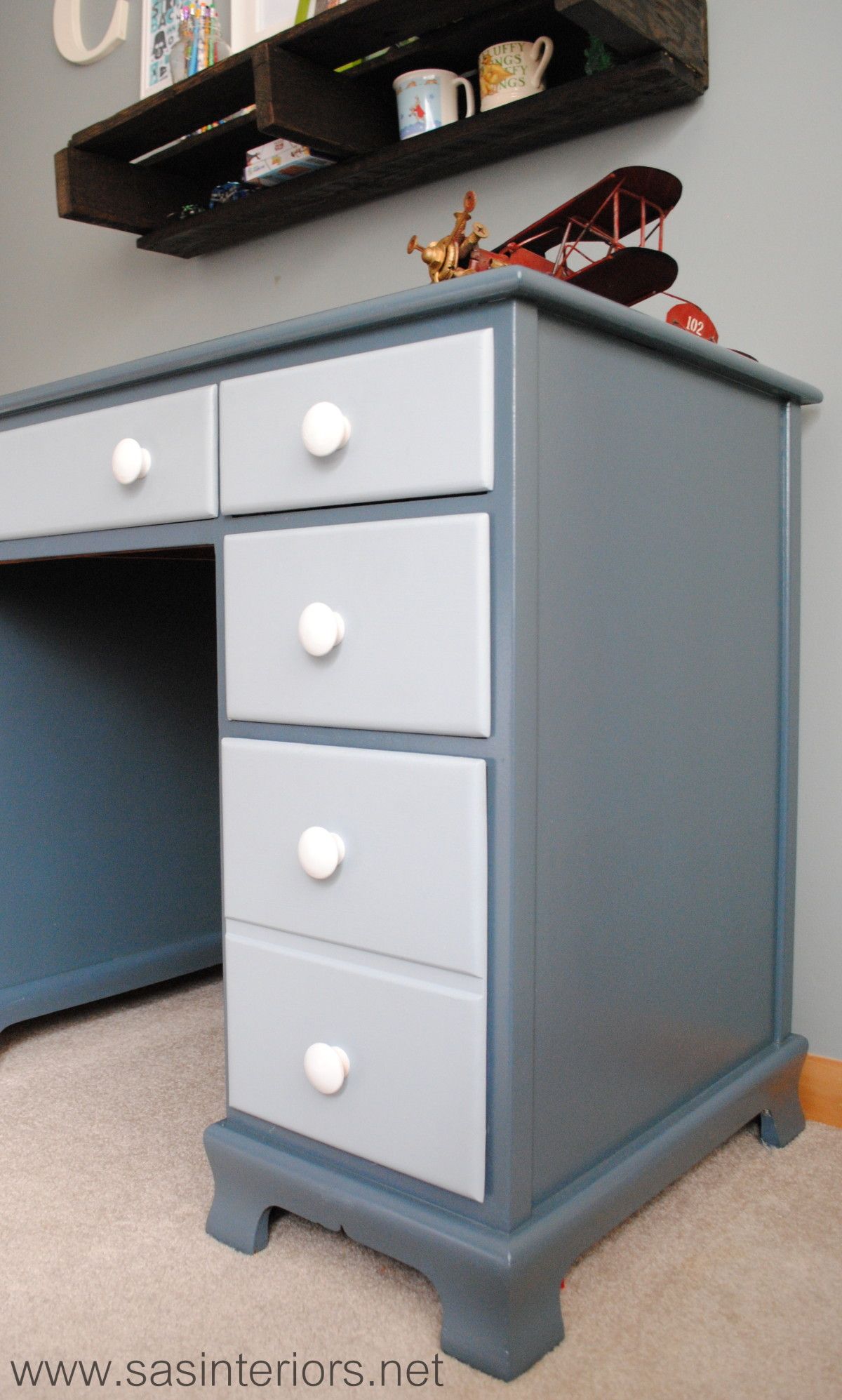
If you remember back quite a long time ago, I purchased a beauty of a desk off Craigslist.  It lived in my family room ever since (over 6 months), but wasn’t “right”.  Then pufff… I had an idea – it would be perfect for my son’s room.


And this is the evolution of the Craigslist Desk…

It started off as a stained executive desk typical of the 1940s and is in really great condition.  The only thing it needed was a little makeover to update it and bring it back to life to mesh with today’s decor style.

In knowing that the desk would live in my son’s room, I wanted to do it right.  With my lack of patience, I sometimes skip steps or rush, but with this desk makeover I took my time so the result would be something he could live with for many years.

Supplies: Onto the makeover – here’s my arsenal of supplies…

1. Fill Holes & Sand: I started off removing the hardware, which I decided to replace with simple knobs.  Then I filled all of the scratches, holes, and nicks with wood filler.   And the last step before painting was to sand the overall desk surface with my orbital sander using a 120 grit sandpaper (medium coarse), then a 220 grit sandpaper (very fine coarse).

2. When the sanding was complete, I cleaned off the entire surface with a damp rag before I started priming.

3. Primer: Once the desk was completely dust-free, I added one coat of primer with my favorite Kilz Primer which blocks the stain and allows for a well-prepared surface to paint.

4. Secret Agent: With every painting job, I always add my favorite “formula” to eliminate brushstrokes – Floetrol.  It always works like a charm to achieve a clean, brushstroke-free surface! (And I wasn’t even paid to say that – I truly just love it 😉

Desk Colors:

  • Desk Top & Frame – Dutch Boy High Seas
  • Drawer Fronts – Dutch Boy Hurricane Cliffs

5. Paint: After the one coat of primer, I added the first coat of paint, which I used both a brush and roller.  On the top and flat surfaces of the desk, I used a 5″ wide small roller and for the difficult crevices and edges, I used my favorite 1.5″ wide Purdy brush.  *Sometimes, I used the brush first and went over it with the roller.  The roller makes for a smooth surface to avoid brushstrokes.

6. Then onto painting the drawers.  I wanted this desk to be a little playful and not just one color, so I decided to use a lighter color blue on the drawer fronts.

7. Polyurethane: The last painting step was to add a coat of polyurethane – truly the most important part in finishing any piece of furniture!  I usually use water-based clear satin polyurethane, but since I knew this desk would be getting lots of use in the years to come, I decided to use an oil-based polyurethane, which really is more durable (hands-down).

8. Hardware: Once the painting was complete, I drilled one hole in each drawer front for the new knobs, which were originally natural that I spray painted white.  The knobs went in and the desk was complete.
To add a little unexpected fun to the desk, I added a drawer liner that has a geometric pattern with green, blue, and turquoise colors.  My son was quite surprised when he opened the drawers to find this hidden treasure!

And once again here is the before and after…

And these are just a few important tips to remember when painting furniture:

 Do you like painting furniture? Have you painted anything lately?